LIVESENSE Recruitment, Corporate Site
- Client
- Livesense Inc.
- Role
- Planning, Project Management, ArtDirection, Design, Development
- Date
- Jan 2017
- Overview
-
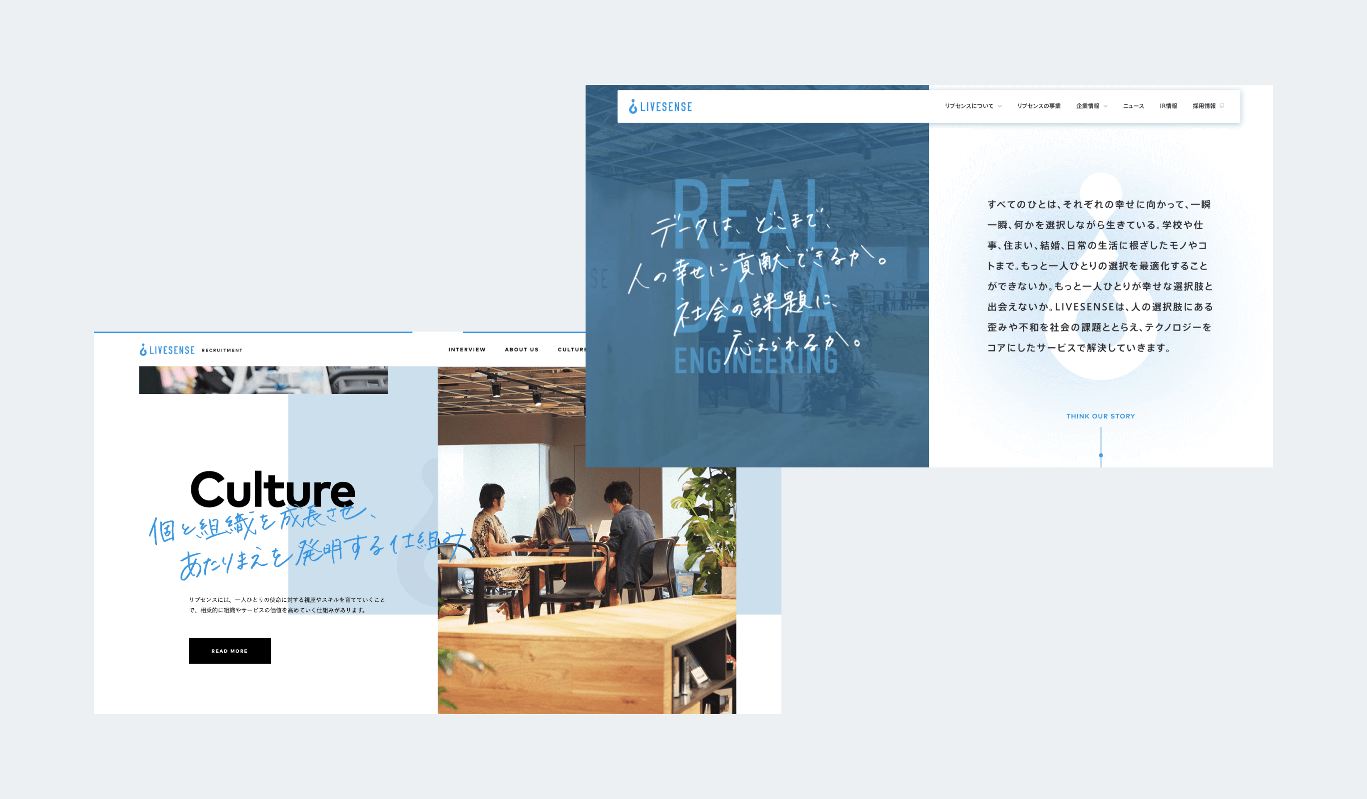
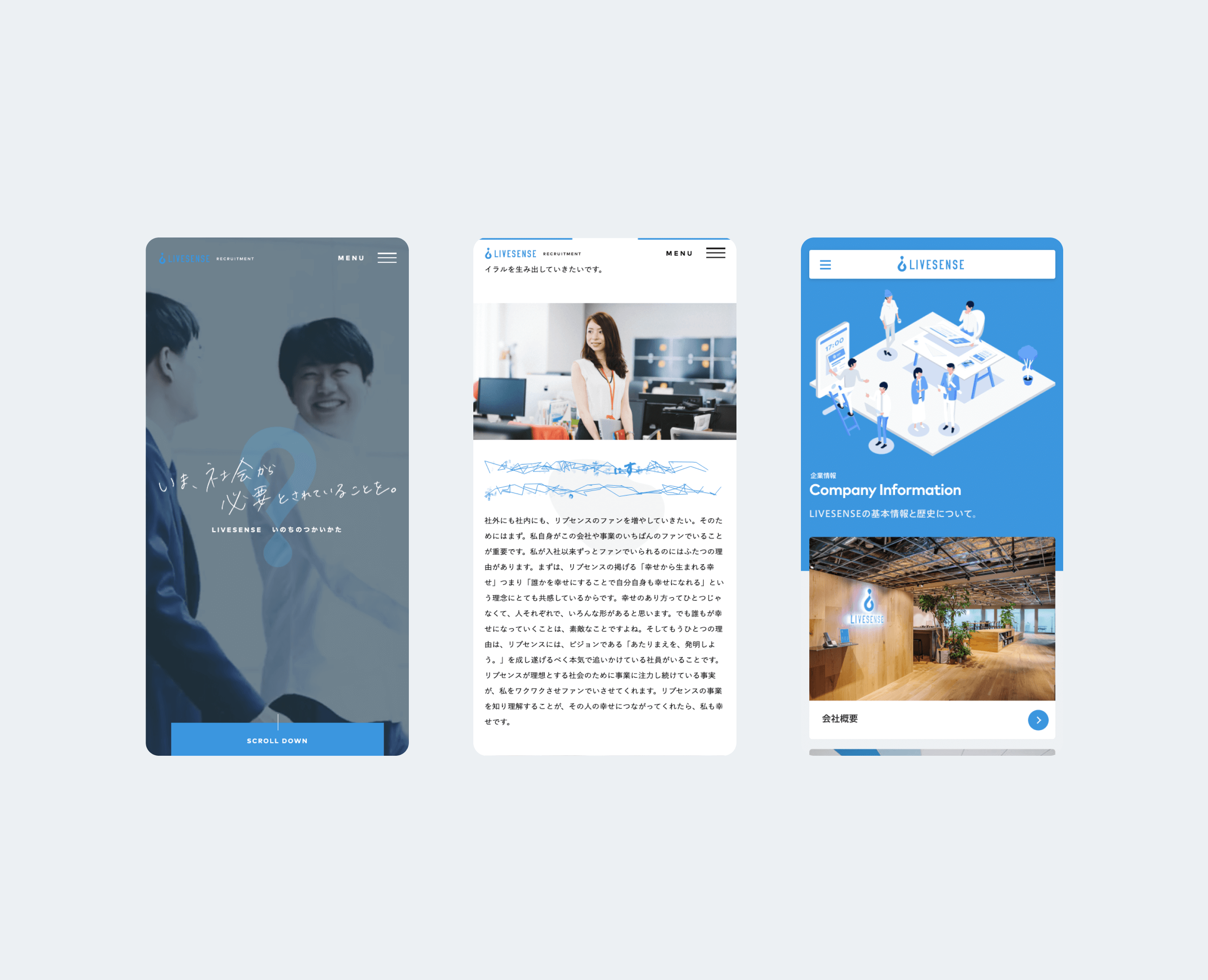
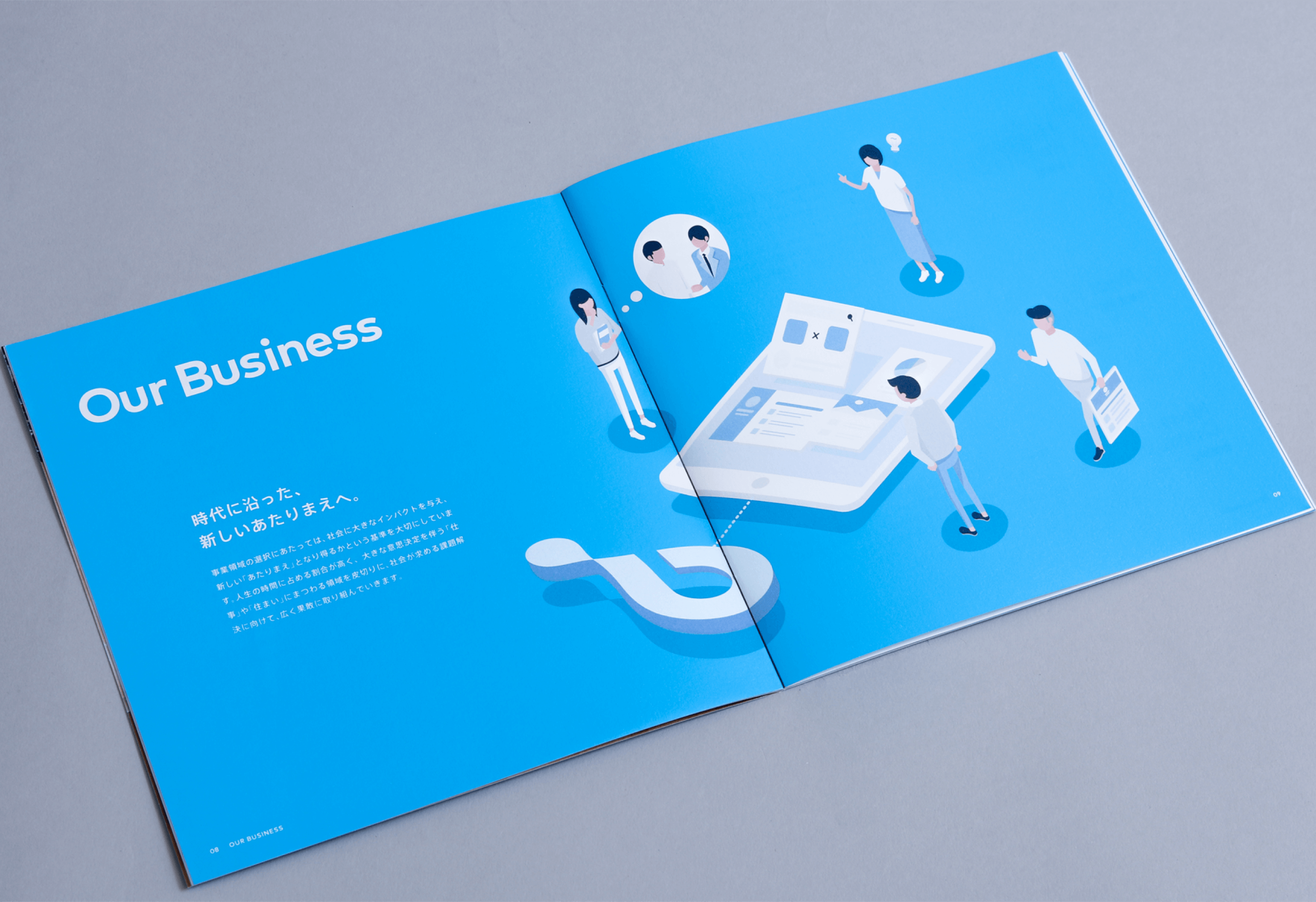
Creating a consistent brand image in a variety of outputs.
多様なアウトプットのなかにも一気通貫のブランドイメージを
Creating a consistent brand image in a variety of outputs.
多様なアウトプットのなかにも一気通貫のブランドイメージを
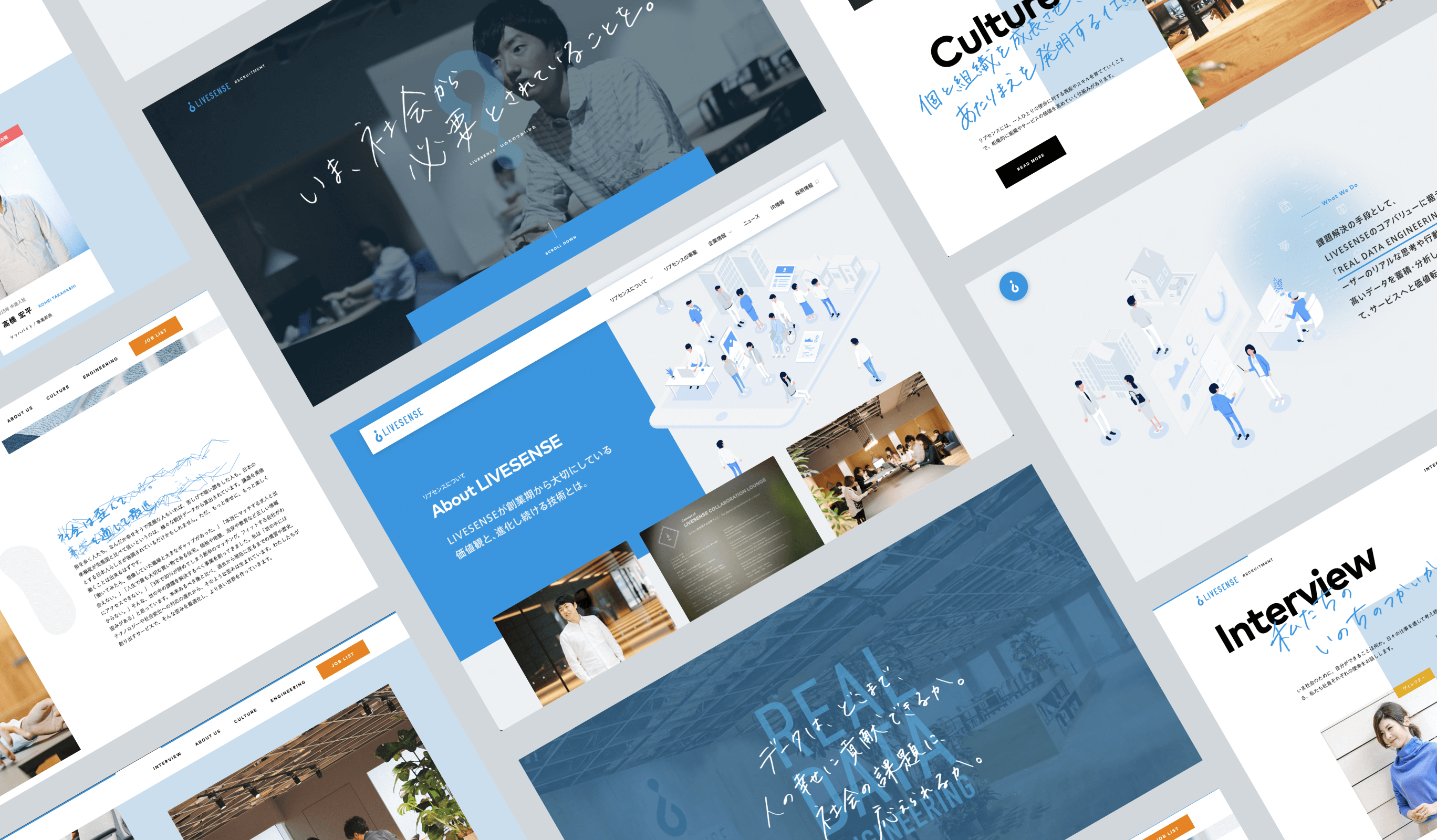
株式会社リブセンスのブランディングの一貫として、コーポレートサイト、採用サイト、会社案内の制作を担当しました。コーポレートサイトと採用サイトでトーンに違いを持たせつつ、関連性のあるブランドイメージを醸成しています。
- Insight
-
Visualizing the "character" that crosses both digital and real worlds.
デジタルとリアルを横断する「らしさ」を可視化する
Visualizing the "character" that crosses both digital and real worlds.
デジタルとリアルを横断する「らしさ」を可視化する
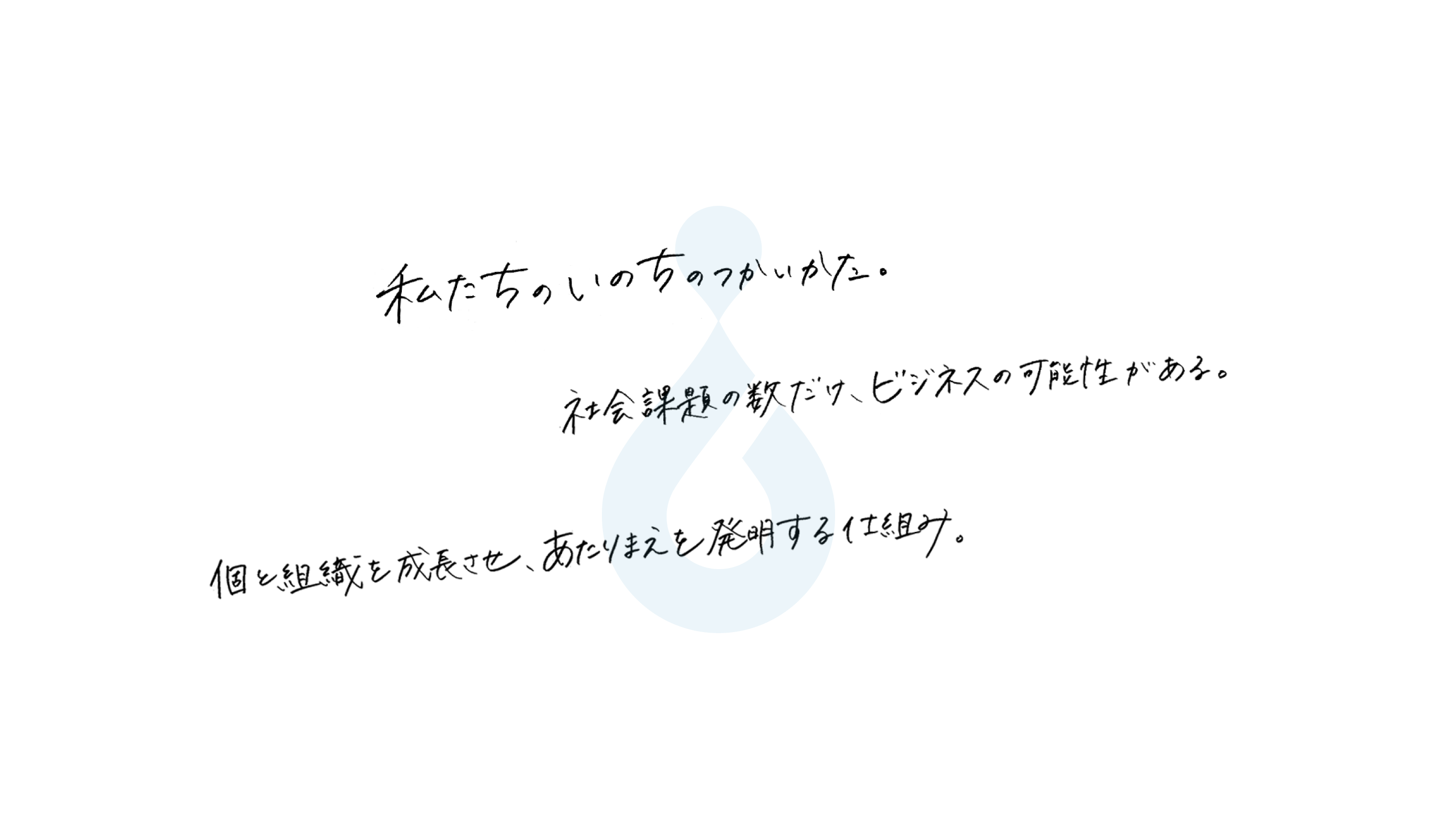
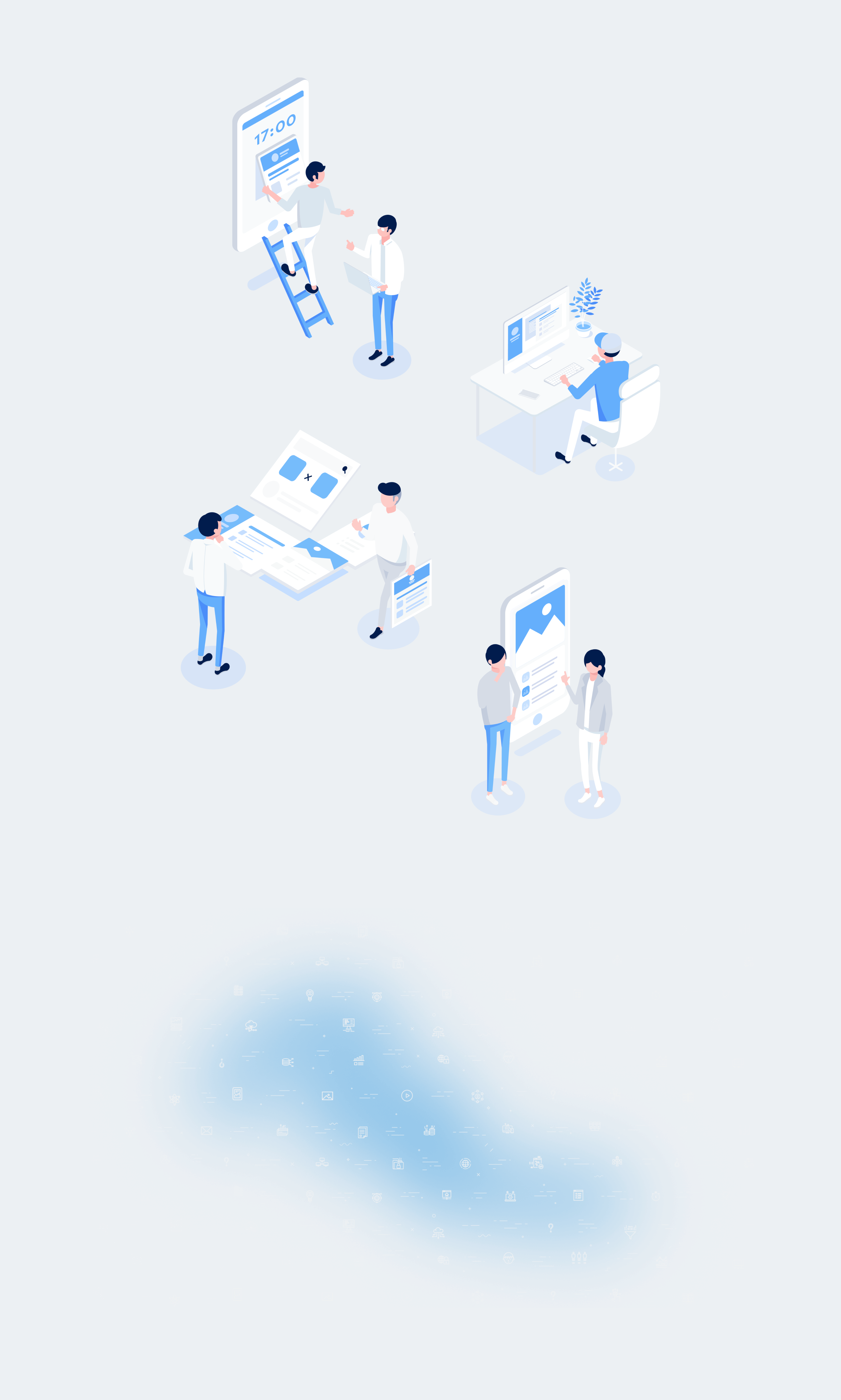
コーポレートサイトではリブセンスが目指すデジタルとリアルを横断する姿勢を表現するため、アナログなレタリングと、デジタルで立体的なイラストレーションを使用。また、まだ可視化されていないものを見えるようにして、あたりまえなサービスとして「浸透」させていくメタファーとして、背景にブラー表現を取り入れました。
- Idea
-
Conveying the Livesense spirit of steadfastly tackling challenges.
堅実に課題に取り組むリブセンスらしさを
Conveying the Livesense spirit of steadfastly tackling challenges.
堅実に課題に取り組むリブセンスらしさを
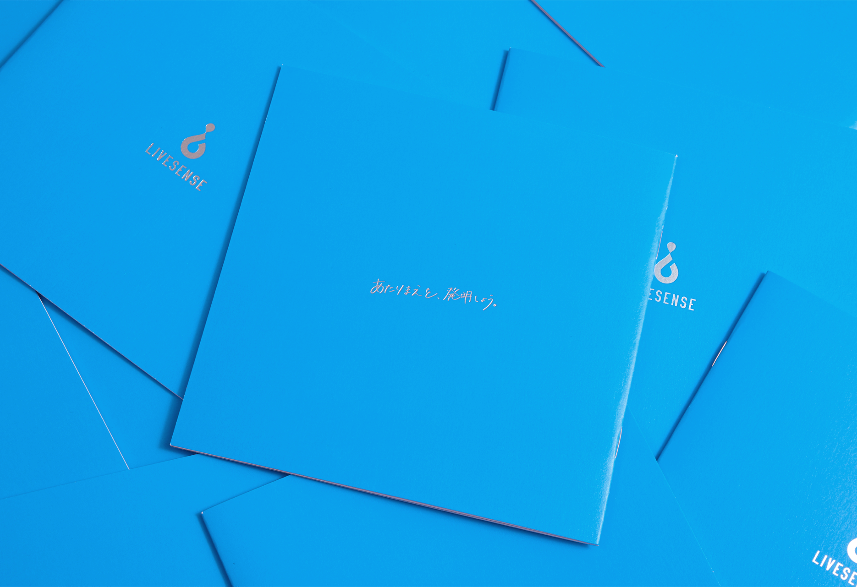
リブセンスのコーポレートカラーである青をベースに、全体的に誠実さが感じられるトーンにしました。
加えて各社員の実際の手書きを用いることで、社員の雰囲気やリブセンスが採用に対する本気度をありのままに伝えています。
また、誠実感といったサイト全体の雰囲気は保ちつつ、ロゴを用いた遊びを設けることで、リブセンスのアイデンティティを表現しました。
演出面ではリブセンスが大切にしている「常に疑問を持ち続ける」「堅実に課題に取り組む」という姿勢をロゴの「?(クエスチョンマーク)」を反転させることで表現し、堅実なだけでなく個性の強い社風を表すために、様々なギミックをサイトに散りばめています。
Project team
- Ryohei Kamada
- External Advisor / Art Director
- Hiroki Miyamoto
- Art Director / Designer
- Keitaro Suzuki
- Art Director
- Daiki Machida
- Project Manager
- PARADOX Corporation.
- Agency
- Ryosuke Takeuchi (PARADOX Corporation.)
- Planner / Copywriter
- LIG Inc.
- Partners
- Mana Otsuka (SONICJAM)
- Partners
- Mikako Nohechi (SONICJAM)
- lettering
- Akihiro Morita (SONICJAM)
- Illustrator
- Fuminari Yoshitsugu
- Photographer