BitStar Branding
- Client
- BitStar, Inc.
- Role
- Planning, Copy, Writing, Project Management, ArtDirection, Design, Development
- Date
- Apr 2020
- Overview
-
Becoming a company that can be remembered at a glance.
Becoming a company that can be remembered at a glance.
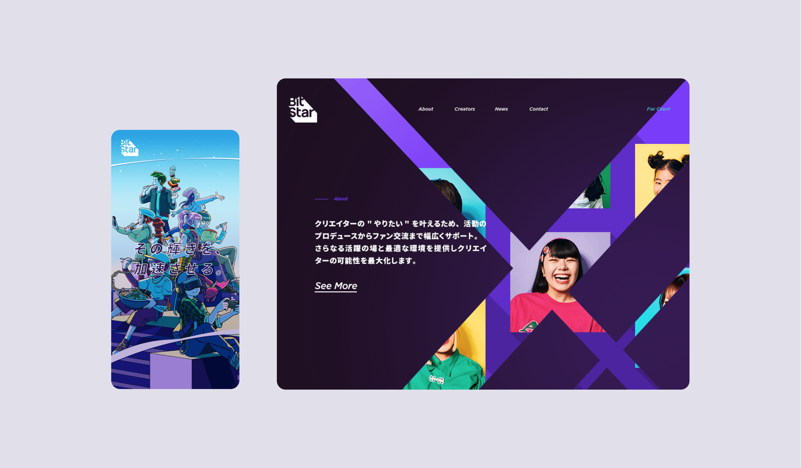
This is a rebranding project for BitStar, a company engaged in creative (influential) production, advertising, and content business. The primary objective is to organize the businesses that have been developed in different tones and manners, and to bring a sense of unity to the way they are perceived by the public. To achieve this, we first formulated a logo and tagline. The logo and tagline are based on the company’s stance of shining a light on all kinds of creators and accelerating their brilliance, and are incorporated into the design, content, and animation.
- Insight
-
Finding the underlying value of the company in order to unite other businesses.
Finding the underlying value of the company in order to unite other businesses.
BitStar’s greatest strength was its ability to meet all the needs of all creators through “structuring” and “technology.” As a result, creators will be able to immerse themselves in what they love and produce better creations, and a society filled with attractive content will become brighter and brighter. We defined this as the social mission of BitStar, and the keyword “illuminate” came to mind.


- Idea
-
A worldview unified by light and shadow.
A worldview unified by light and shadow.
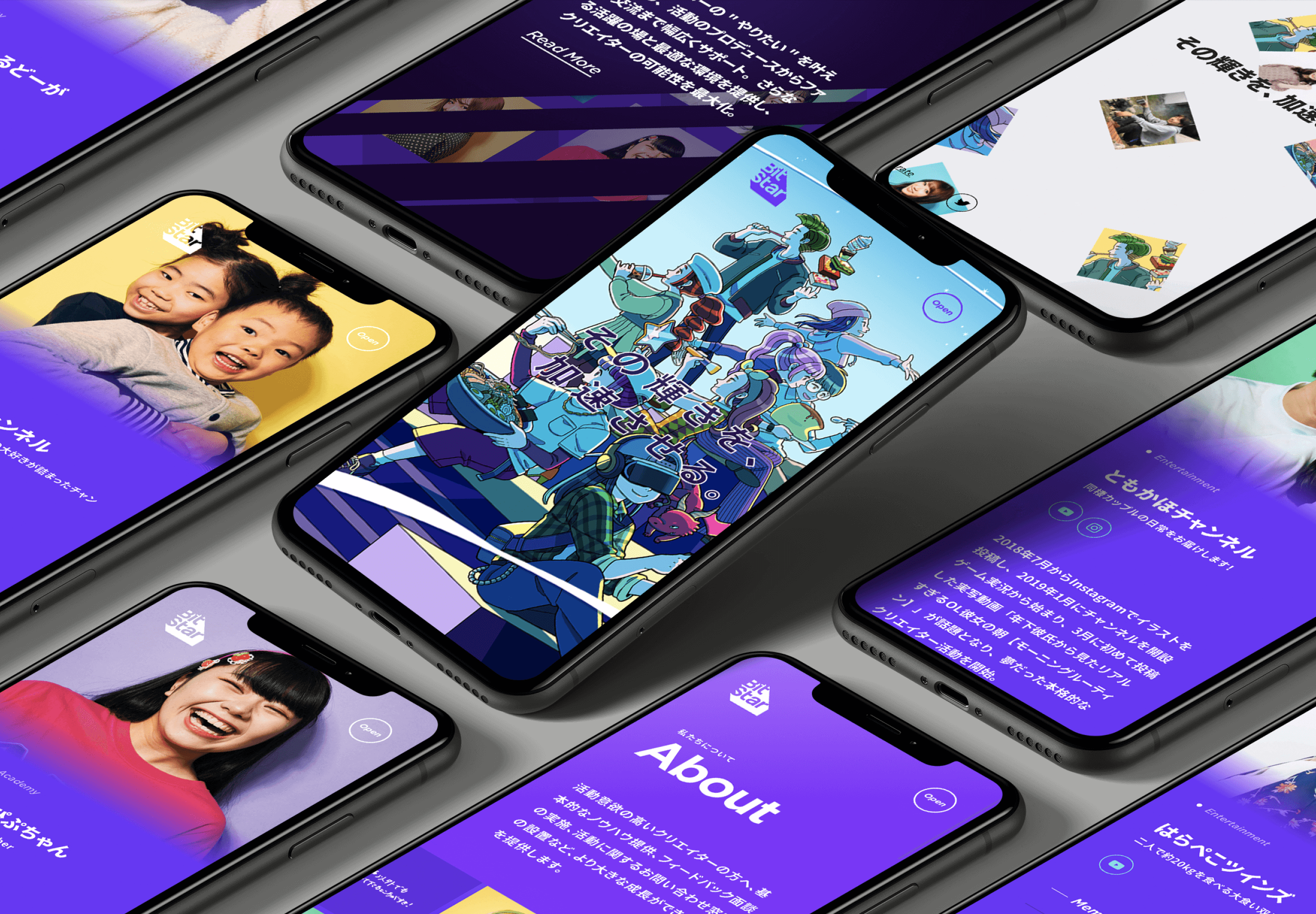
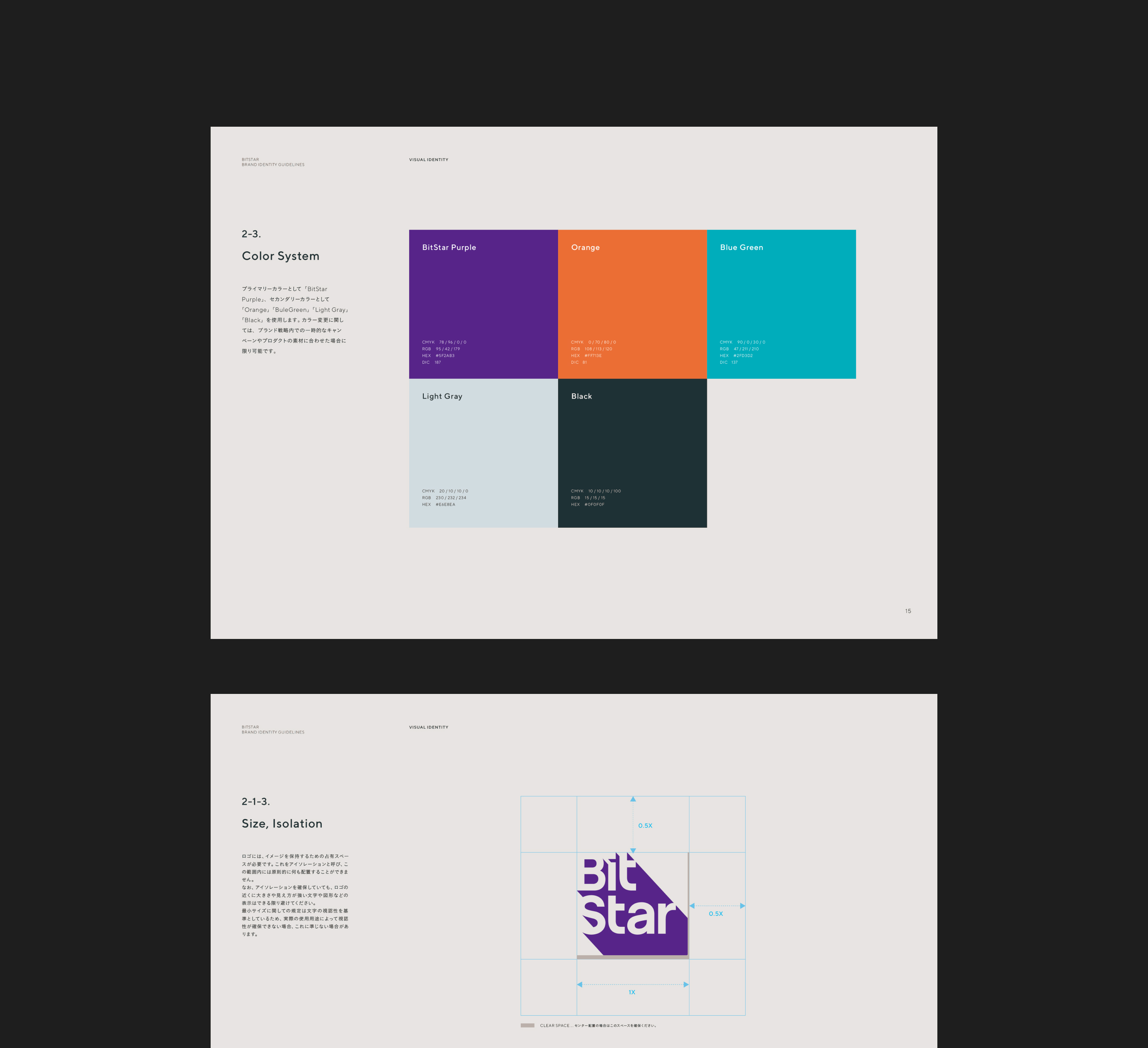
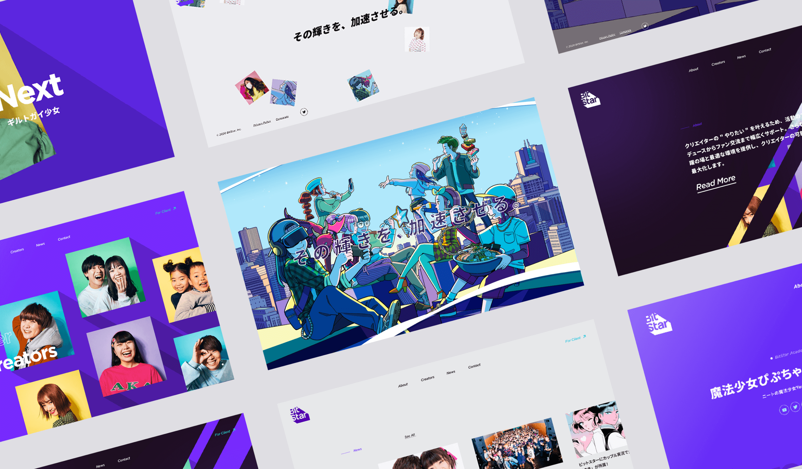
For the logo, we visualized a shadow that falls vigorously due to intense light. The length and angle of the shadows would greatly change the impression and visibility, so we repeatedly fine-tuned the form. We also directed the creators’ photos and illustrations based on the same concept as the logo mark, and created them so that they would have the same expression no matter how they were cropped.
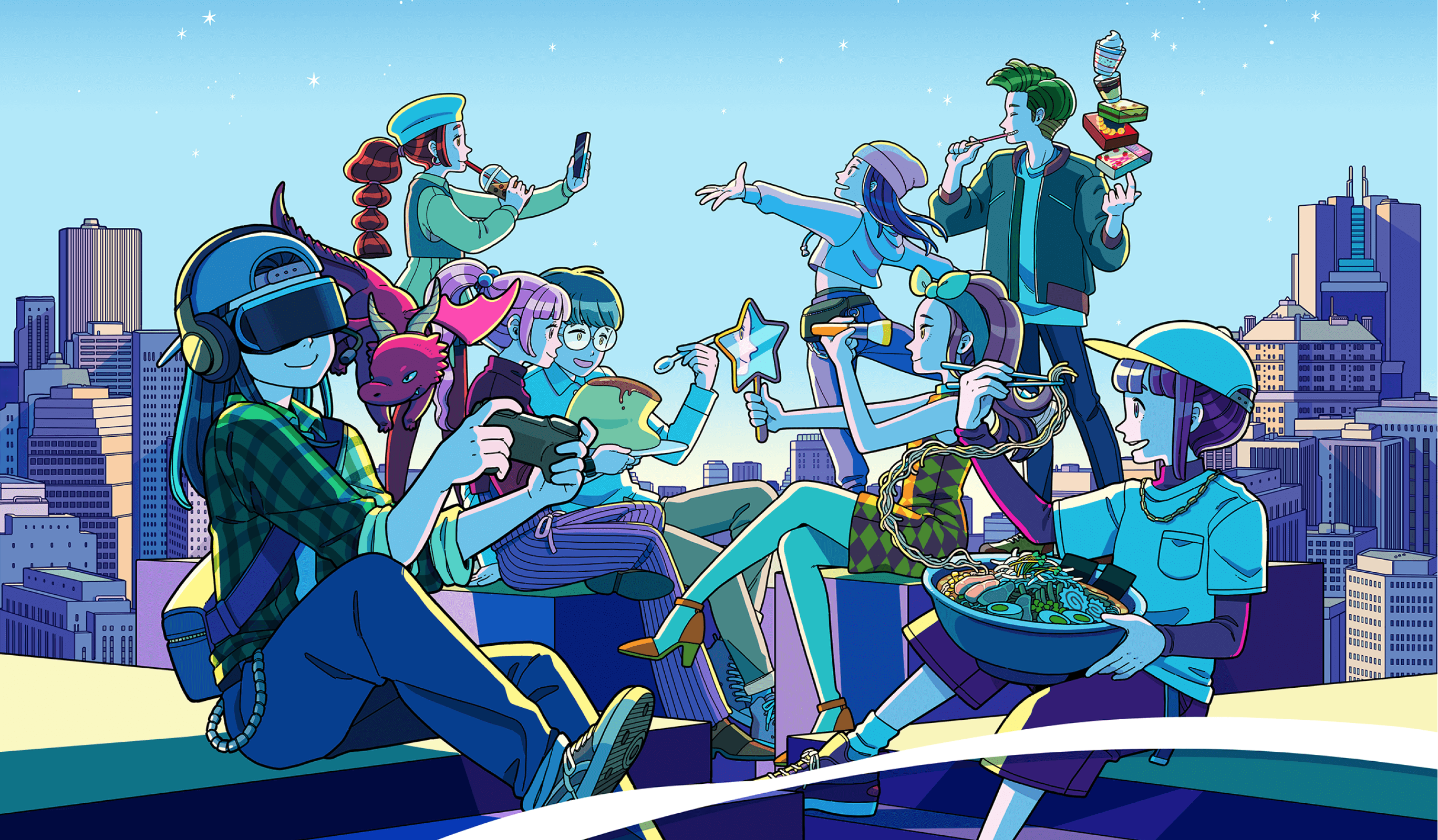
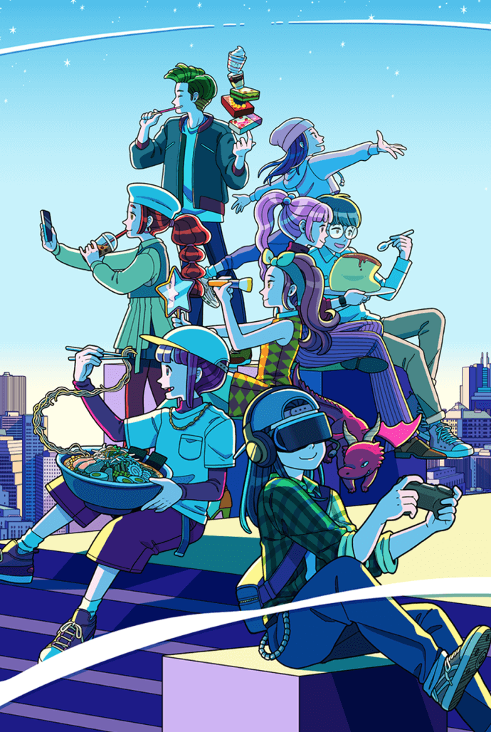
For the main visual of the website, we used illustrations to show the creators, who are the key players, communicating their “likes.” The site’s animations, such as hover functions and transitions, are based on the motif of shadows cast by strong light, just like the logo. The animation is dynamic and energetic with the image of entertainment where creators are active. In addition, the top page has a playful feel to it with hidden commands.
Project team
- John Nishiyama
- CSO / Copywriter
- Hiroki Miyamoto
- Art Director / Designer
- Arisa Miyasaka
- Designer
- Junichi Nishiyama
- Senior Interactive Designer
- Hiroaki Yasutomo
- CTO / Technical Director
- Gen Shibano
- Project Manager
- Atsuhiro Shirahata
- Partners
- Utomaru
- Illustrator
- Keitaro Suzuki
- Design Director
- Masakazu Tsuru
- Producer