KUUM Brand Site
- Client
- FELISSIMO CORPORATION
- Role
- Project Management, ArtDirection, Design, Development
- Date
- Mar 2016
- Overview
-
Conveying the fun of "assembling" through video and animation.
Conveying the fun of "assembling" through video and animation.
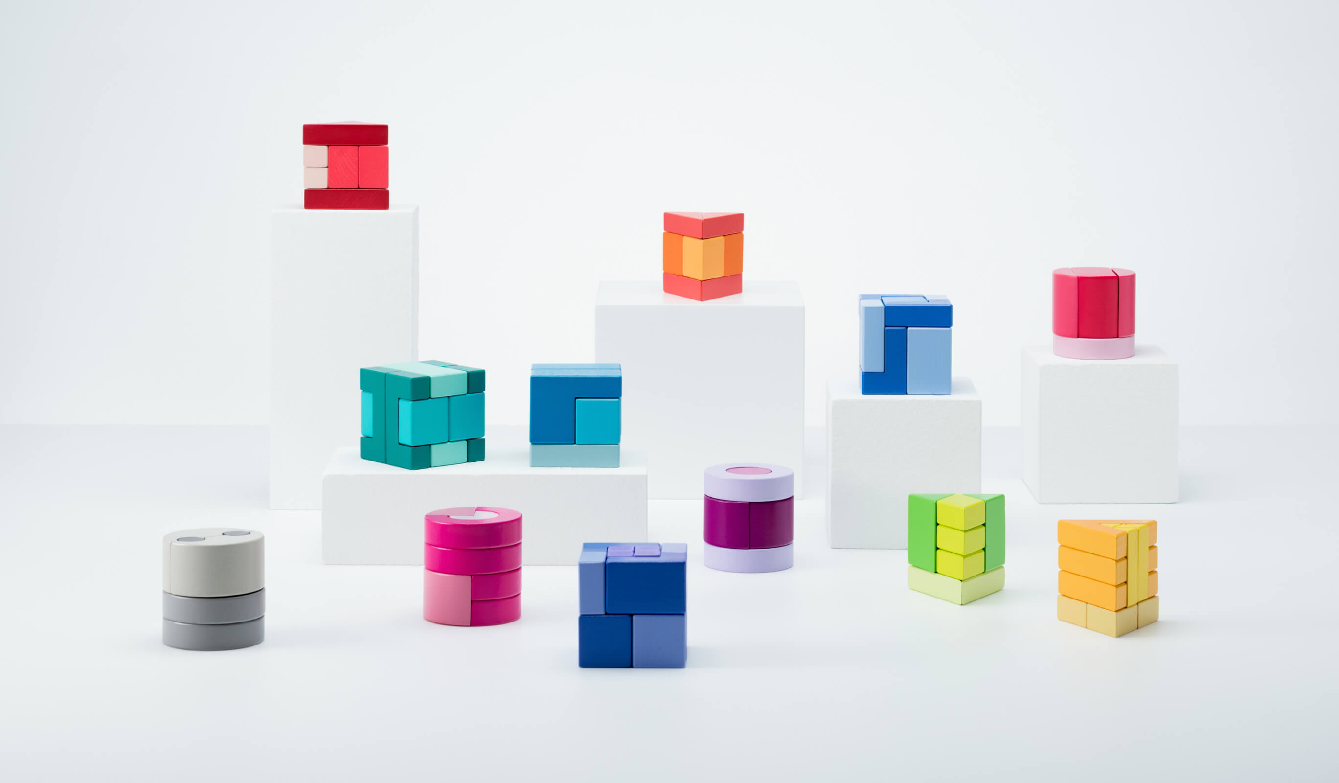
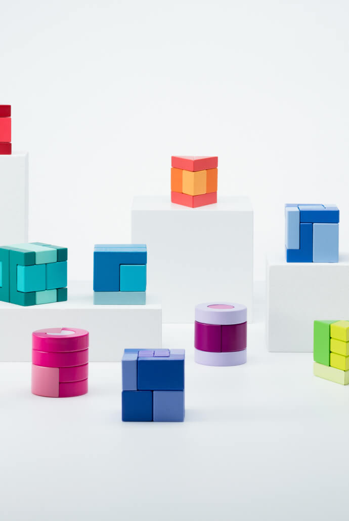
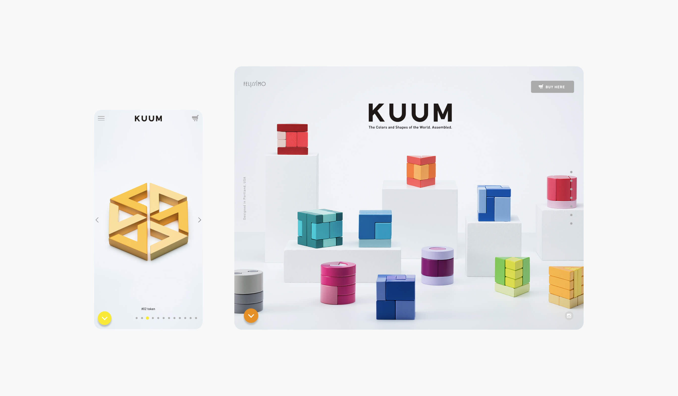
Under the creative direction of monogoto, a design firm based in Portland, OR,USA, we created an LP for the international launch of the new “Kumu” KUUM building blocks. The site is designed to present the product in a simple way, with a scroll-and-slide interface, and visuals that focus on the product, for overseas users.The coloring, shapes, and detailed animations based on the products also express the worldview of the products themselves, which have a high degree of design perfection.
- Insight
-
Representing the simplicity and sophistication of KUUM's design.
Representing the simplicity and sophistication of KUUM's design.
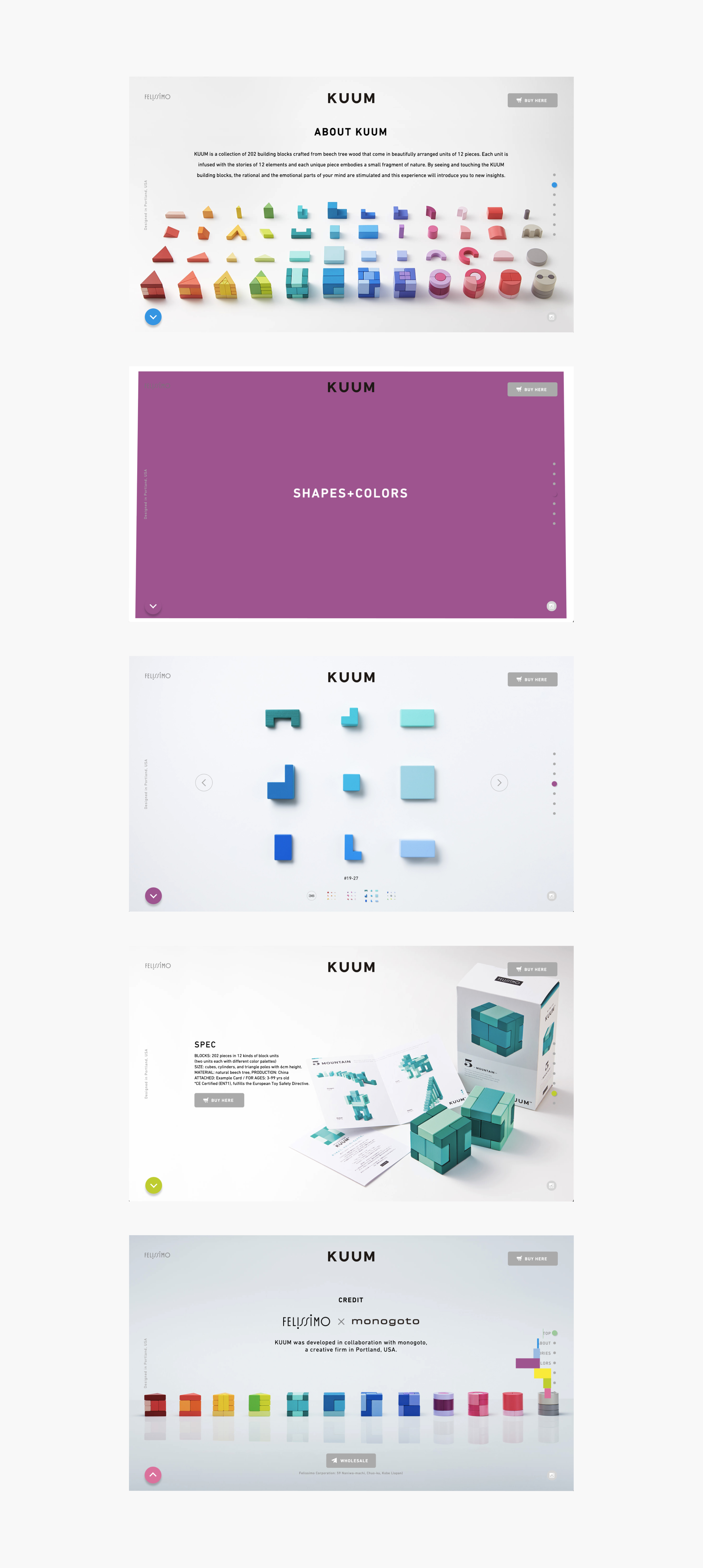
KUUM is known for being simple and sophisticated, so we tried to create a simple design for the site using the same scrolling and sliding design as the product itself. We were conscious of creating a rich experience within this simple structure, and creating a site that can present the product well, and also of sticking to the world view of the product with things like coloring, shape, and other fine details.
- Idea
-
Use animation to express the tone of the product.
Use animation to express the tone of the product.
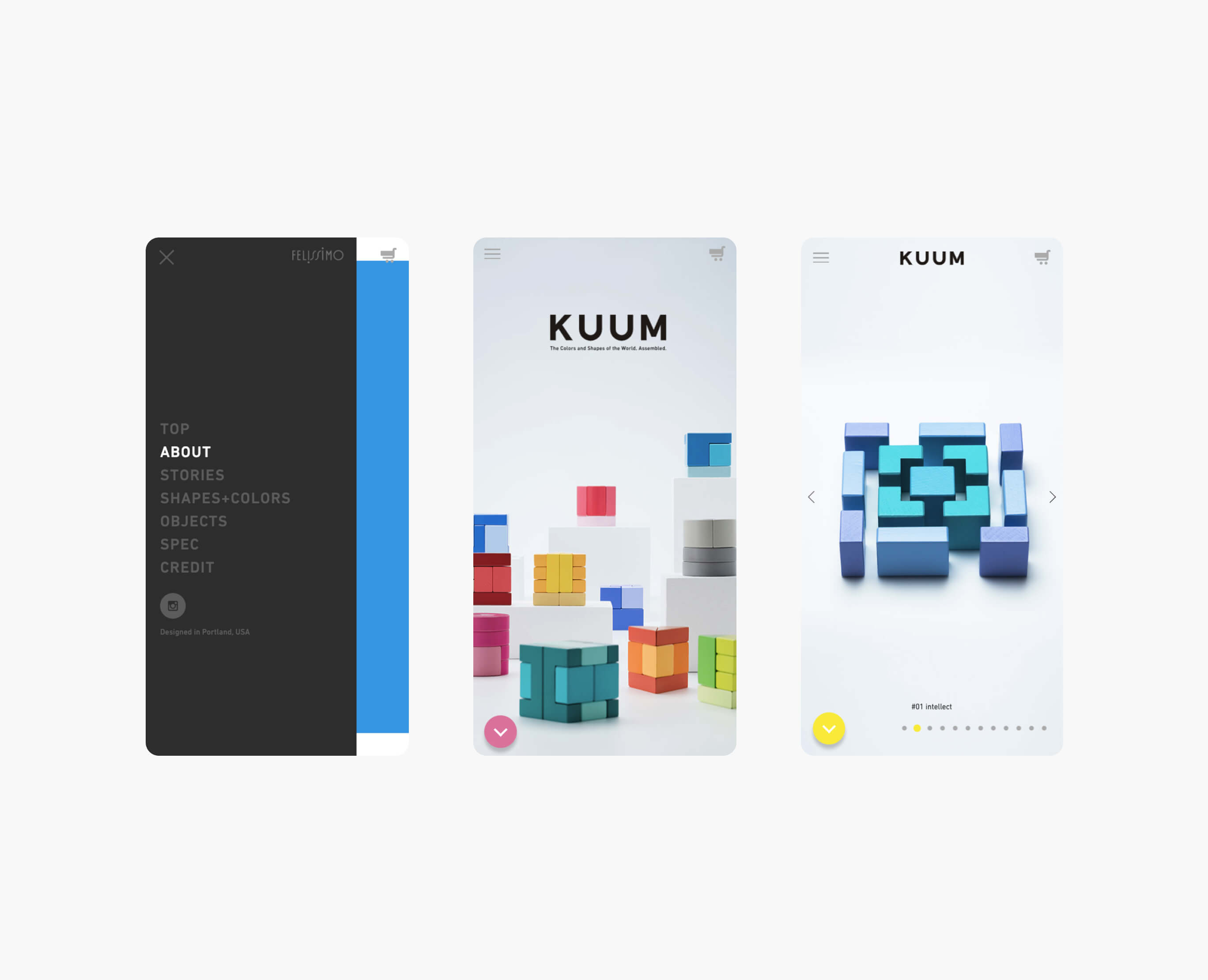
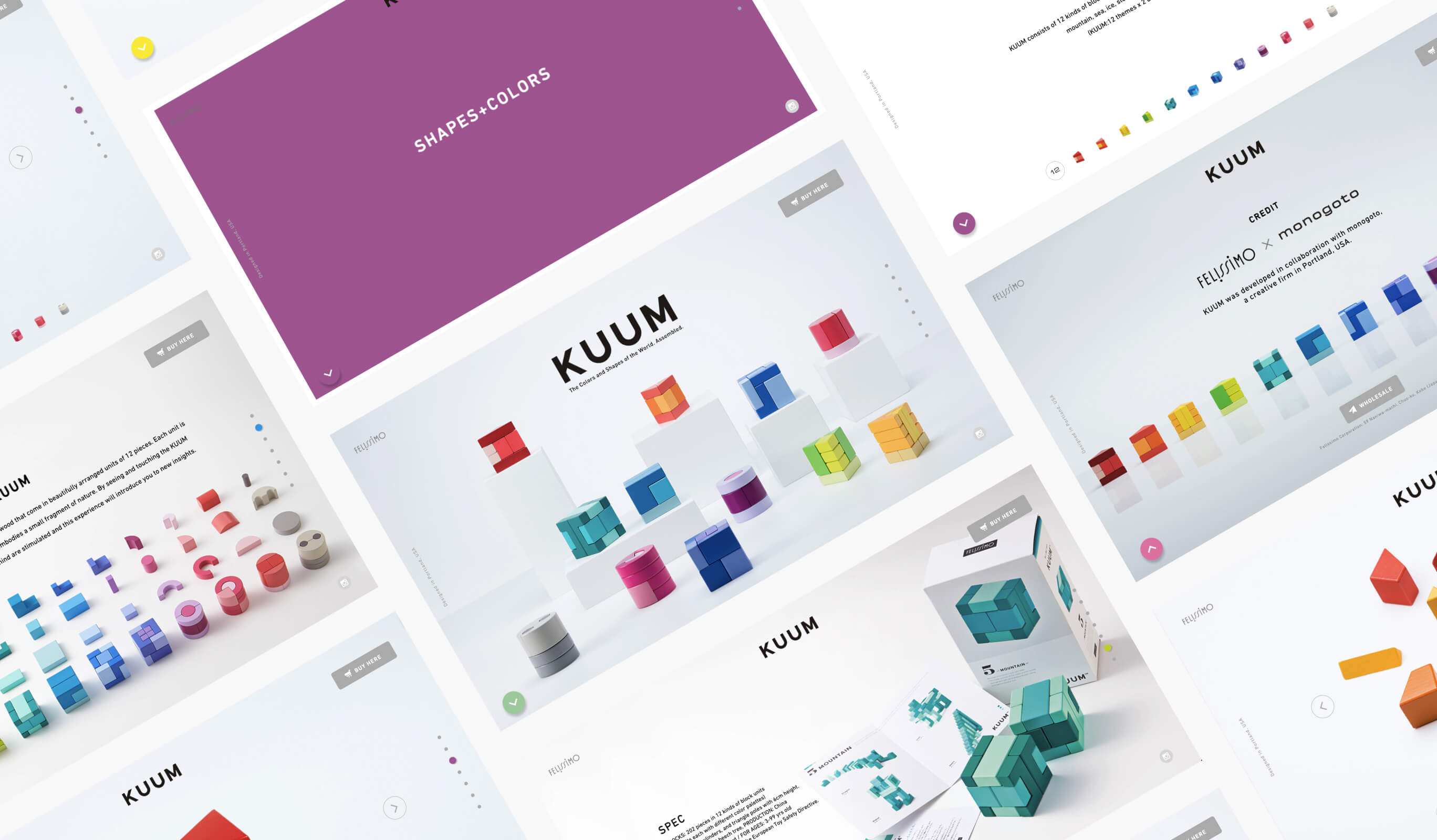
The bright, warm colors of KUUM are incorporated into the animation, and colors similar to those of the main section appear when transitioning between pages. We tried as much as possible to use animation that has a depth to it that cannot be seen on other websites.
Awarded
- Red Dot: Best of the Best — Red dot Award
- Website of the Day — CSSDA
Project team
- Wongeun Heo
- Technical Advisor
- Keitaro Suzuki
- Art Director / Designer
- Marie Uno (monogoto)
- Creative Director
- Takumi Ota
- Photographer

