NIKKEN HOUSING SYSTEM
Corporate Site
- Client
- Nikken Housing System Ltd.
- Role
- Planning, Copy, Writing, Project Management, ArtDirection, Design, Development
- Date
- Oct 2020

- Overview
-
The embodiment of "fluidity and immutability".
The embodiment of "fluidity and immutability".
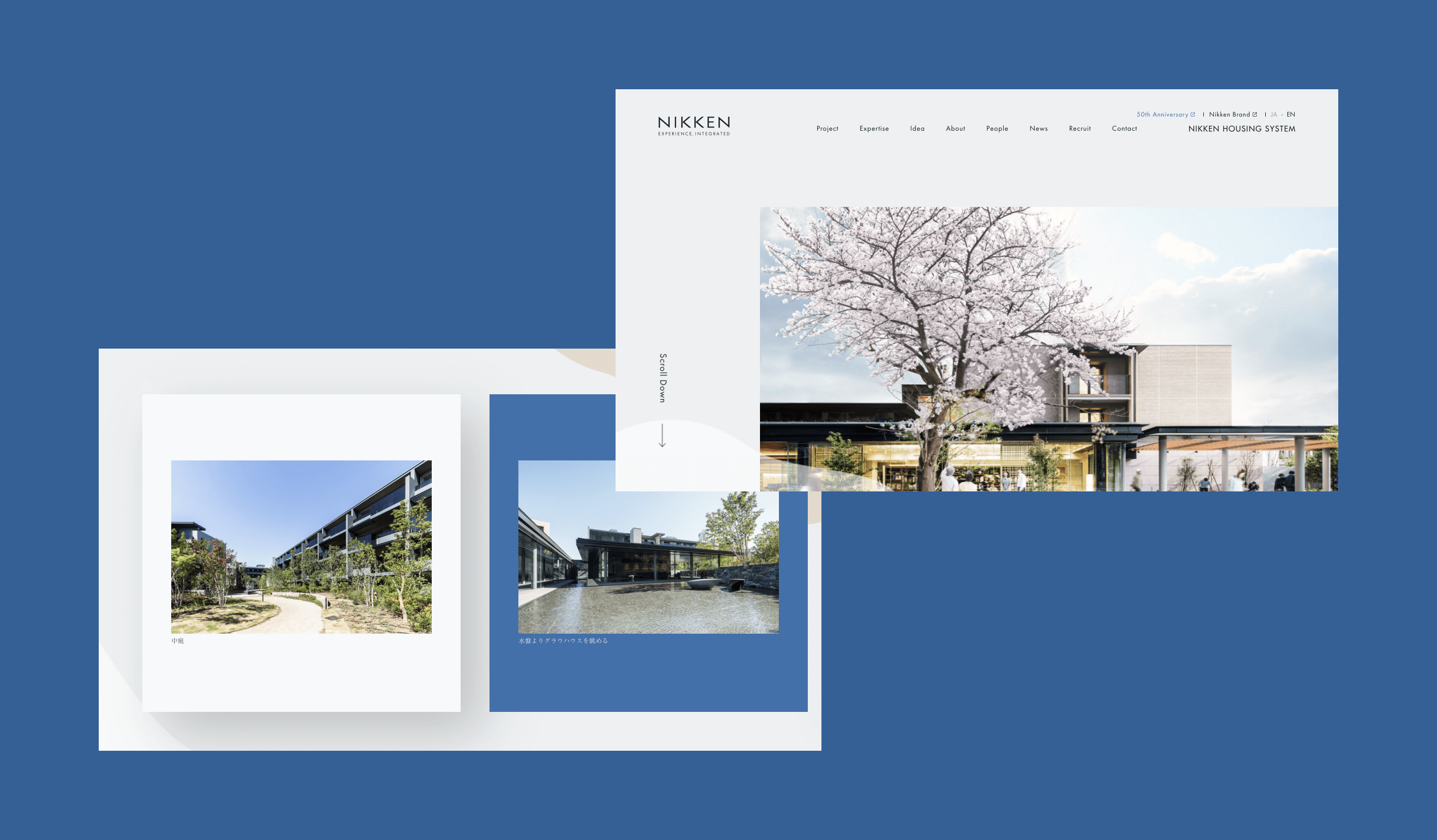
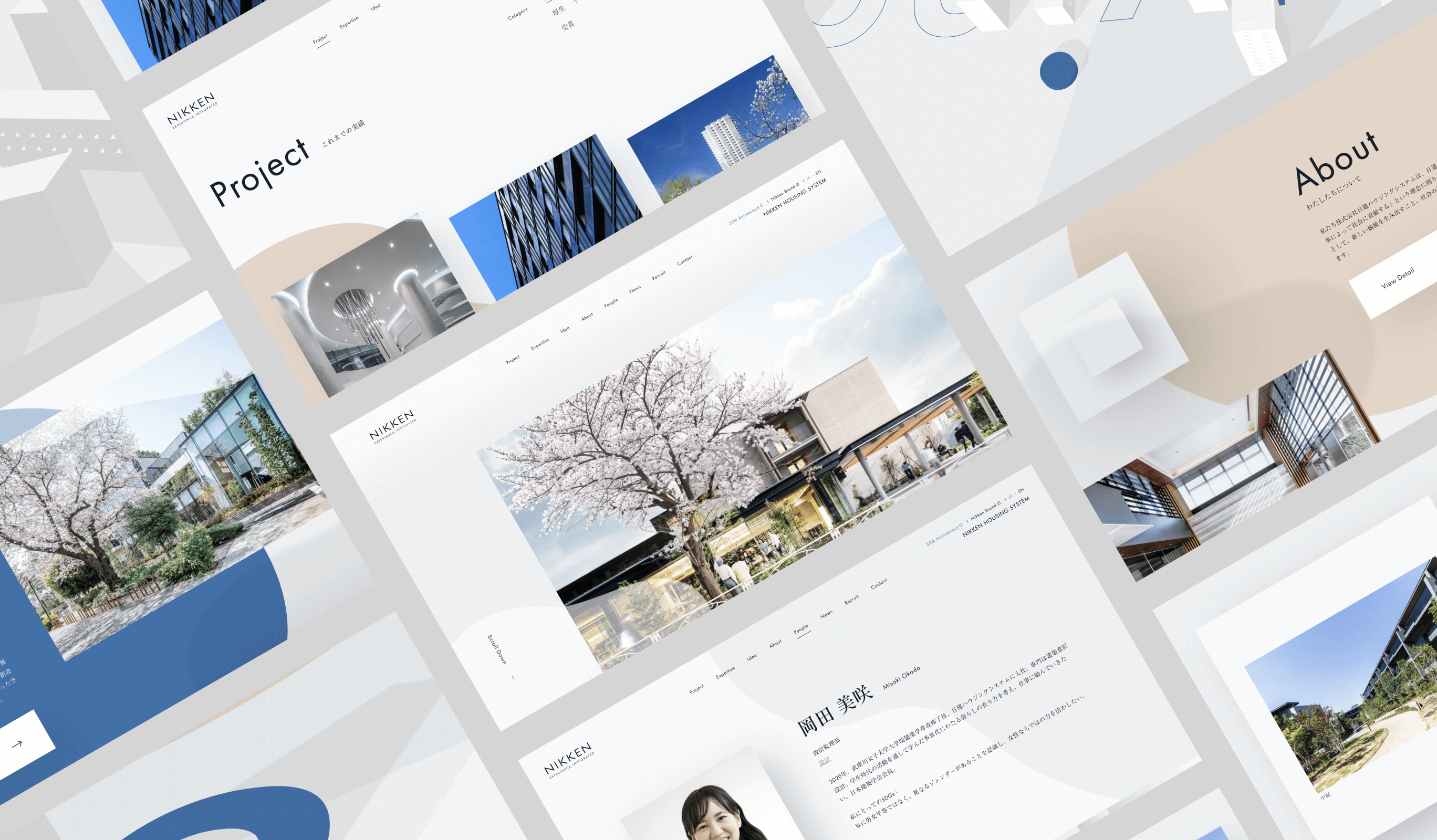
We have renewed the corporate website of Nikken Housing System Corporation, which celebrated its 50th anniversary in 2020, to embody the principle of fluidity and immutability, as in Haiku poetry. Due to COVID-19, there is a renewed interest in the way “housing” ought to be, and as a design company with a long history and high level of expertise, we are looking at what we should and should not change. This project, which lasted about eight months, aimed to express the new Nikken Housing System by taking a hard look at its corporate DNA.
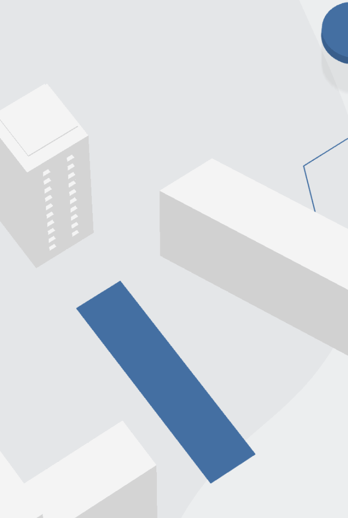
In order to express the company’s commitment to “not only creating buildings but also enriching people’s lives,” we created a visual in which the word “Living” appears as a collection of abstract buildings. By combining organic objects and shadows, we created a sense of air and warmth, and designed the entire website to be a single space.
- Insight
-
Intro animation with a sense of space and humanity.
Intro animation with a sense of space and humanity.
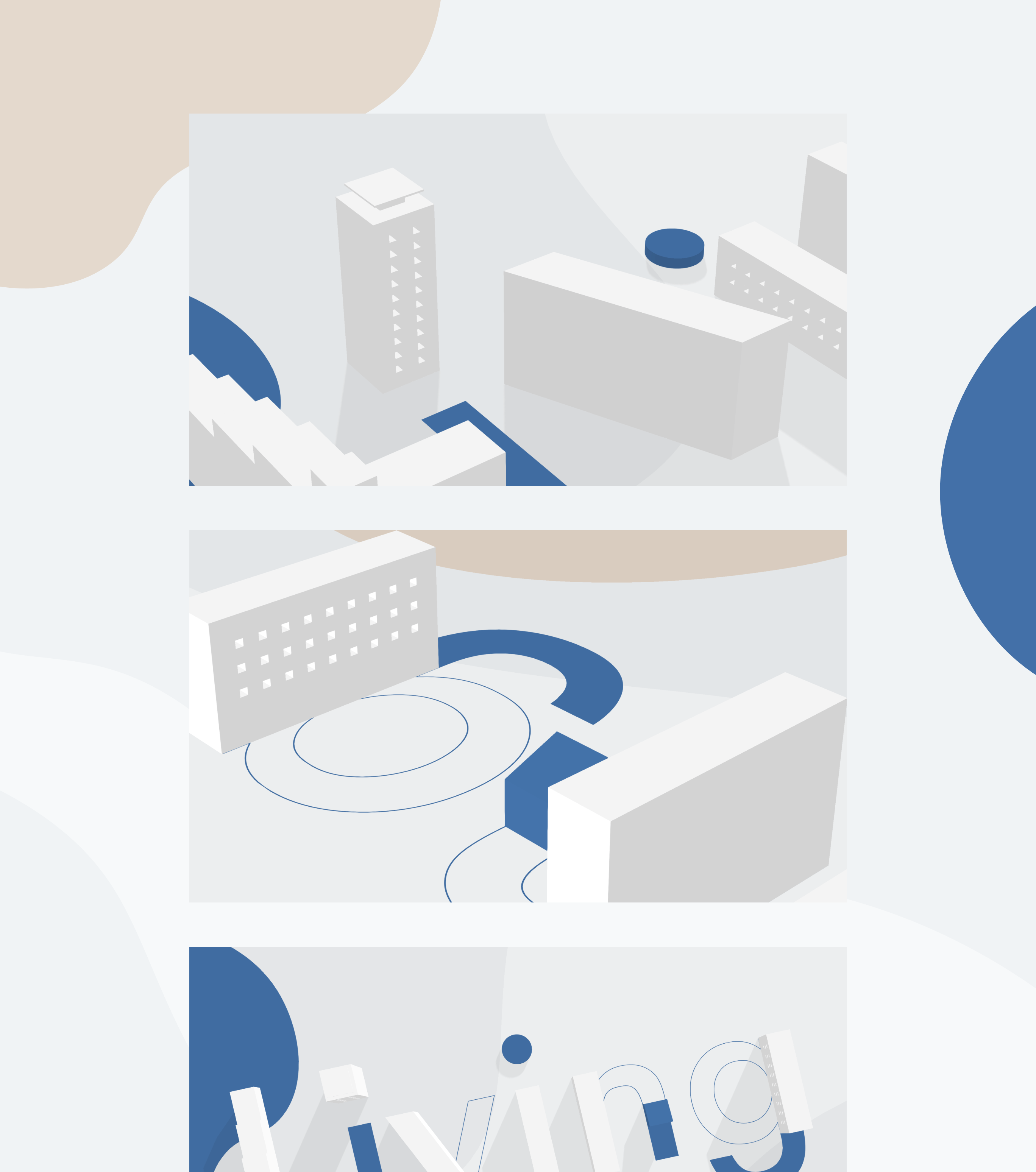
Nikken Housing System creates introductory animations with a sense of extensity and humanity, not just a “box” or the like, but a “home” that thoroughly addresses people’s lives. In the design of the corporate website, a major theme was how to express the impression of spatiality, humanity, and warmth in the neat appearance of a brand with a long history. In particular, the animation in the introduction, which is composed of 3D objects that look like abstracted housing complexes, is one of the elements that symbolize the overall design of the site.
- Idea
-
"Spatiality" in every detail
"Spatiality" in every detail
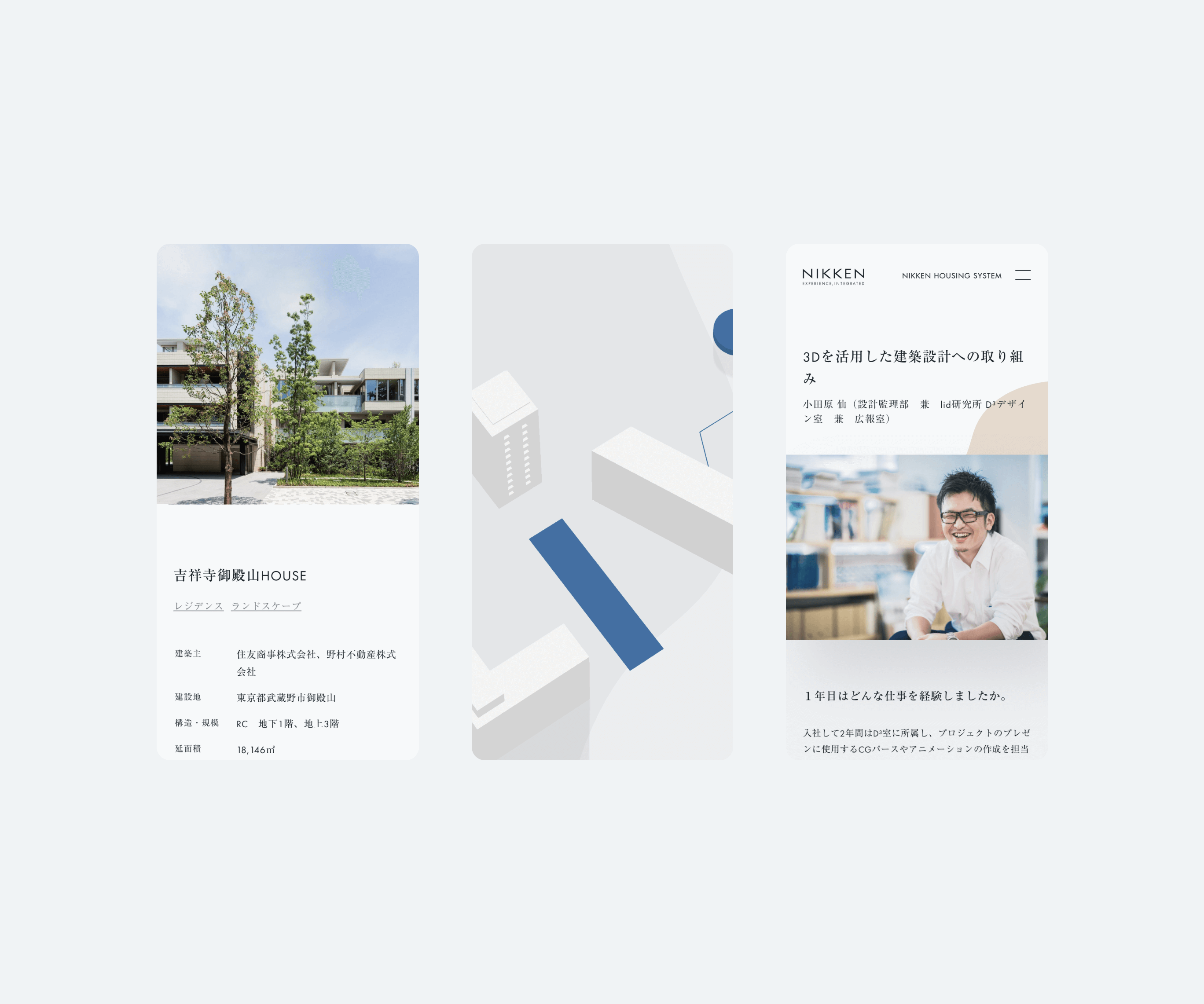
It is not only the animation in the intro that forms the impression of the site, but also the “spatiality” in the details. While the layout of text and images is relatively basic, the use of parallax and shadows adds spatiality and depth. Every interaction that the user touches is also designed based on a consistent concept.
- Impact
-
A Site More True to our Values. A More Familiar site.
A Site More True to our Values. A More Familiar site.
By creating a design that embodies the company vision and mission, and a website that incorporates motion graphics, we have contributed to communicating the way they value residents and the environment in a non-verbal way. In addition, the About (corporate information) and Expertise (explanations of the company’s specialized divisions), which were newly established as a result of the content review, have been widely used as sales tools for learning about the overall vision of Nikken Housing System. By reviewing the regularly updated content, including Project (track record introduction), we have been able to increase the repeat rate by 17.1%.
Project team
- Kazuya Okada
- COO / CMO / Producer
- Masaya Yamamoto
- COO / Creative Director
- Wataru Urakawa
- Senior Planner / Copywriter
- Masashi Fujiyoshi
- CDO / Art Director / Designer
- Nanako Kono
- Junior Designer
- Wongeun Heo
- Technical Advisor
- Serika Ikurumi
- Front-end Developer
- Takaaki Sato
- Developer
- Umi Teranishi
- PMO / Project Manager
- Yukie Yamaya
- Partner


