Branu Branding
- Client
- BRANU Inc.
- Role
- Planning, Copy, Writing, Project Management, ArtDirection, Design, Development
- Date
- Feb 2019
- Overview
-
Brand renewal with business transformation.
Brand renewal with business transformation.
In an effort to change the industrial structure of small business, Branu is developing digital solutions and an industry cloud specialized for the construction industry.
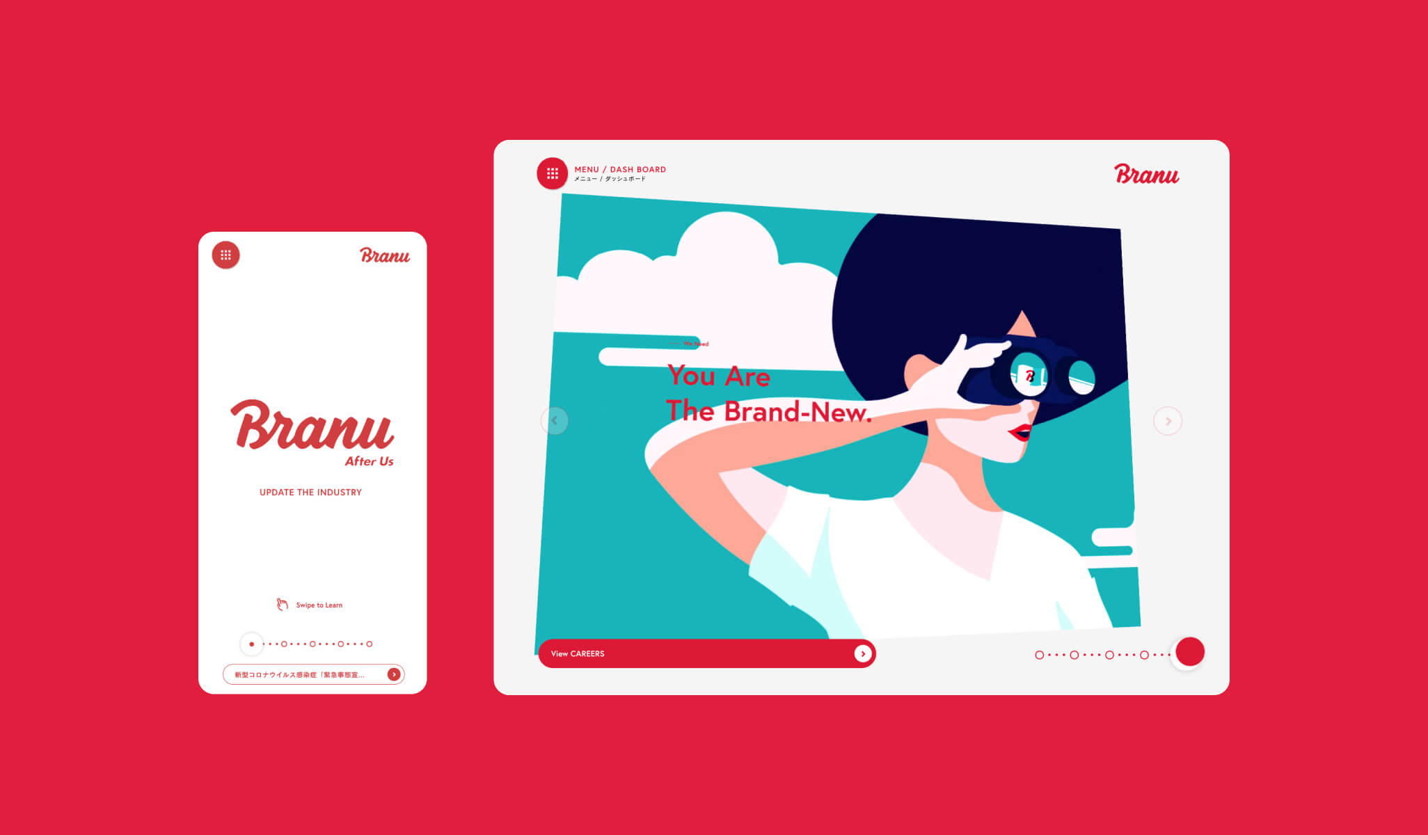
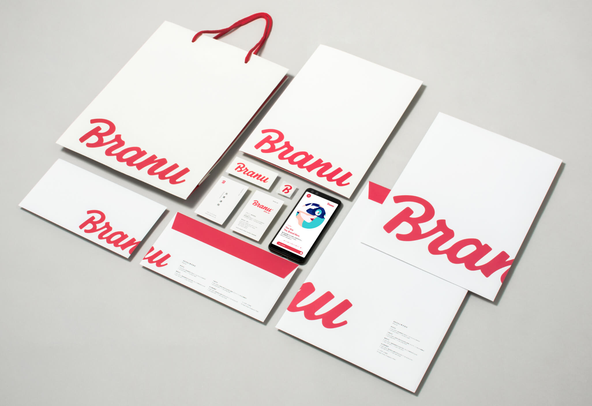
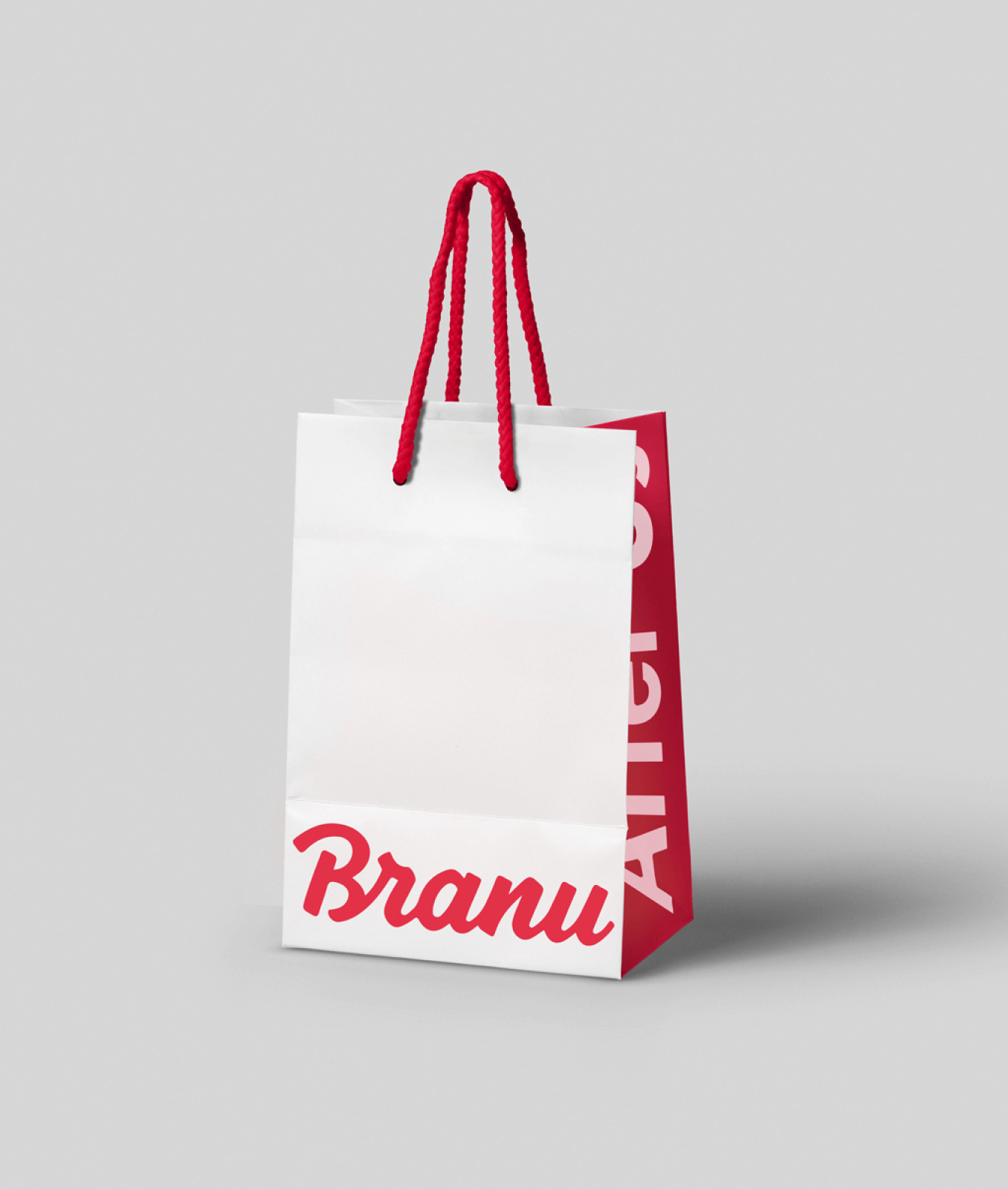
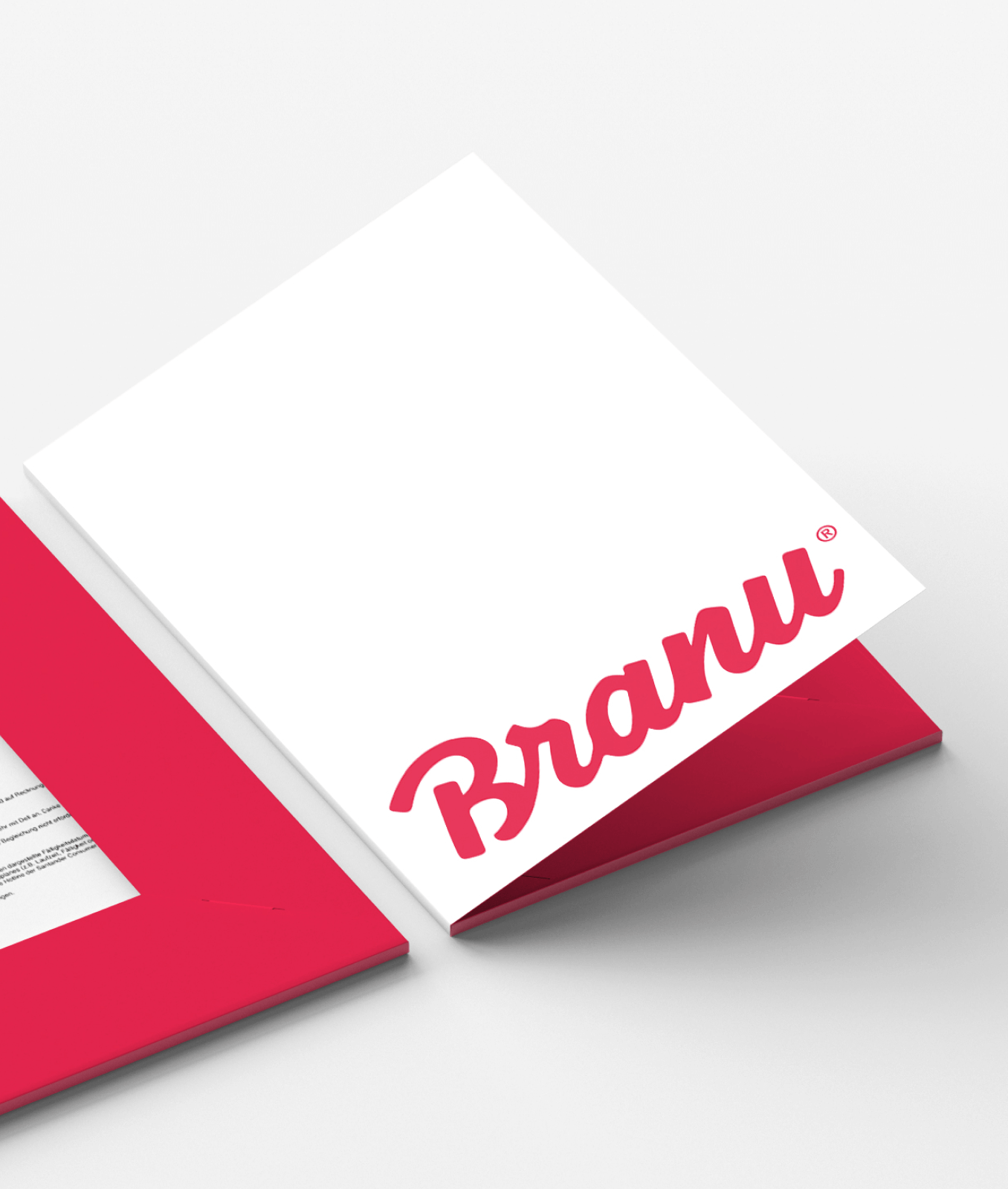
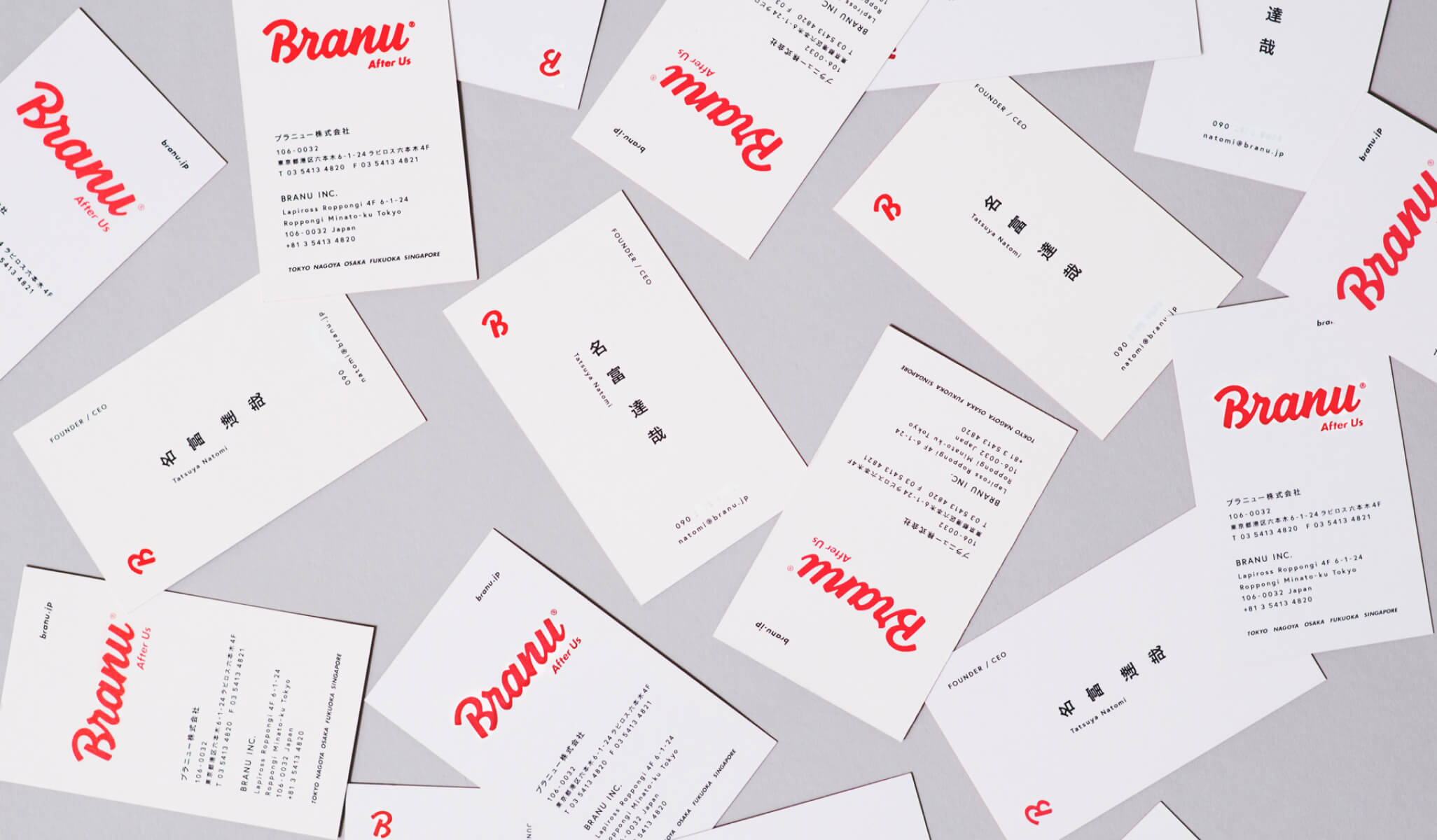
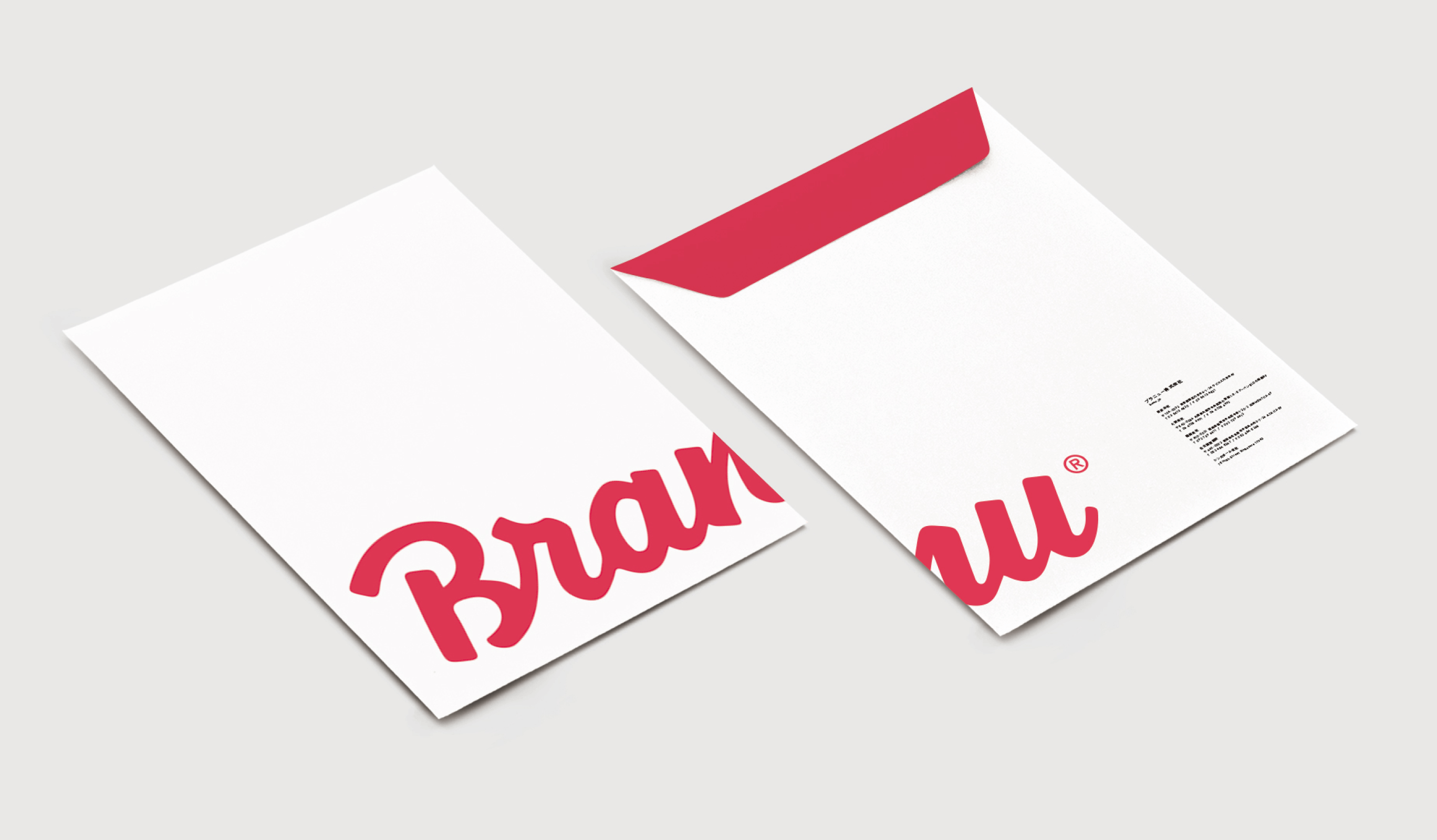
The company has undergone a major business transformation over the past few years, and wanted to refresh its brand. Based on the innovation and vitality that has remained unchanged since the company’s founding, we created the logo, tagline, and original fonts that form the foundation of the company. We collaborated with Paul van Excite, a Dutch lettering designer, for the logo design and Mr. Morita of SONICJAM for the illustrations, and developed business cards, envelopes, paper bags, and the corporate website.
- Insight
-
Promising a strong corporate will, both inside and outside the company.
Promising a strong corporate will, both inside and outside the company.
This rebranding project was an important milestone for the company as it was going through a business transition. The first step was to create a tagline and logo to convey the strong unity within the company and the new Branu to the outside world.
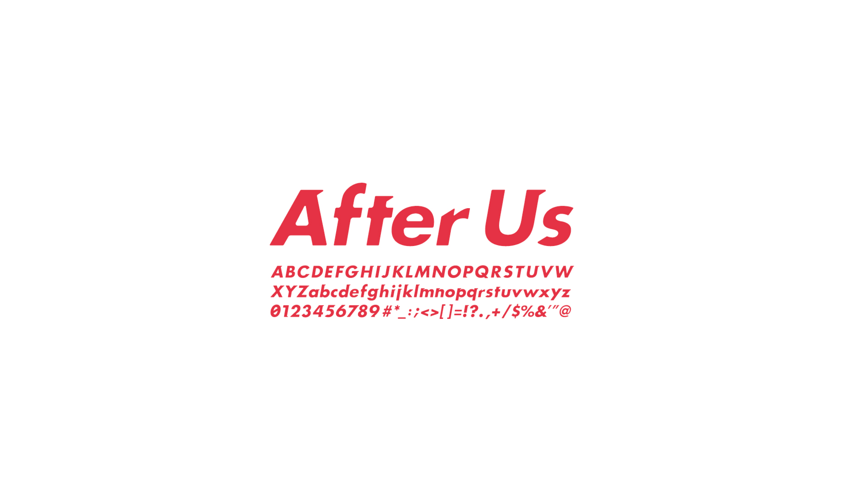
The tagline is “After Us,” a reference to the idiom “After You,” which reverses the meaning of the phrase because it is essential to have a mindset that is one step ahead of the competition in order to achieve their mission of “changing the structure of legacy industries through technology and creativity.”
The logo expresses the vibrancy and innovation of a startup through color and shape. In order to express the integration of conflicting values at a high level, we chose handwritten lettering, which is the opposite of the business we are involved in.
- Idea
-
A renewed impression in all respects.
A renewed impression in all respects.
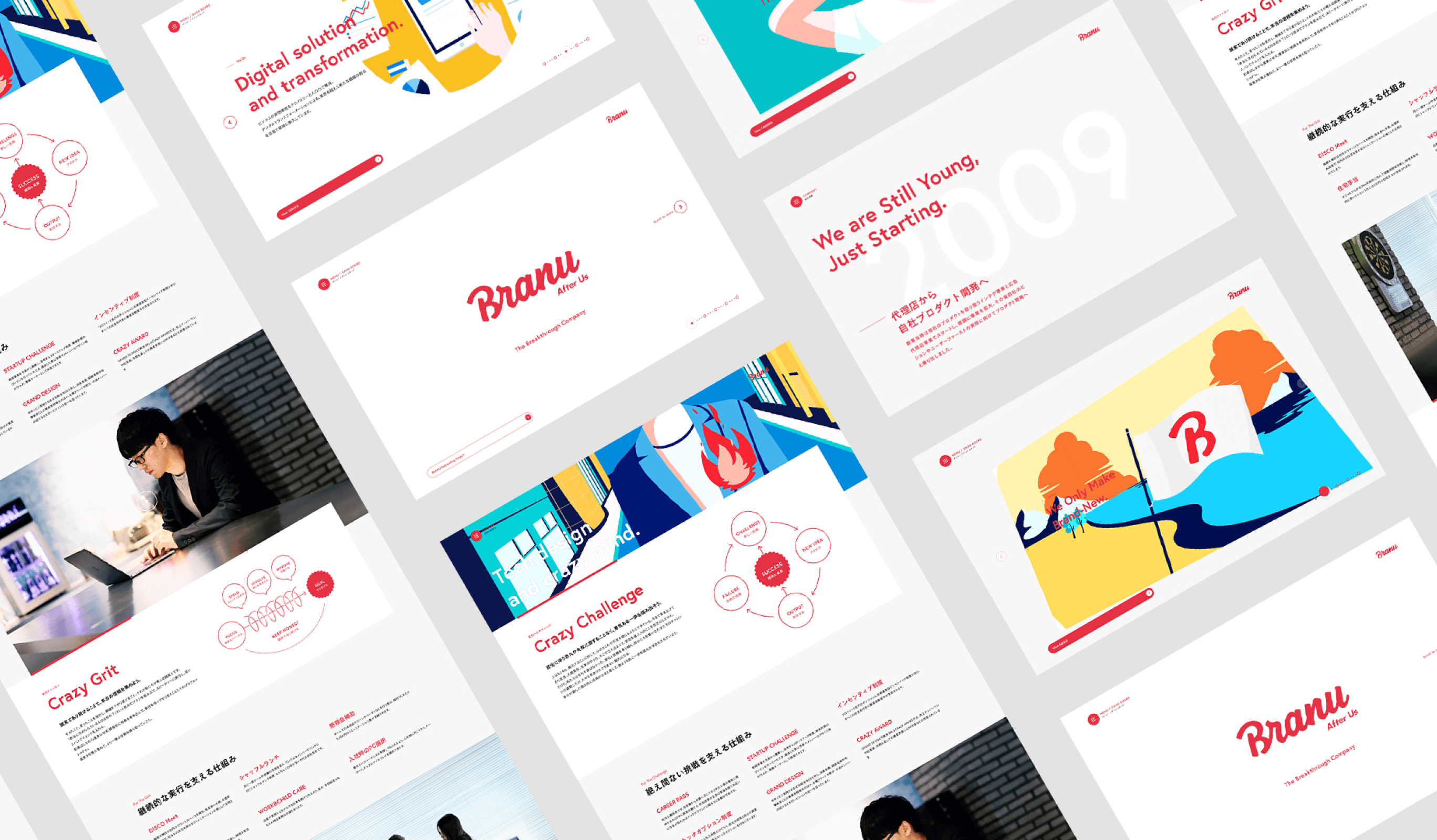
We decided to work on the graphic tools and the web at the same time. Using the brand story as a starting point, we created a base visual language for both offline and online, and developed it into each tool, designing the identity through color design, including the development of Branu Red, custom fonts, and typography.
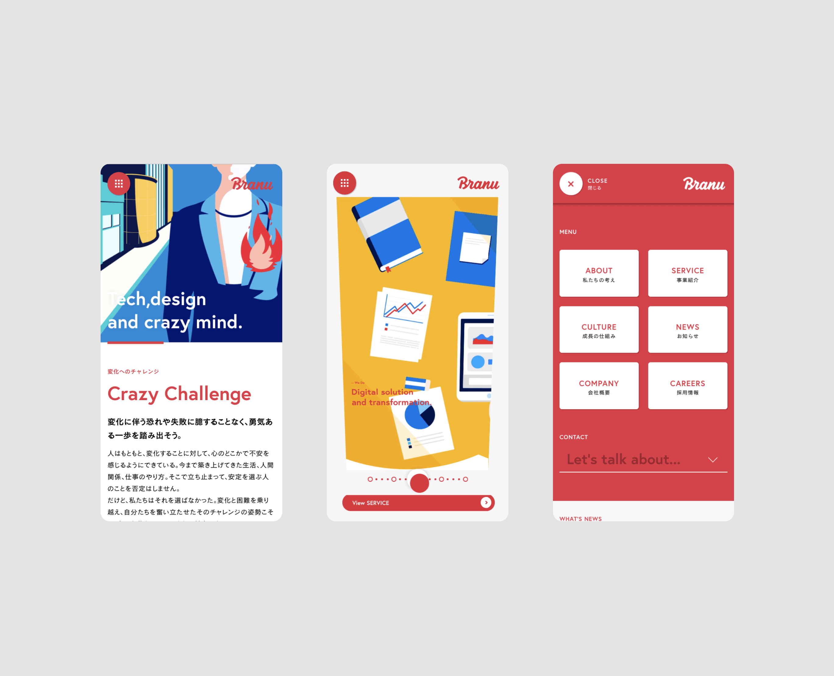
For the web, we designed unique information considering the fact that many users access the site from smartphones, and we mainly used illustrations. We focused on micro-interactions and transitions to express the brand image of Branu. The graphic tools were designed to reflect the dynamic and moving image of the web, while also taking cost performance into consideration.
In terms of implementation, the key point was to add cute motions that match the overall design tone. The top page was implemented to be lightly operable like an application, and the scene changes depending on the user’s operation, such as the video seek control and the use of CSS3 3D transform to make the screen look 3D.
Also, overall, we used Canvas technology to represent areas that would be difficult to express using the DOM alone. In particular, we used Canvas for the navigation and page transitions to make them look like curtains opening, and finished them smoothly. The loading animation was implemented using SVG path to express the B of Branu as it is drawn.
Project team
- Masaya Yamamoto
- COO / Creative Director
- John Nishiyama
- CSO / Copywriter
- Ryohei Kamada
- External Advisor / Art Director
- Hiroki Miyamoto
- Art Director / Designer
- Wongeun Heo
- Technical Advisor
- Hiroaki Yasutomo
- CTO / Technical Director
- Akihiro Morita (SONICJAM.Inc)
- Illustrator
- Ken Murakami
- Photographer
- Paul van Excite
- Keitaro Suzuki
- Design Director, Designer
