Rissho University
- Client
- Rissho University
- Role
- Planning, Copy, Project Management, ArtDirection, Design, Development
- Date
- Aug 2020

- Overview
-
An academic discipline that is actually close to home.
An academic discipline that is actually close to home.
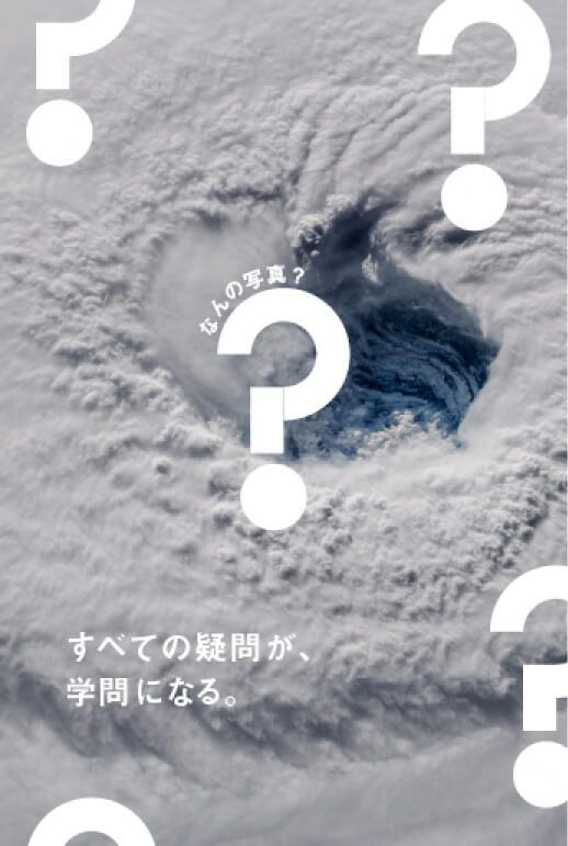
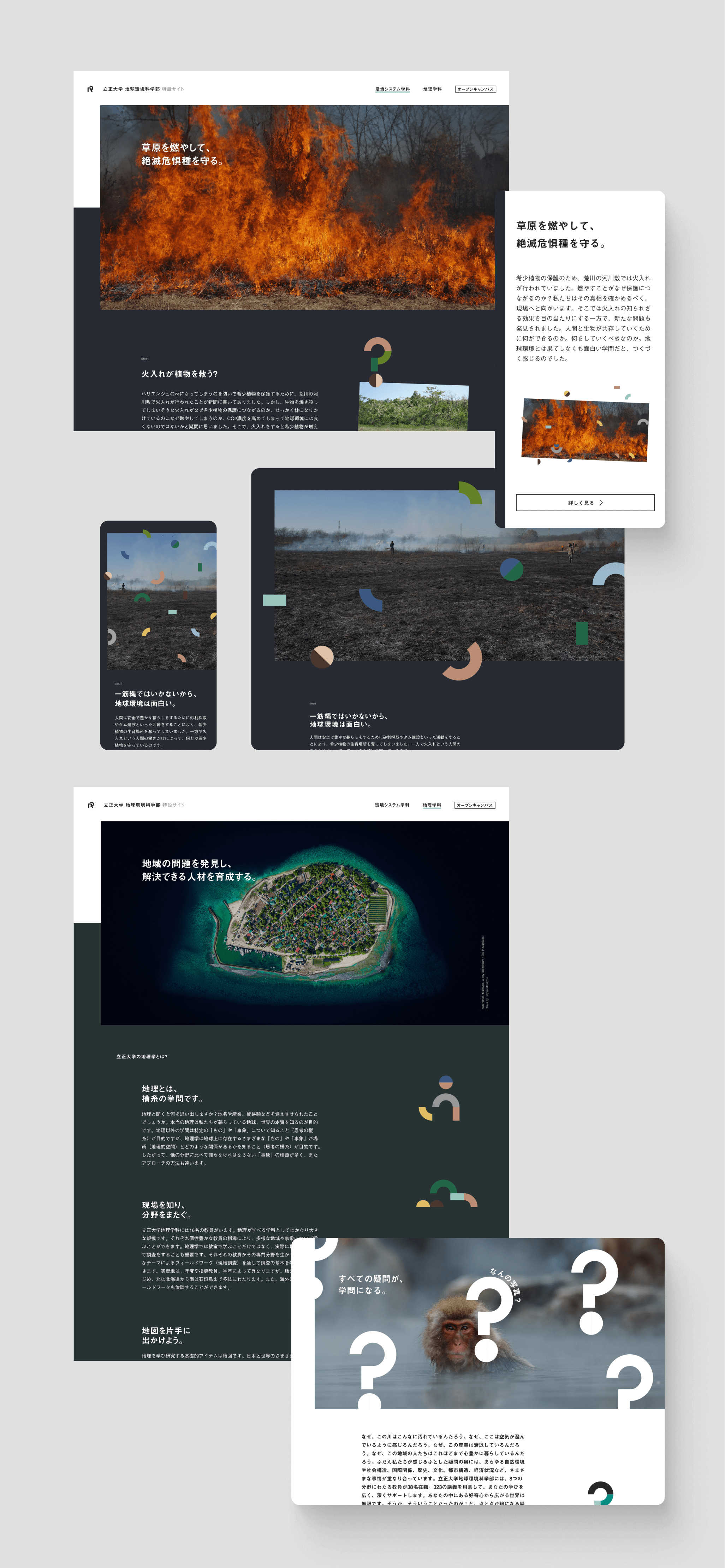
The School of Earth and Environmental Sciences at Rissho University has a particularly niche field of study, and its biggest challenge is that people think it is “unfamiliar” or “uninteresting”. However, “everything in the world is a subject of research,” the professor said with a smile. The trivial events of our daily lives are overlaid with various circumstances, such as the natural environment, social structure, international relations, history, culture, urban structure, and economic conditions. The site design is divided into five parts of the “?” symbol, which always comes to mind when studying, and colors are used to associate the departments. Our goal was to create a website that communicates to students in an easy-to-understand manner the fun of learning, which can be transformed into a different discipline depending on the combination of different parts.
- Insight
-
How to get rid of the image of the department as being difficult and uninteresting.
How to get rid of the image of the department as being difficult and uninteresting.
I don’t think there are that many high school students who think, “this is the field I want to study!” when they hear the words “School of Earth and Environmental Sciences.” Many students who take the entrance exam have no idea what they are going to study here, and there is a great possibility that they will overlook it.
However, as I listened to the professors, I realized that the study is deeply rooted in our daily lives and that it is very exciting even for us adults. Therefore, we needed to communicate with the students to eliminate the negative image associated with the name of the department, and to let them know that it is an easy-to-grasp and enjoyable discipline to study.
- Idea
-
Expanding the world from the "?" in everyday life.
Expanding the world from the "?" in everyday life.
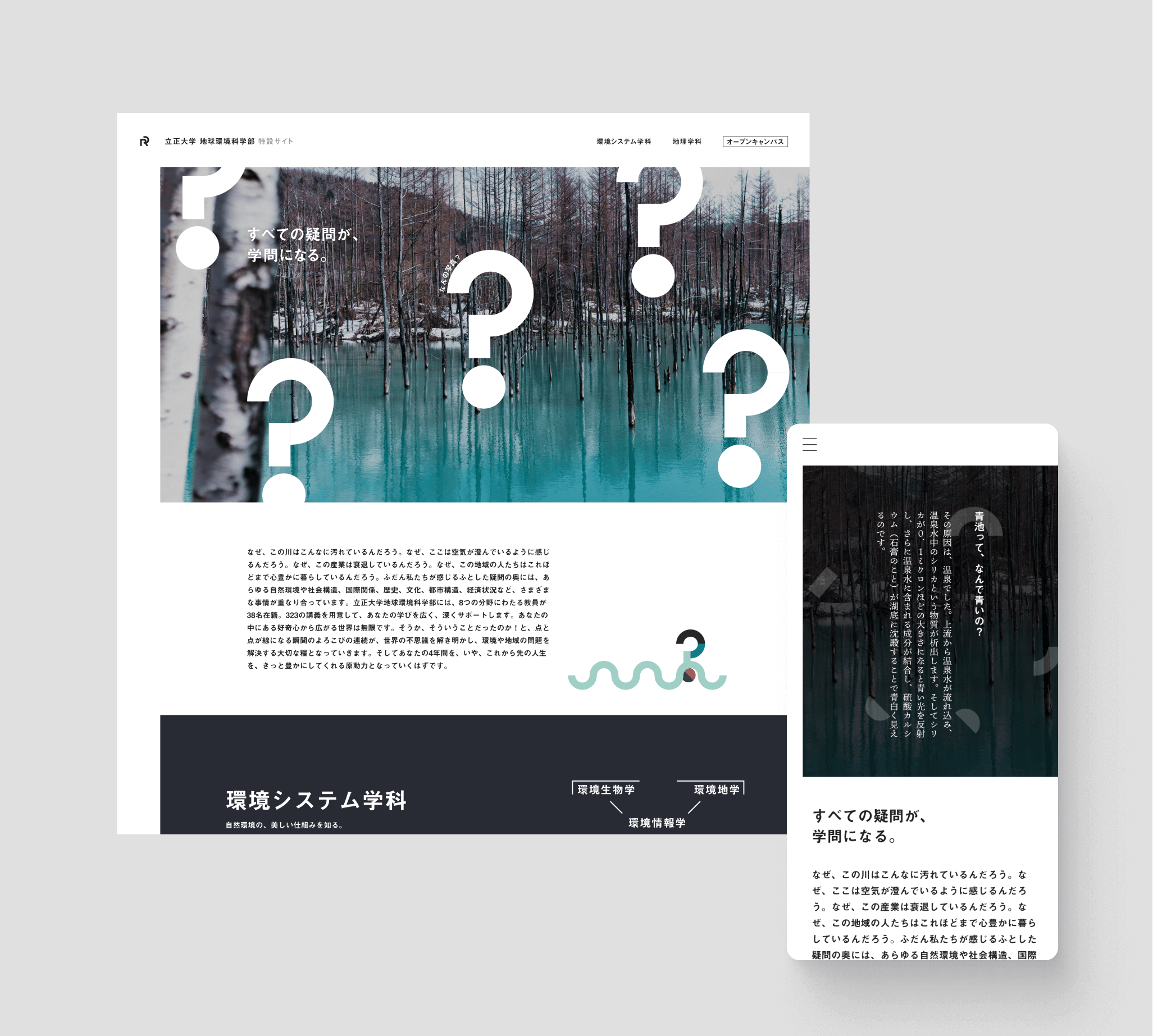
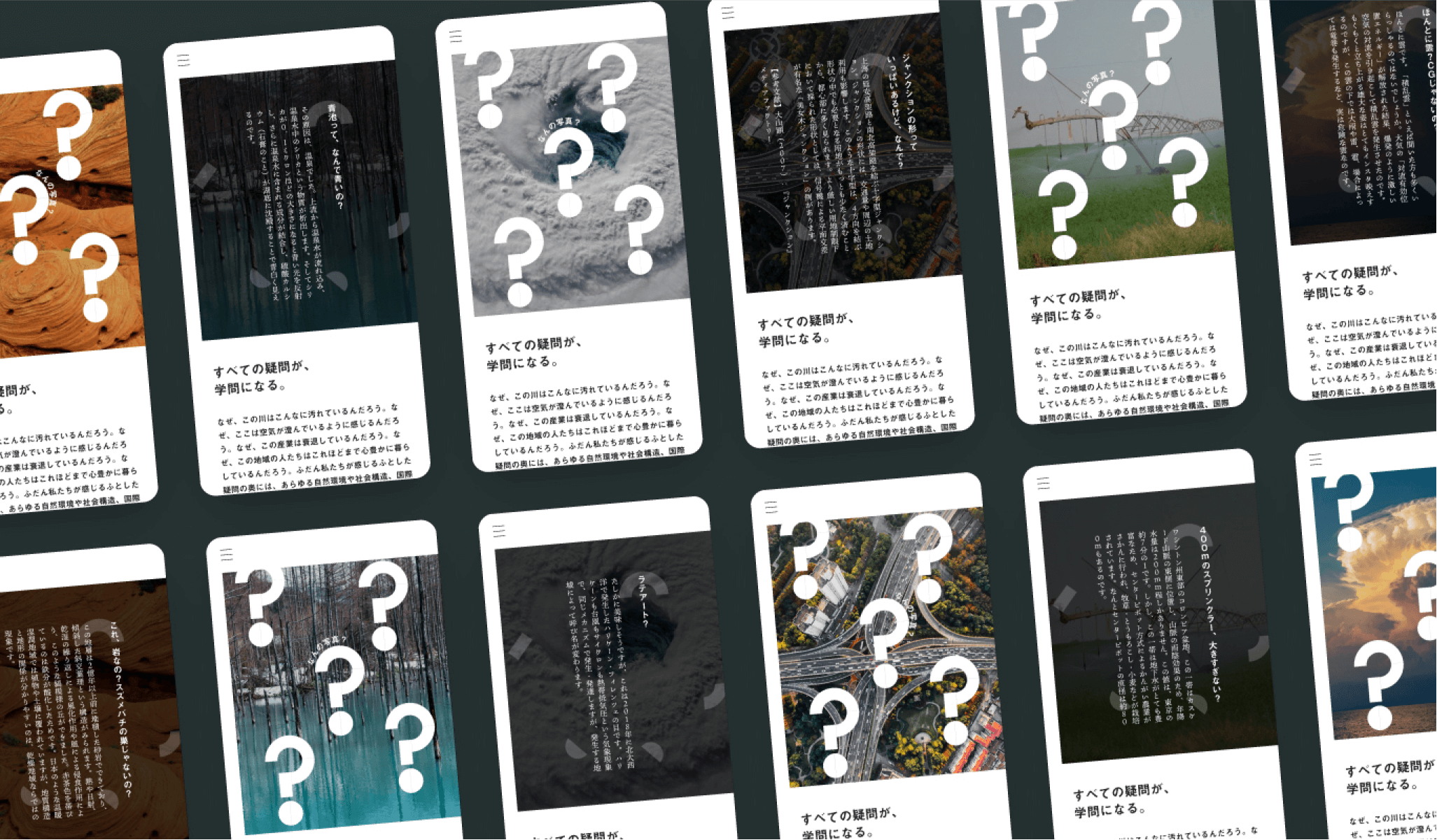
In order to appeal to the fact that this is an academic discipline that is rooted in everyday life, we set the theme of “All questions become academic disciplines,” which was the theme of the project. In the design, the “?” symbol, which is divided into five parts, was boldly scattered over the entire design. The parts of the “?” symbol represent clues to the studies scattered all over the earth, and at the same time, depending on how they are combined, they represent the studies of the Biology and Earth Course as well as the Meteorology and Hydrology Course. The vivid colors of the parts were extracted with an eyedropper from the nature photos taken by the professors.
The themes behind the design is Earth, Politeness, Diversity.
・A willingness to explore interests and questions through fieldwork and analysis.
・The breadth of our faculty and academic disciplines and our 100-year history of providing personalized learning.
・The diversity and flexibility of our faculty, which specializes in both the humanities and sciences, including humanities, geography, and natural sciences.
These were created with the aim of making it fun for high school students and their parents.
In terms of implementation, we adopted GatsbyJS, a React-based static site generator. Due to the limited number of development days, it was difficult to include page transitions, however, by using the Gatsby plugin, we were able to shorten the implementation time and implement them. The animation of the five motifs required adjusting the SVG data and manually setting the position and tilt of the parts one by one in order to control them with a script. Although it was a time-consuming process, we implemented the same script for the main visual on the top page, the background, and the transitions.


Project team
- Takuma Kato
- CEO / Producer
- Masaya Yamamoto
- COO / Creative Director
- John Nishiyama
- CSO / Copywriter
- Masashi Fujiyoshi
- CDO / Art Director / Designer
- Mana Ohtake
- Project Manager
- Hiroaki Yasutomo
- CTO / Technical Director


