EggForward Branding
- Client
- Egg Forward Inc.
- Role
- Planning, Project Management, ArtDirection, Design, Development, Copywriting
- Date
- Jun 2019

- Overview
-
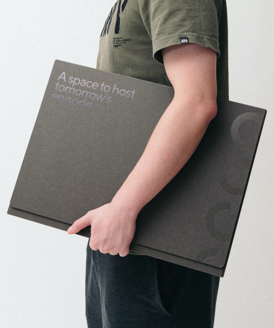
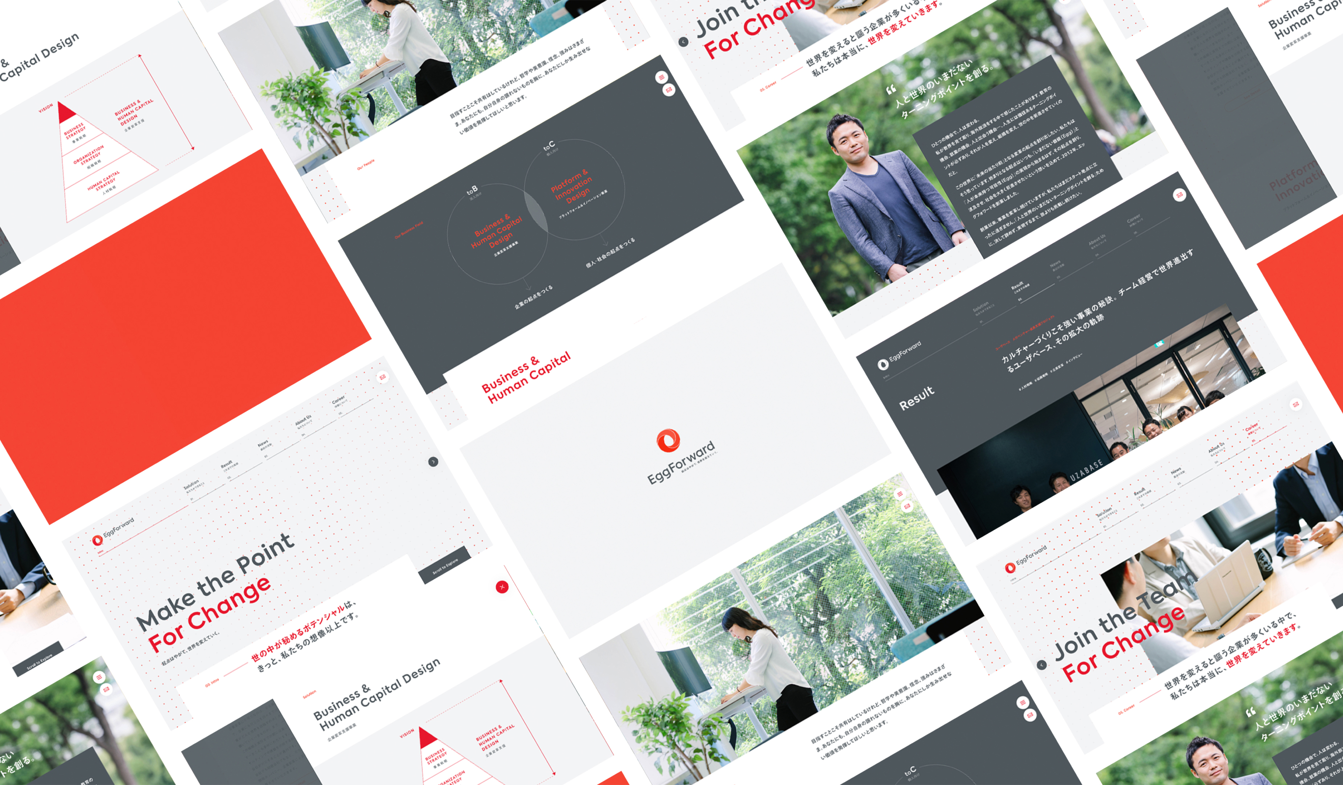
Creating a starting point and spreading the word.
Creating a starting point and spreading the word.
EggForward is the world’s only human resource development company that provides management, business, organizational, and human resource strategy consulting as well as human resource development. For the renewal of their corporate website, we helped them redesign their logo and tagline. We visualized and verbalized the core idea of “creating a starting point for maximizing the potential of people, organizations, and society, and making it ripple outward,” and integrated it into the information design, design, and animation of the corporate site.

- Insight
-
Breaking away from the image of a training company.
Breaking away from the image of a training company.
At the time, EggForward was often seen as a “training company”, despite the fact that it offers a full range of services from management, business, organizational and human resource strategy consulting to human resource development. This project started with researching the client and the industry, organizing and structuring the business, organizing the brand identity, and verbalizing and visualizing it.
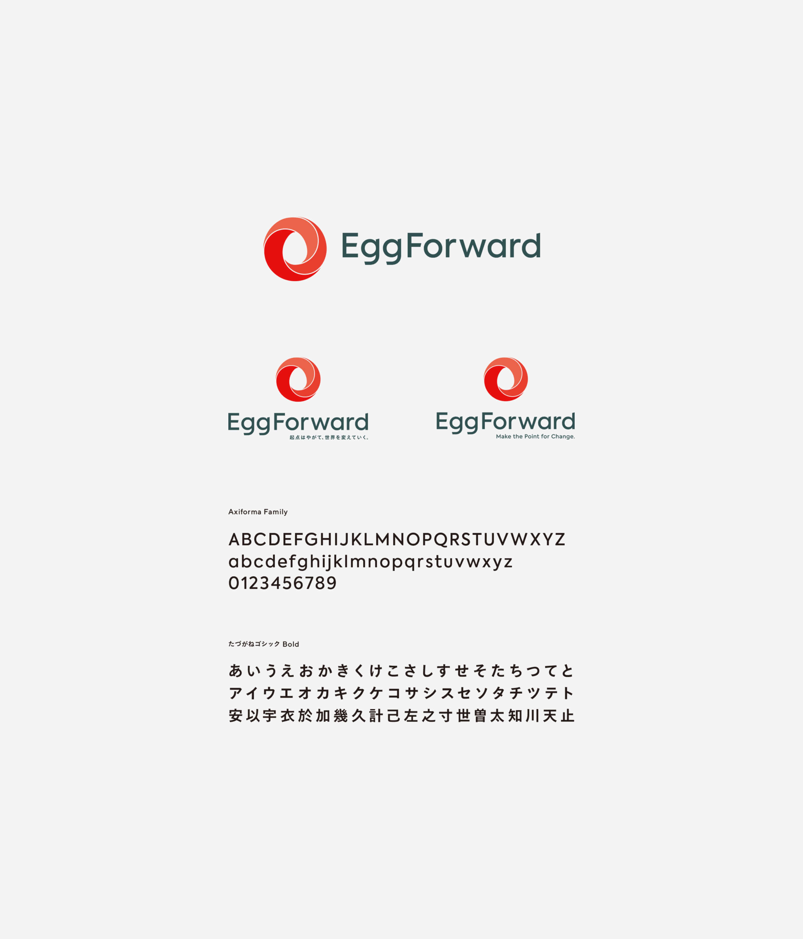
The tagline was considered as a word to express the vision and mission, and was considered at the same time as the logo mark. We worked together with the client to come up with multiple ideas for a logo that would express the words “egg”, “starting point,” and “ripple,” and a logo that would tell the story of how the egg, the starting point, is invisible and only becomes visible when it spreads.


- Idea
-
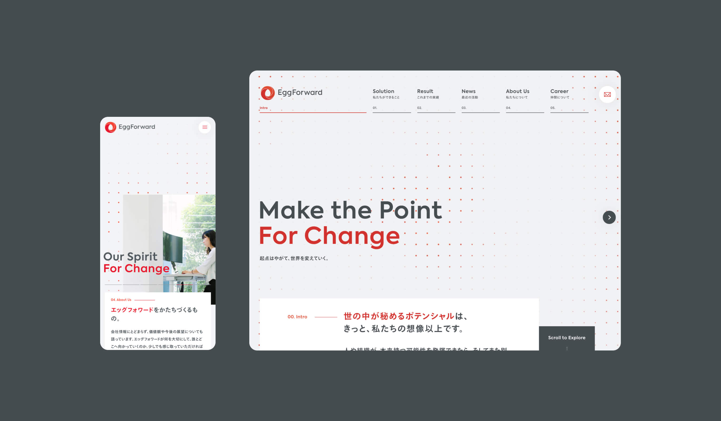
Incorporating the corporate philosophy into design, content, and animation.
Incorporating the corporate philosophy into design, content, and animation.
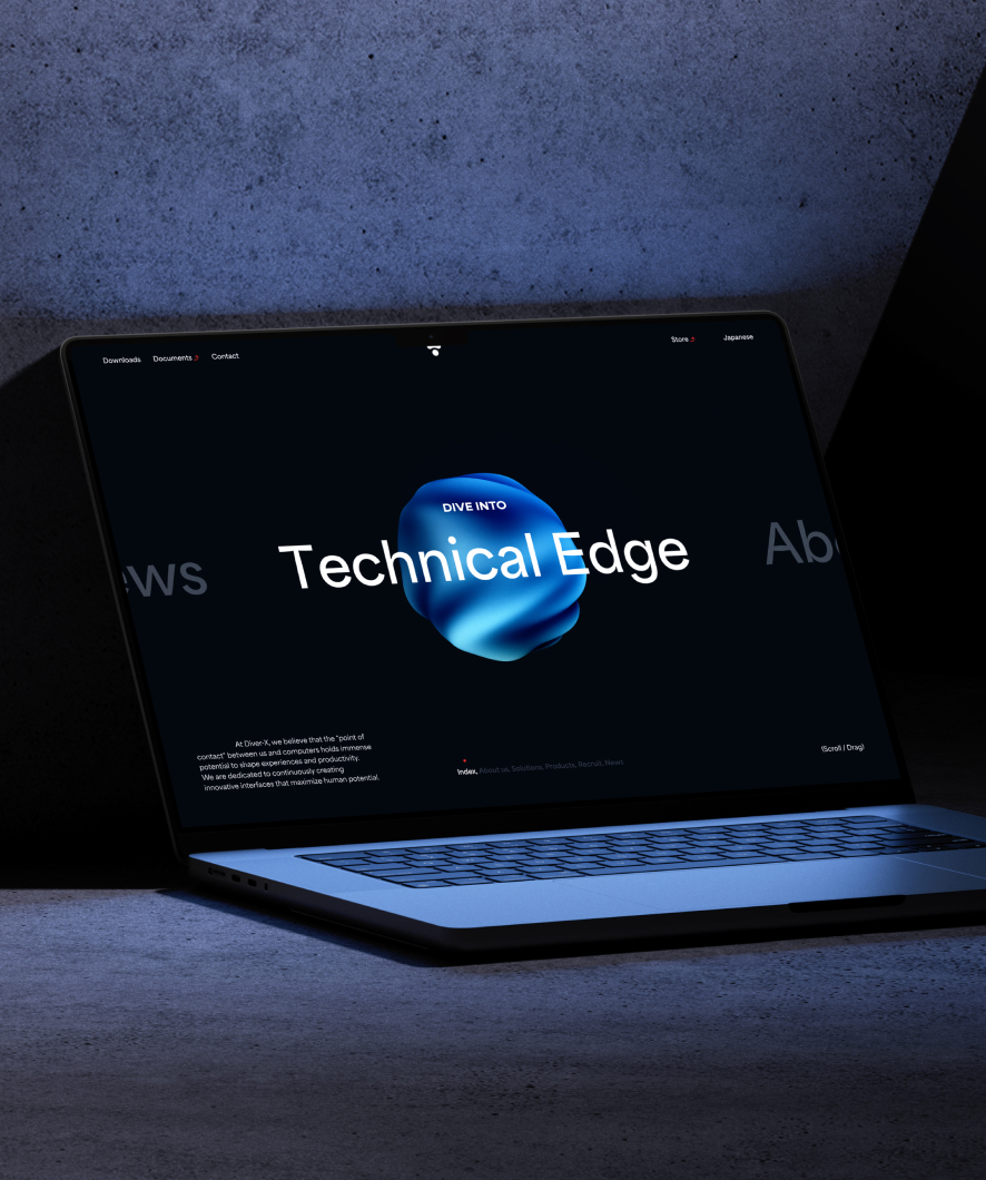
EggForward, which is developing in a new way, needed new content. The information that emerged from the business reorganization was edited as a story and incorporated into the web content, and the design was designed to provide functions and design that could successfully convey this information. We also discussed with the client several patterns of how to develop the abstract message of the tagline in the main visual, and as a result, we adopted an animation using dots that functioned as a visual identity while maintaining the level of abstraction and visually supplementing the meaning.
Project team
- Umi Teranishi
- PMO / Project Manager
- John Nishiyama
- CSO / Copywriter
- Hiroki Miyamoto
- Art Director / Designer
- Hiroaki Yasutomo
- CTO / Technical Director
- Takaaki Sato(Quappa)
- Developer
- Fuminari Yoshitsugu(freelance)
- Photographer
- Sunao Nakamura
- Producer
- Keitaro Suzuki
- Design Director,Designer