Good Morning Sunshine
Media Site
- Client
- New Balance Japan
- Role
- Planning, Project Management, ArtDirection, Design, Development
- Date
- Mar 2016
- Overview
-
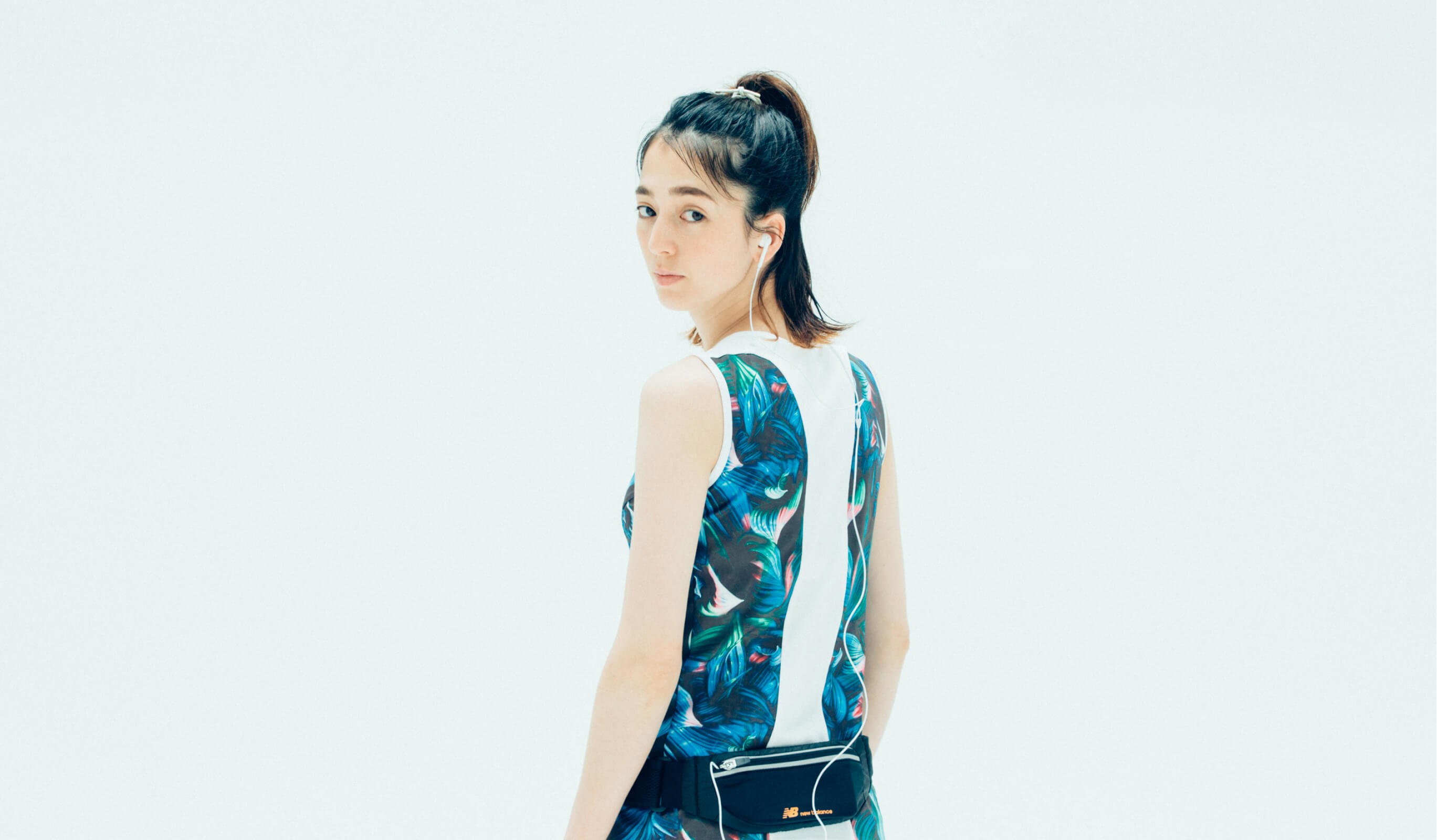
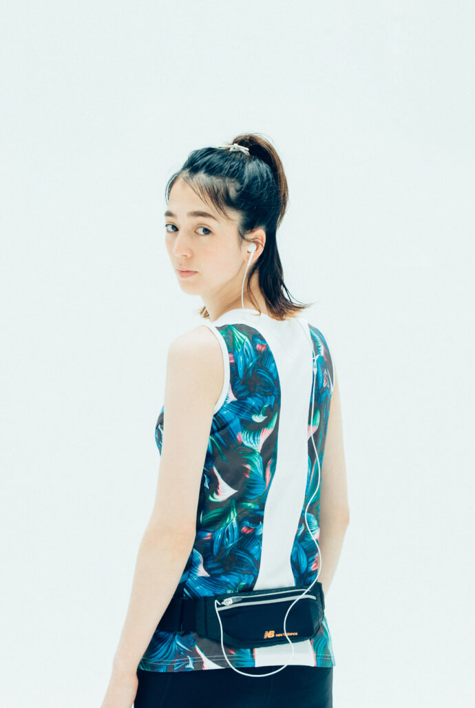
A media site where you can experience "everyday life with sports" as advocated by New Balance.
A media site where you can experience "everyday life with sports" as advocated by New Balance.
We renewed “Good Morning Sunshine”, a media site geared towards women launched in 2015 by New Balance Japan . Based on analysis of past access, we completely reviewed the UI/UX, and aimed to create a structure and design that allows users to navigate the site comfortably.
- Insight
-
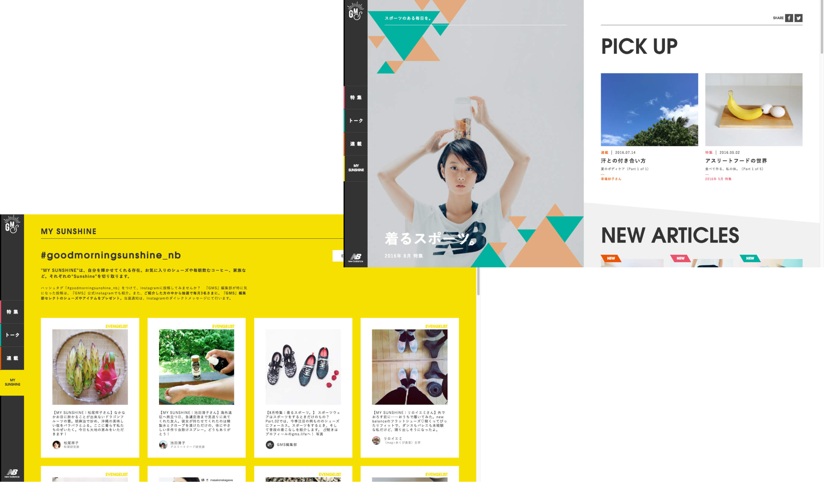
Visualizing brightness and creating a graphical experience.
Visualizing brightness and creating a graphical experience.
The tone was chosen whilst being conscious of giving a bright impression that you get from the name “Good Morning Sunshine”, and the vitality revealed from the brand. Also, the layout was chosen to create an experience similar to that of reading a magazine, by utilizing symbolic graphics used in each type of content. Object designs and animations that embody the tone of the brand were also scattered throughout the site, to create a “Good Morning Sunshine” worldview.
- Idea
-
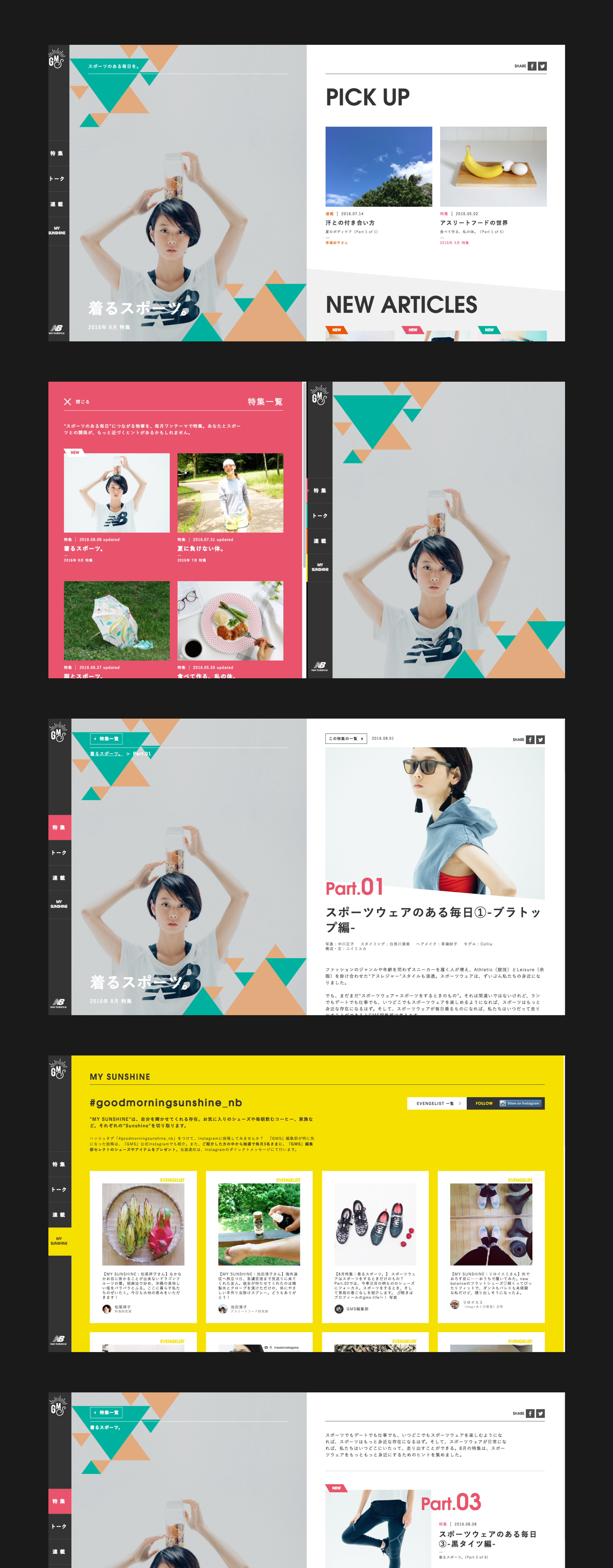
The goal was a user-first design.
The goal was a user-first design.
Based on the results of analysis of past access, we completely revised the UI/UX, and adopted a page structure and design that allows users to move intuitively to different categories while viewing article content. The category names, etc., were also designed in consideration of the analysis results and brand concept, and we adopted a CMS to ensure that updates were made easy. We designed it to make it easy to update graphical photos and articles describing the brand experience.
Project team
- Mana Ohtake
- Project Manager
- Hiroaki Yasutomo
- CTO / Technical Director
- Masaya Yamamoto
- Planner, Project Manager
- BOOMER Inc.
- Agency
- Keitaro Suzuki
- ArtDirection
- Tsukasa Tokura
- Programmer
