MasterVisions Branding
- Client
- Master Visions Inc.
- Role
- Planning, Copy, Writing, Project Management, ArtDirection, Design, Development
- Date
- Jan 2020
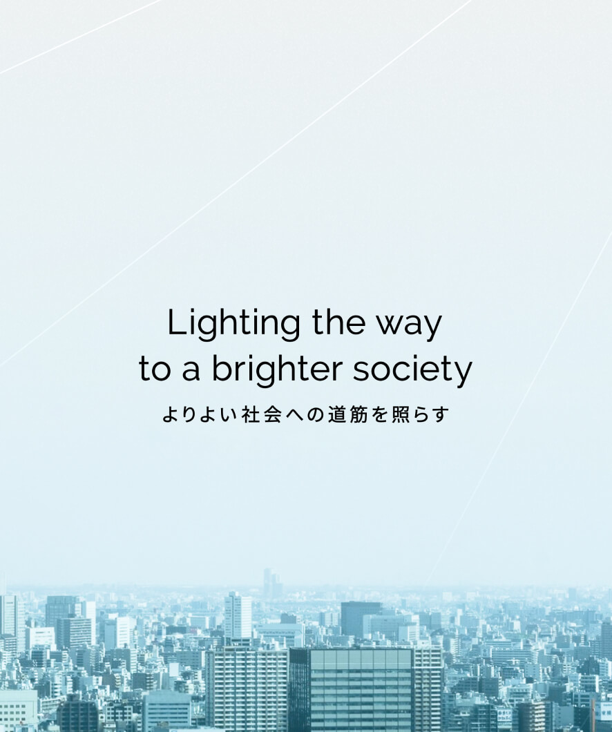
- Overview
-
Rebranding of startups that have broken into their second period (of growth) since being founded.
Rebranding of startups that have broken into their second period (of growth) since being founded.
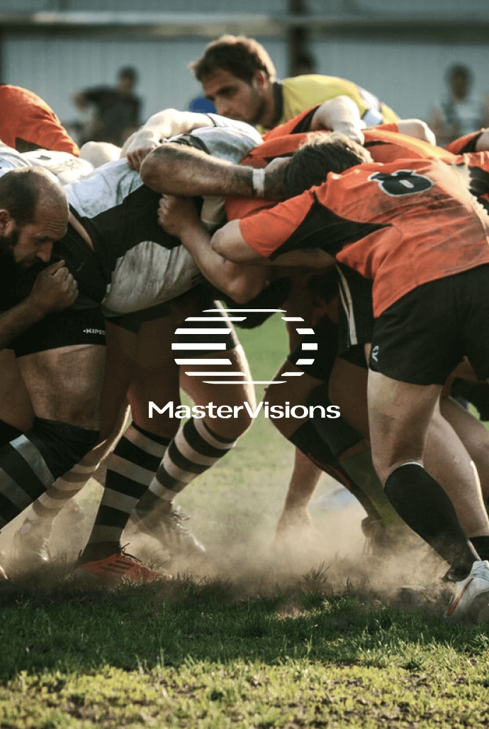
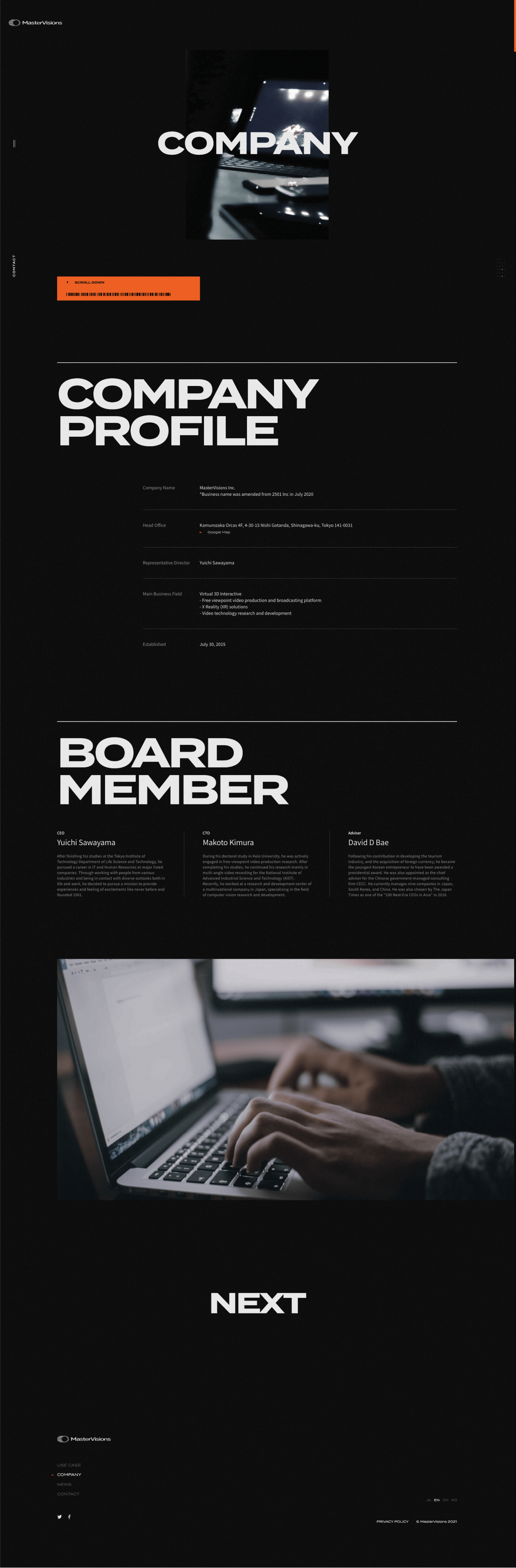
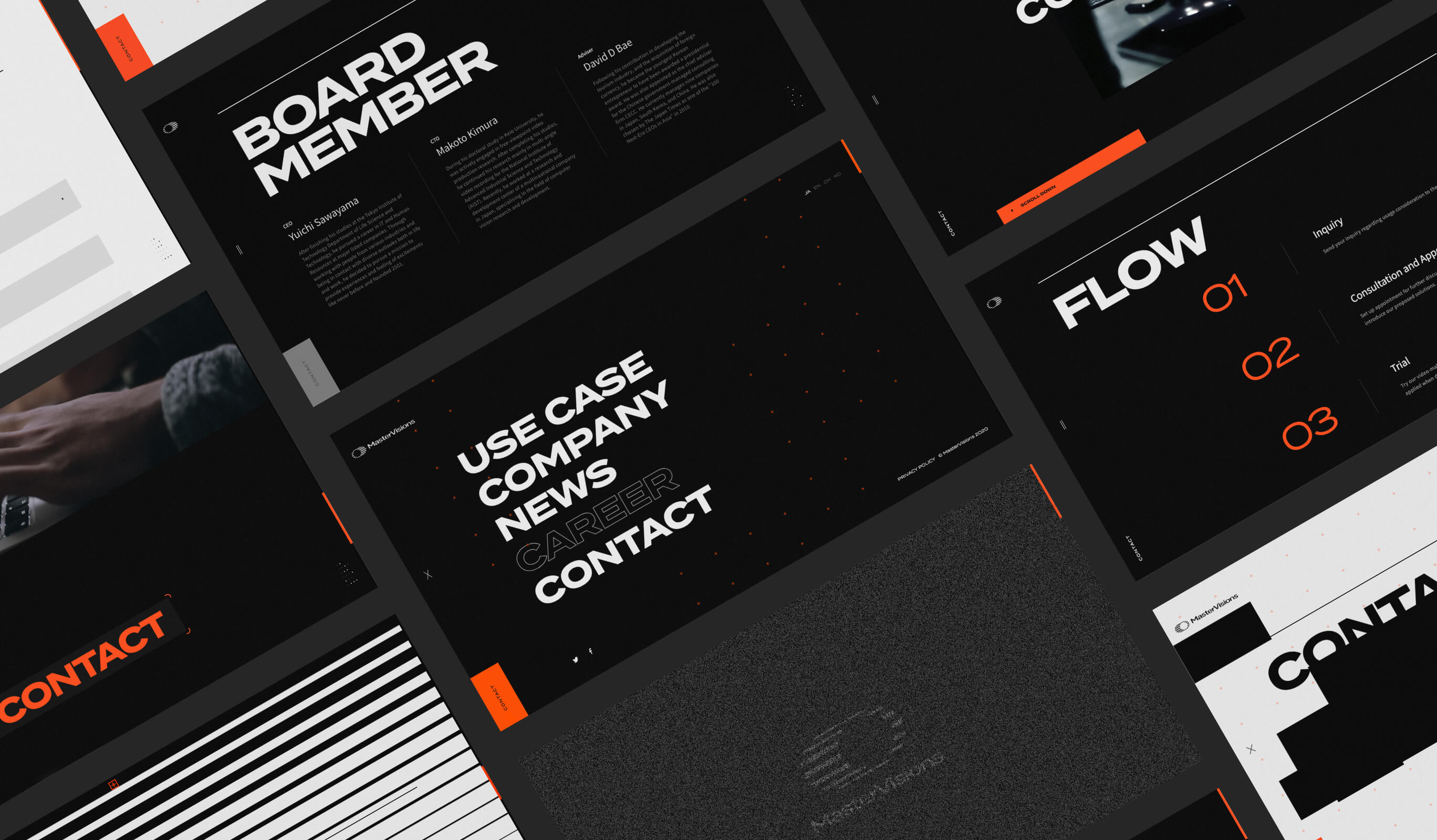
MasterVisions Inc. provides technology for 360° free-viewpoint video. We were in charge of creating the corporate website and designing the logo, when the company changed to their new name.
- Insight
-
How to get you to experience this technology?
How to get you to experience this technology?
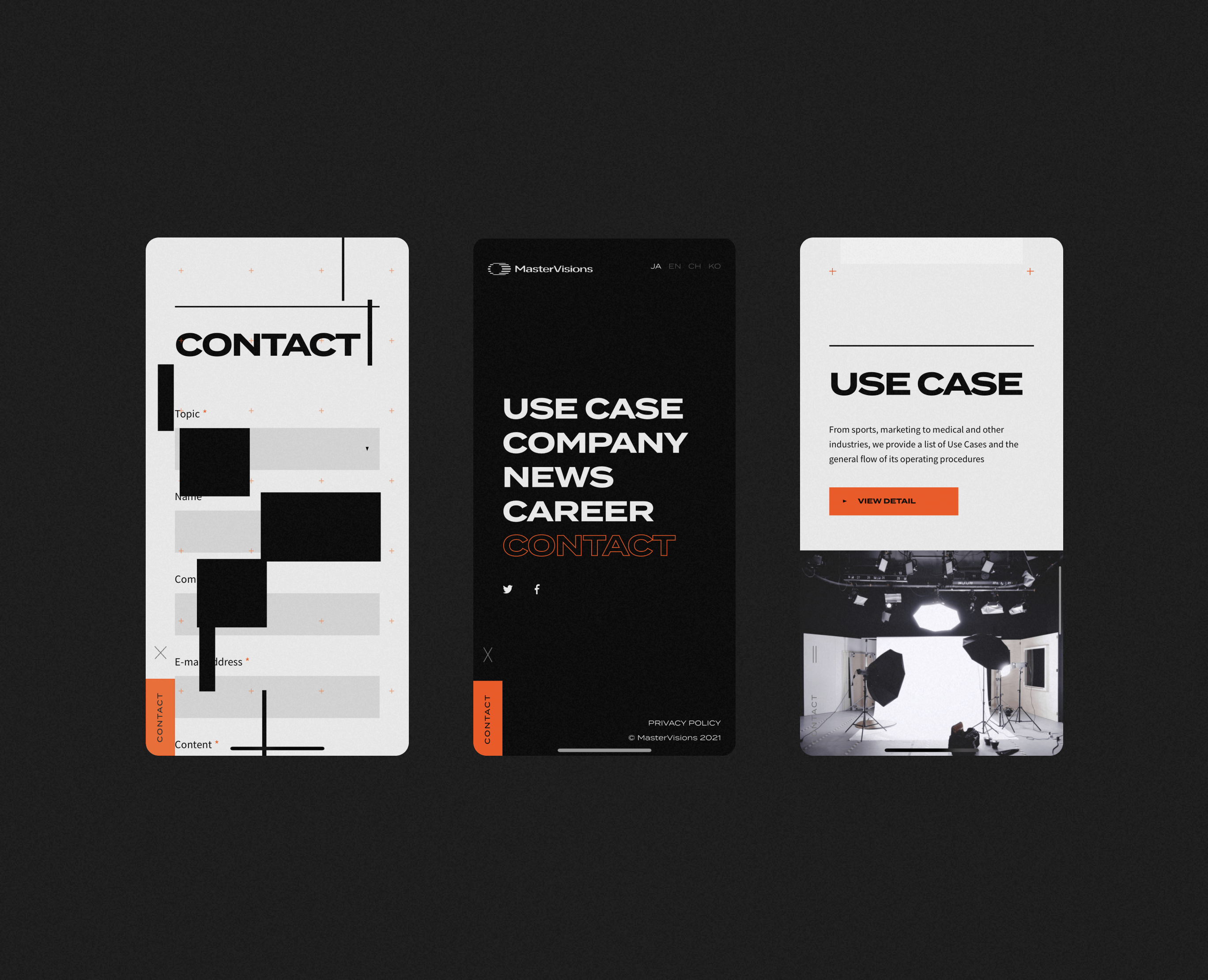
MasterVisions offers a video viewing experience where it is possible to watch from the front, back, side, and diagonally, and zoom in or zoom out. It means that the viewer can decide the angle they want to see at each moment. How to express this innovative technology in a way that is not only easy to understand, but also surprising. It was this point that we focused our concentration on, for this creative idea.
- Idea
-
Control the viewpoint freely.
Control the viewpoint freely.
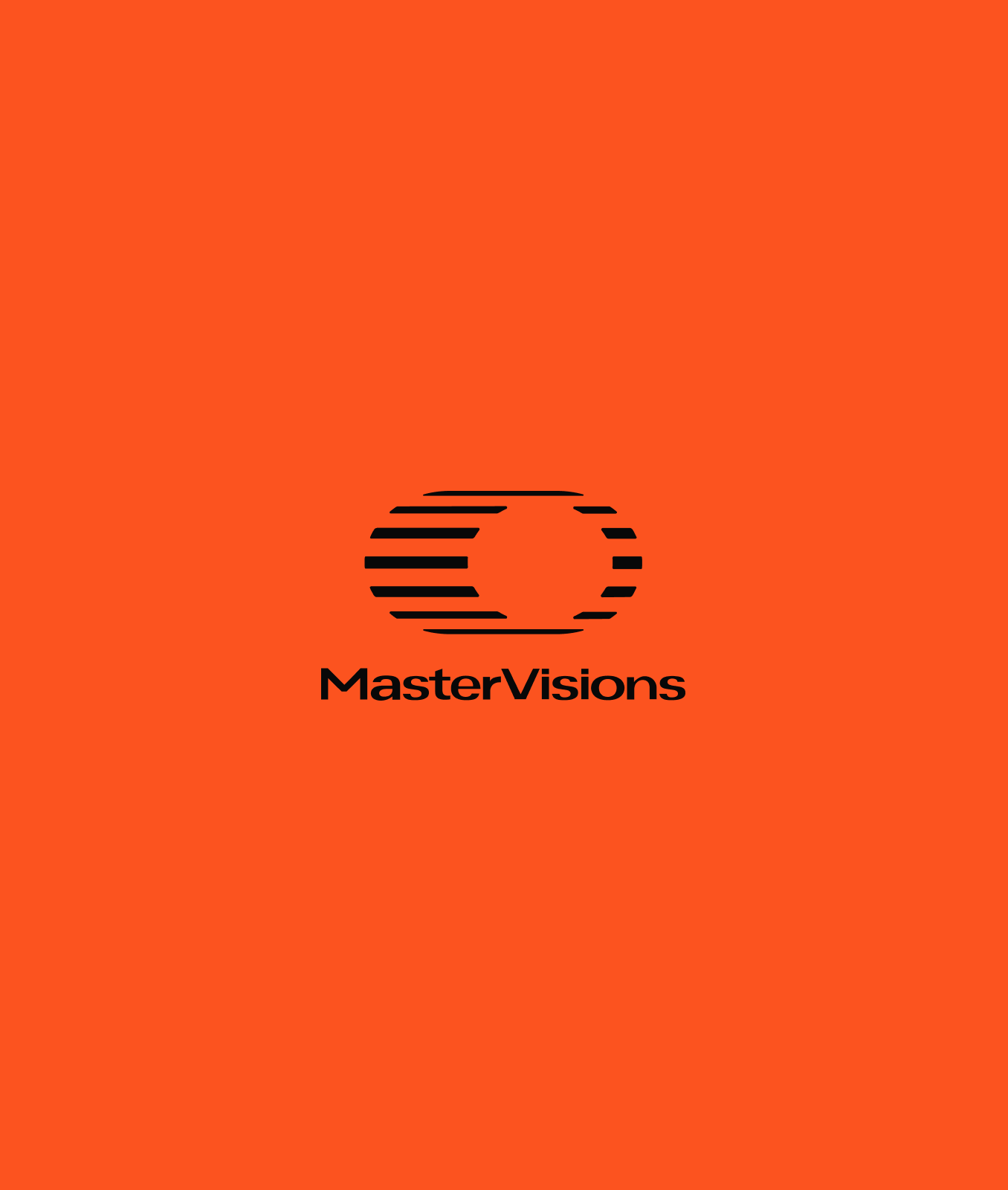
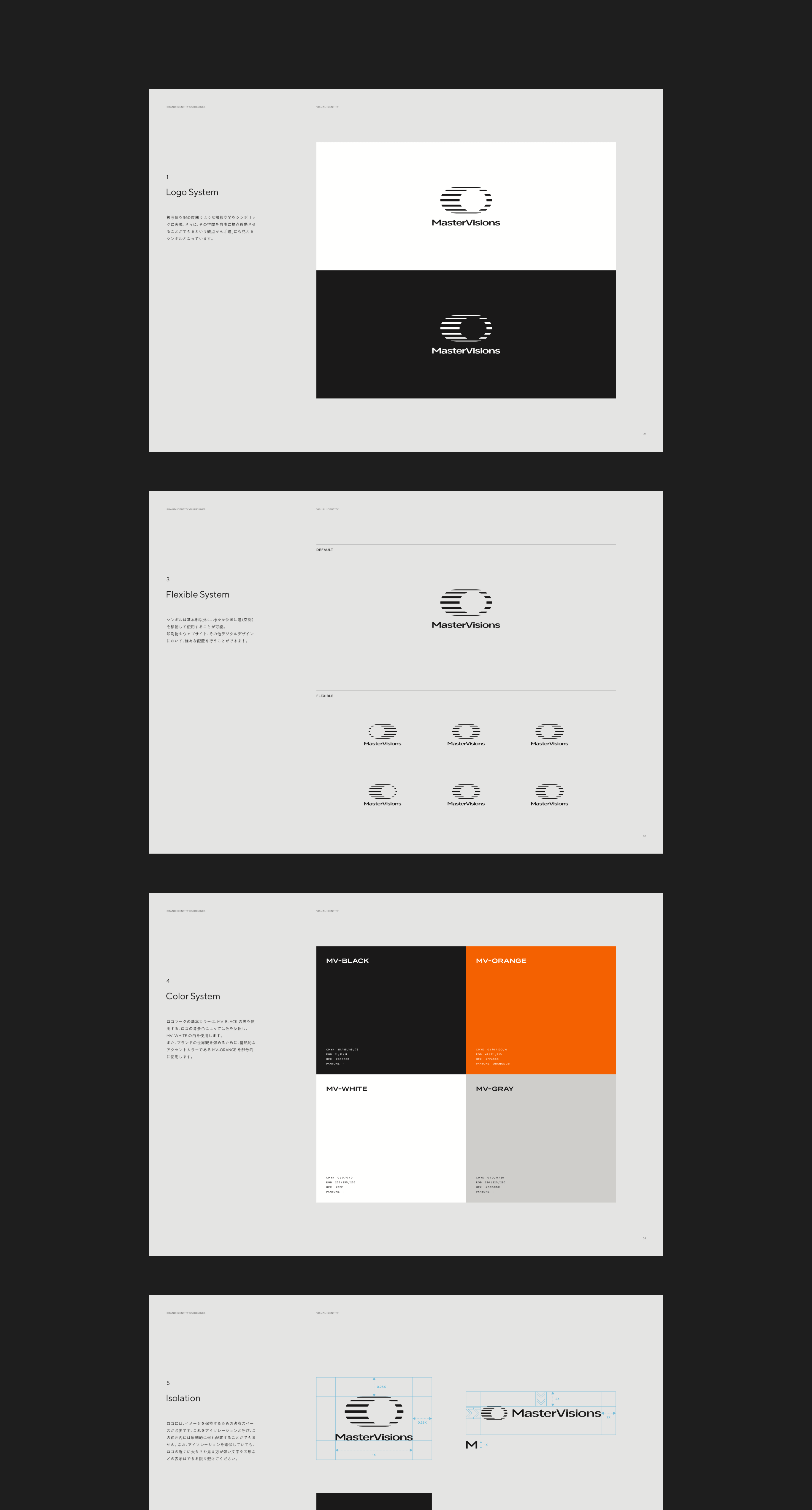
What kind of logo further accelerates the new company name “Master Visions”, that represents the technology for free-viewpoint video that they have? The logo that looks like an eye was created with the keywords “360˚” and “viewpoint”. We have devised a way to make it seem more like an eye, giving the circle (pupil) part inside, the freedom of being able to move.
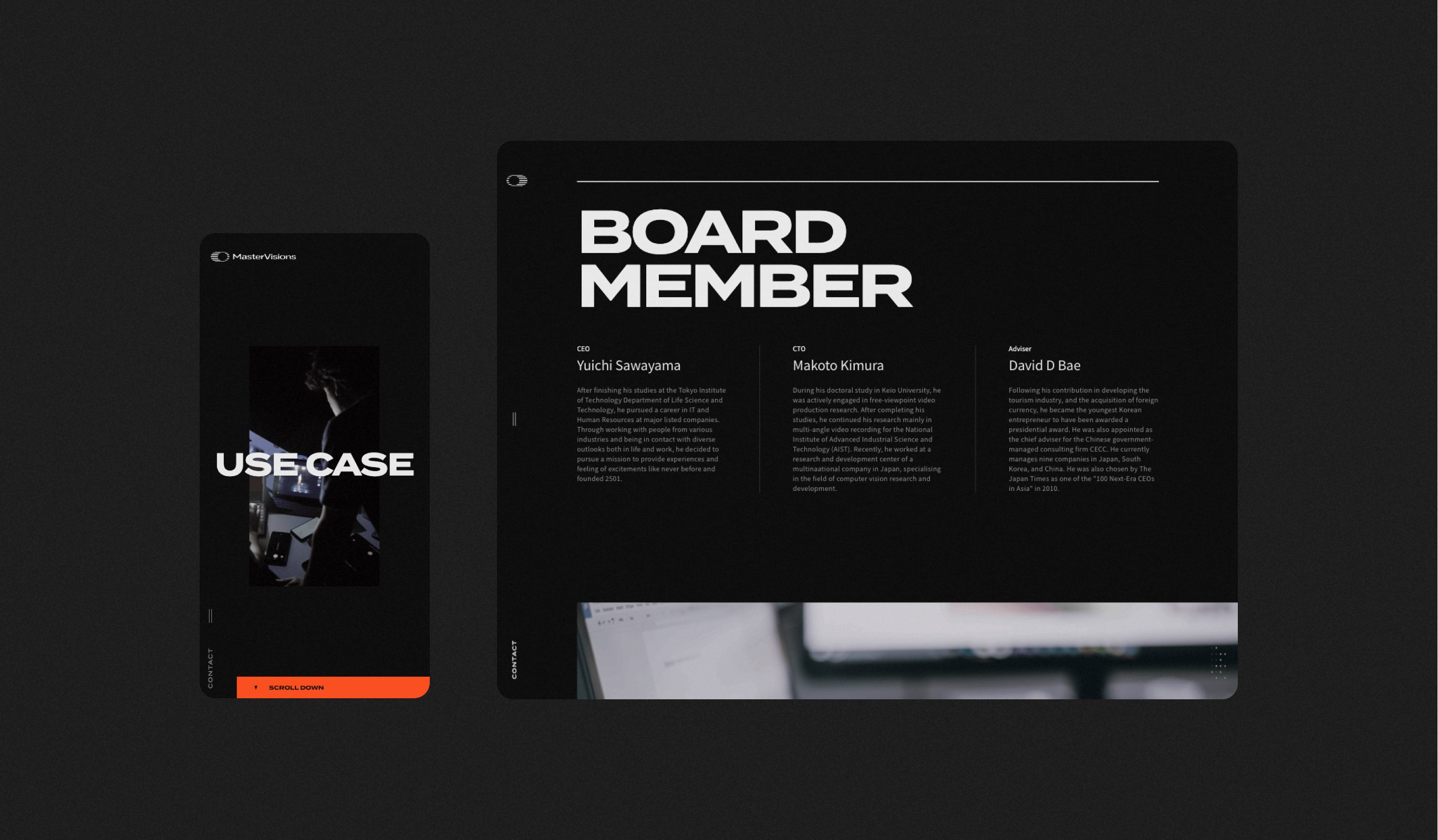
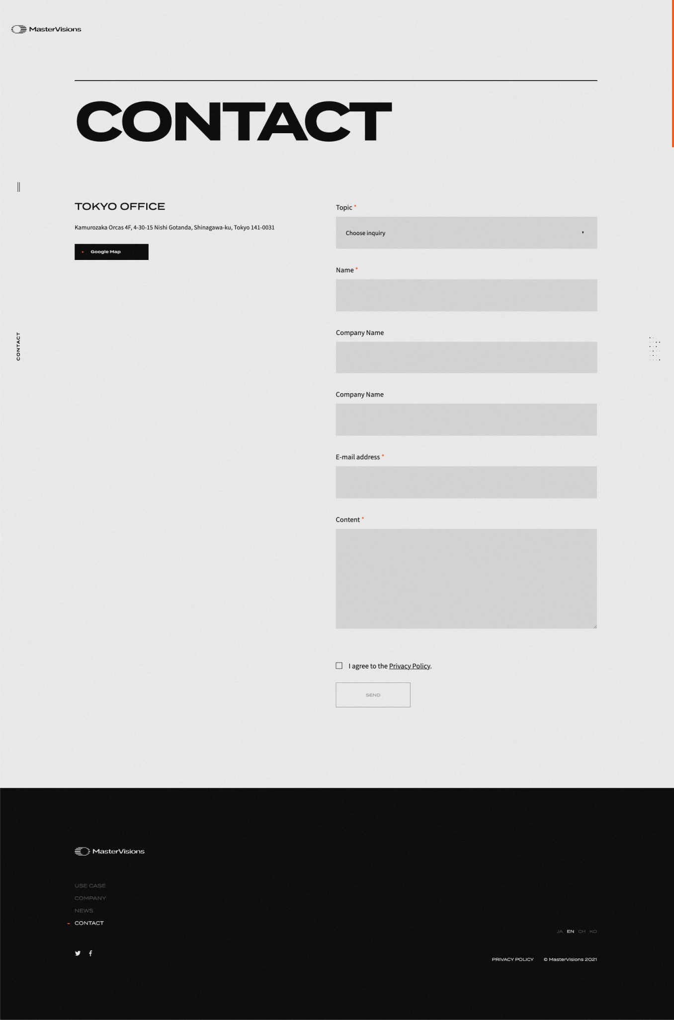
In addition, the website is designed so that you can have an on-the-spot viewing experience using the drag control. The company’s high level of technological power and innovation, are incorporated into the design and animation.
Project team
- John Nishiyama
- CSO / Copywriter
- Gen Shibano
- Project Manager
- Ryohei Kamada
- External Advisor / Art Director
- Takaaki Sato
- Developer
- Masaya Yamamoto
- COO / Creative Director