UTORITO Branding
- Client
- Too Corporation
- Role
- Planning, Copy, Project Management, Design
- Date
- Mar 2024


- Overview
-
Embedding Purpose and Vision into Every Detail.
Embedding Purpose and Vision into Every Detail.
We were responsible for creating the naming, logo, catchphrase, and design guidelines for “UTORITO” a Mac LCM service operated by Too Corporation. Throughout this project, we worked closely with the client to verbalize everything – from the service’s fundamental purpose and value proposition to the underlying vision – and ensured these elements were thoroughly reflected in all outputs.

- Insight
-
Unearthing Undiscovered Roots
Unearthing Undiscovered Roots
First, we conducted interviews with team members across various positions who were actually operating the service. Through these interviews, we verbalized both the mission – the service’s unchanging long-term goal – and the strategies needed to achieve this mission. Additionally, we researched similar services offered by other companies and articulated what makes this service unique and where its strengths lie.
- Idea
-
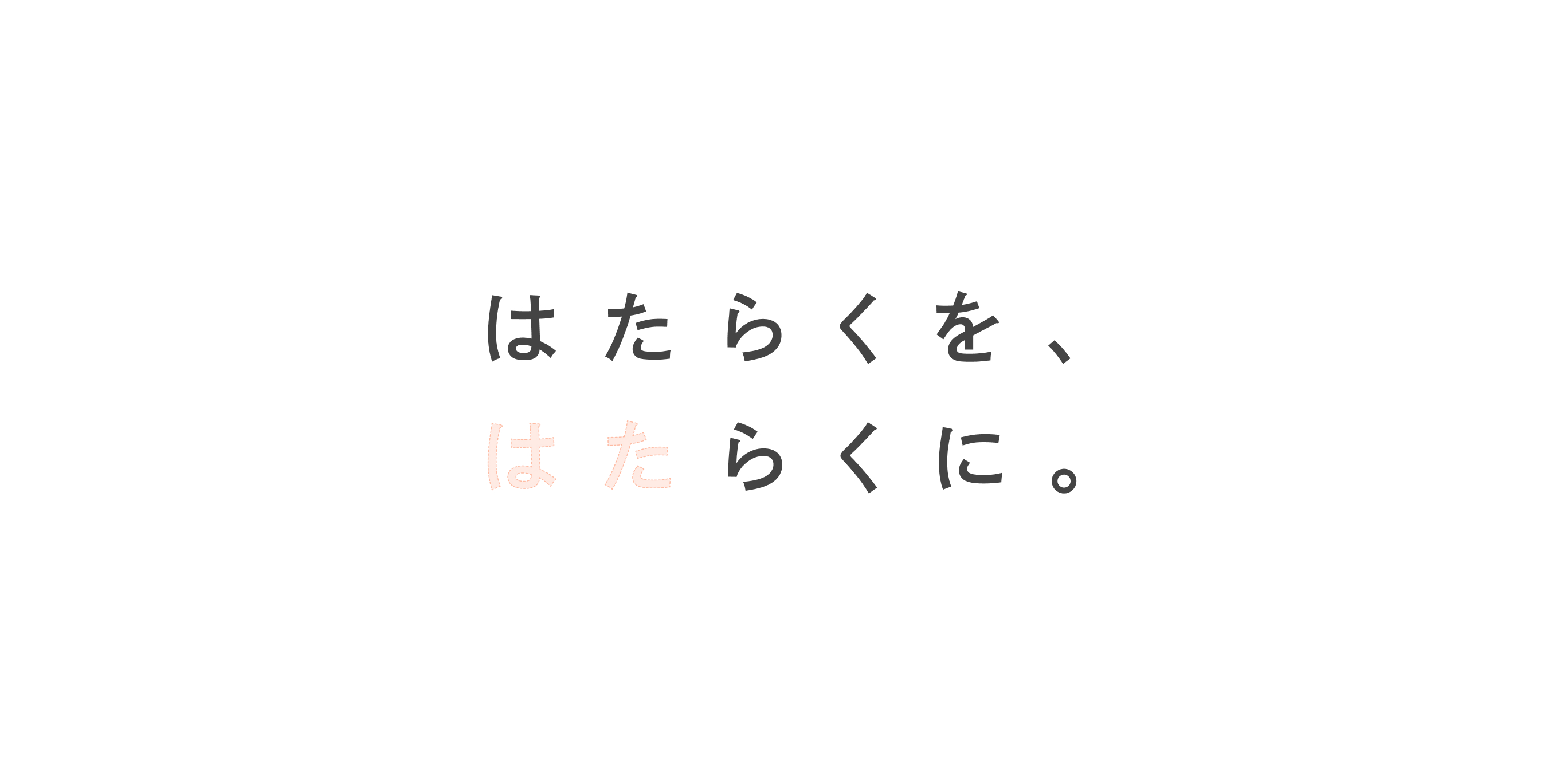
Making Work Easier
Making Work Easier
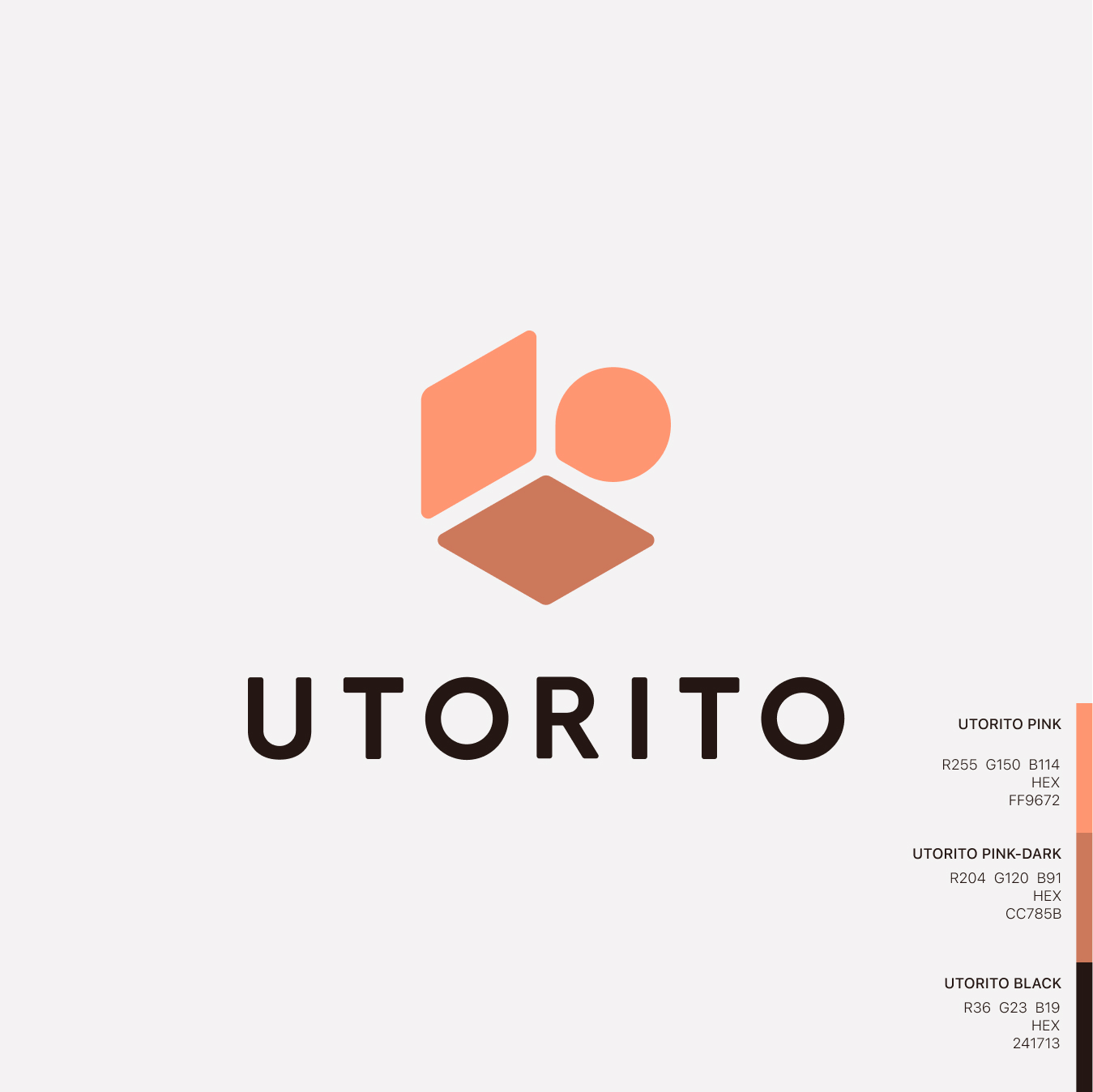
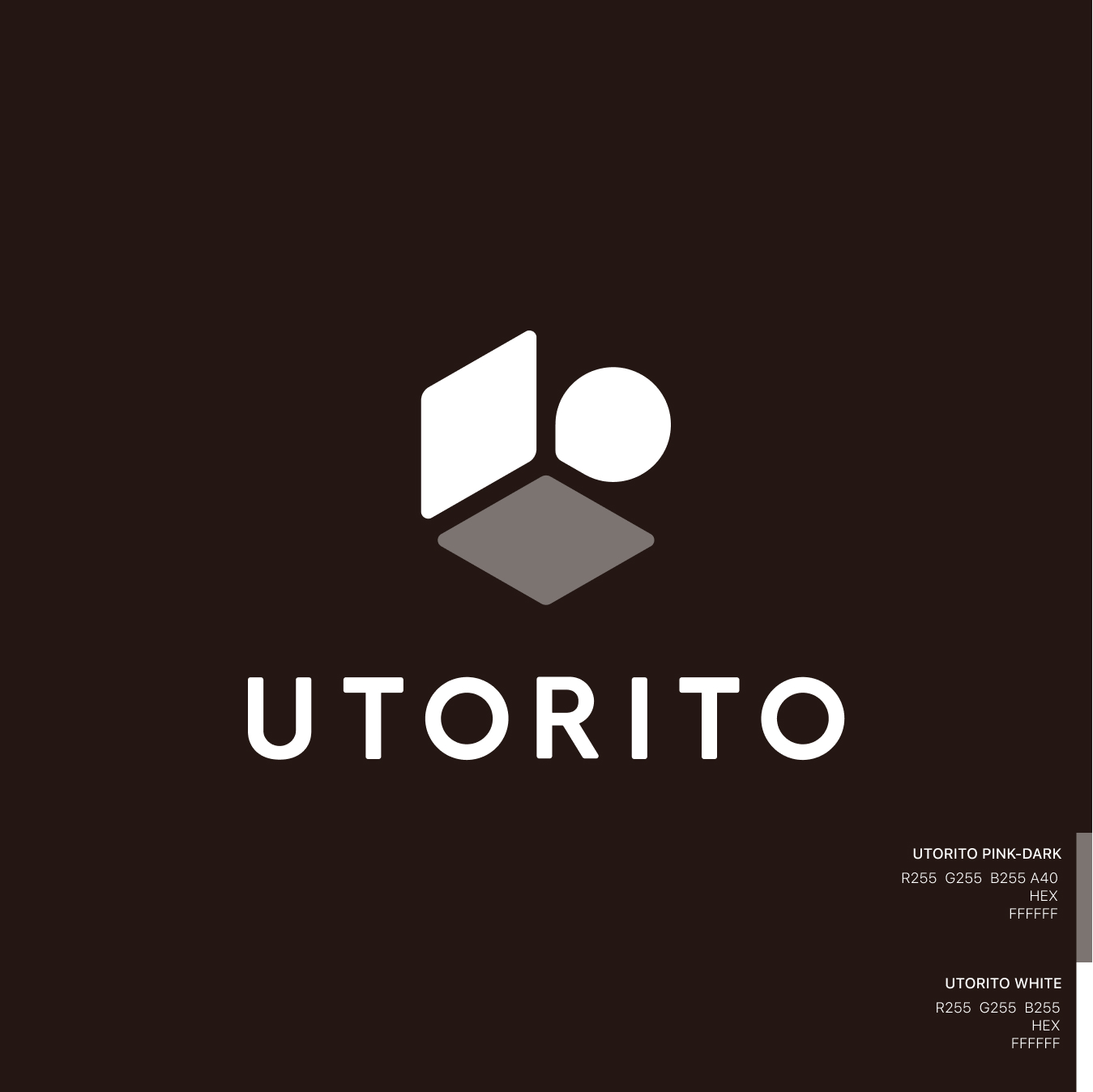
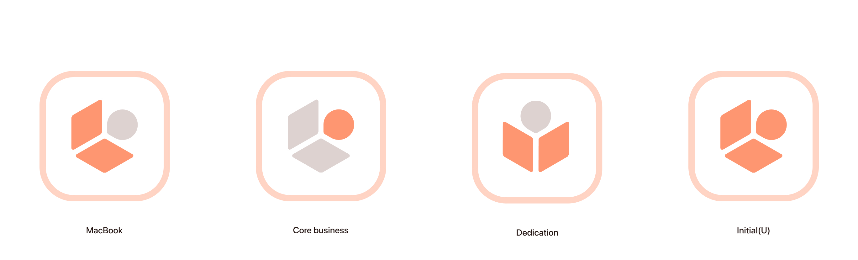
After completing these processes, we created the catchphrase “Making Work Easier” to concisely convey the service’s strengths and purpose to users. We named the service “UTORITO” to emphasize its role in supporting workers’ well-being and growth.
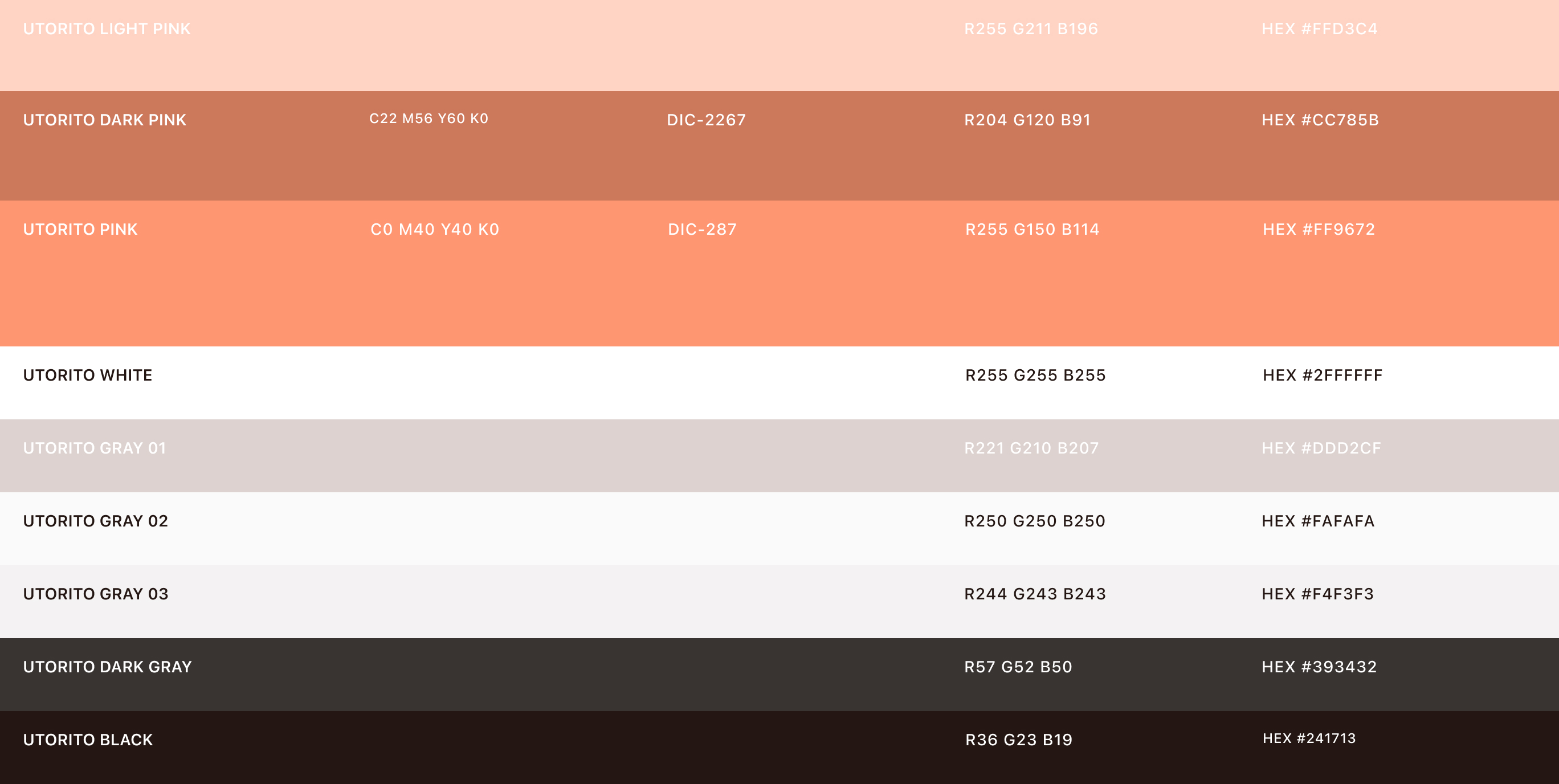
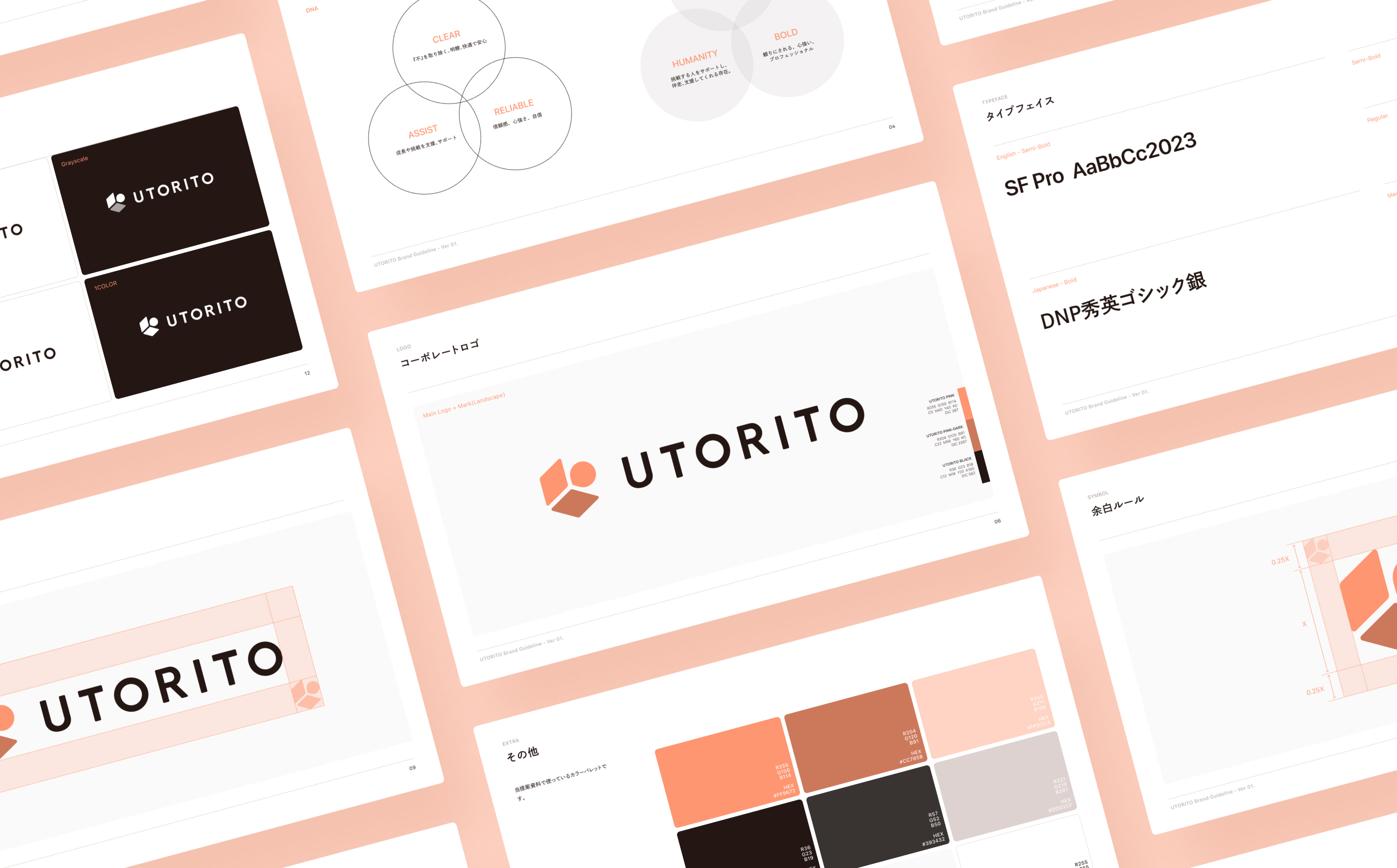
The logo design similarly expresses the service’s aspiration to be a supportive presence that accompanies and assists working people. For the color palette, we aimed to intuitively convey humanity, approachability, and warmth.

Project team
- Kazuya Okada
- COO / CMO / Producer
- Koya Sonoyama
- Account Planner
- Wataru Urakawa
- Senior Planner / Copywriter
- Kento Ishizuka
- Designer
- Umi Teranishi
- PMO / Project Manager
- Chihiro Shigeta
- Project Manager