201˚ Brand Site
- Client
- DRAFT Inc.
- Role
- Planning, Copy, Writing, Project Management, ArtDirection, Design, Development, Technical Direction
- Date
- Jun 2017
- Overview
-
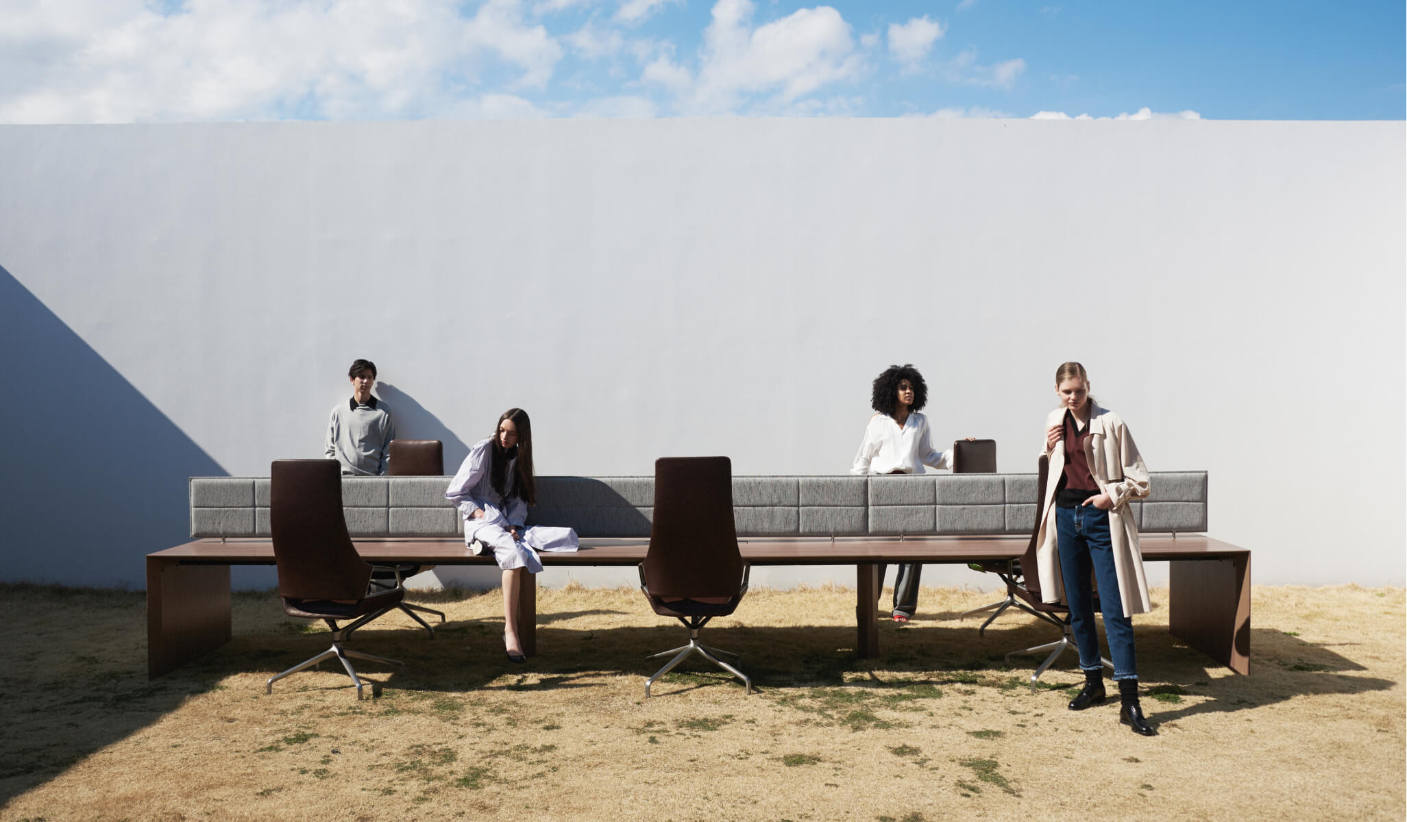
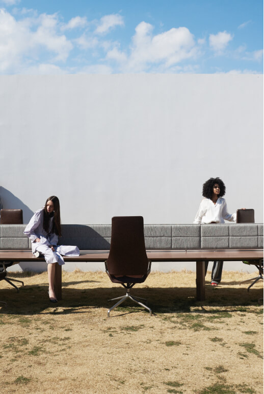
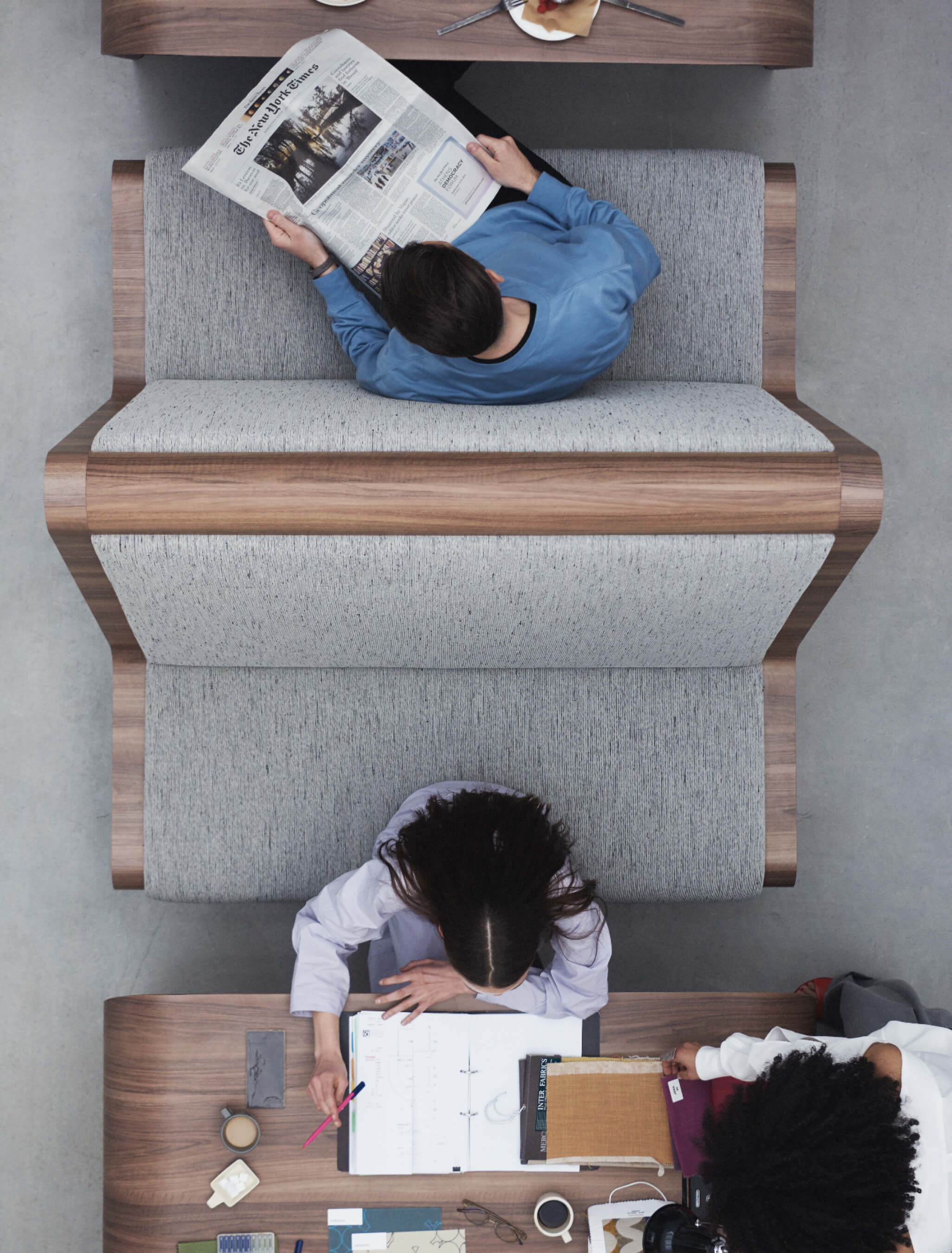
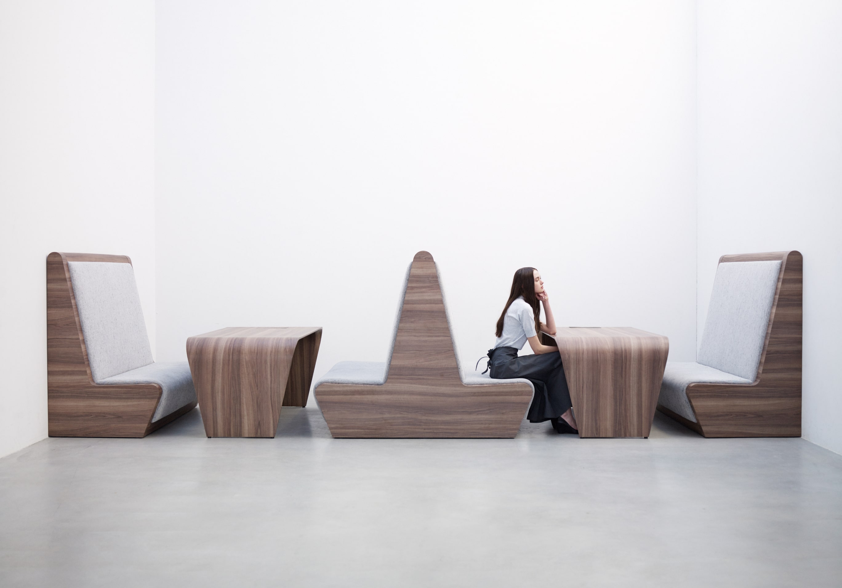
An unprecedented furniture brand launched by a company involved in space design.
An unprecedented furniture brand launched by a company involved in space design.
When interior design company DRAFT launched a new office furniture brand, we were in charge of the brand name, logo, and website. We designed and animated the brand name, logo, and website to make the brand’s philosophy and products easy to understand and appealing.

- Insight
-
Expressing the will of a brand that is not bound by conventional wisdom or customs.
Expressing the will of a brand that is not bound by conventional wisdom or customs.
Office furniture in Japan was somewhat behind the times compared to that of other countries and was bound by the conventions of the industry. With the recent calls for reform in the way we work, Draft’s will to change common sense through furniture was strong, and the company decided that it needed an easily understood slogan that could be circulated inside and outside the company. This project started with the creation of a brand name.
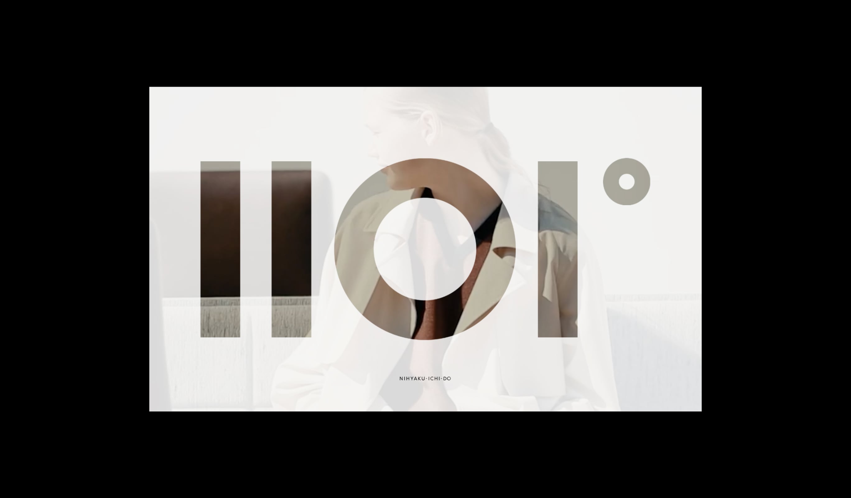
Changing the norm is not something that is out of the ordinary, but by simply changing the industry standards a little bit or offering a choice of fabrics, furniture can take on a new look. We felt that the essence of value lies in this slight difference in perspective, so we proposed the brand name “201˚,” which is 1˚ wider than the human vision of 200˚. We named it with the aim of creating a function that will become a value standard not only for the website, but also for future furniture production.
- Idea
-
The world of 201˚ spreads from the logo.
The world of 201˚ spreads from the logo.
After much research and analysis, we extracted three important keywords for the brand.
Academic – Logical thinking that leads to the business of how we work
Experimental – Experimental design that considers previously unnoticed phenomena.
Unique – Emphasis on the sensory aspects as well as the business aspects
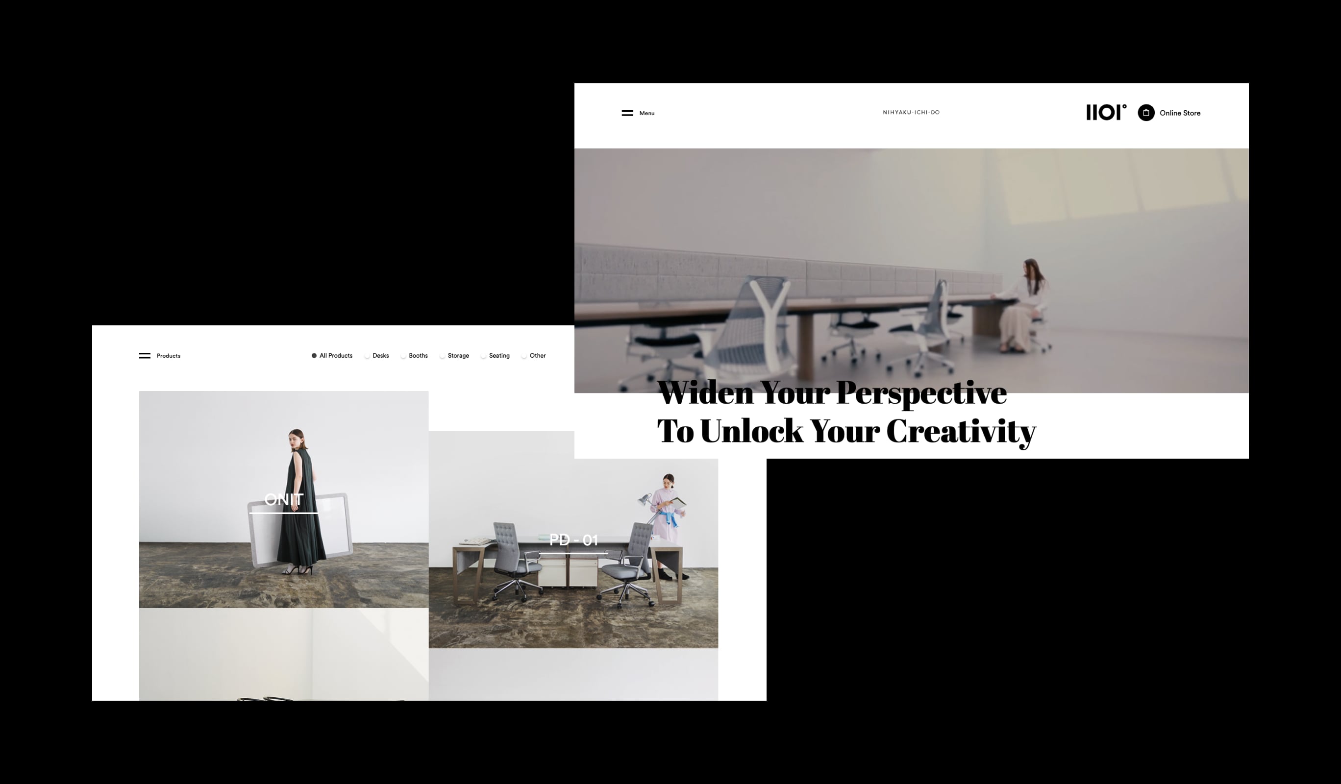
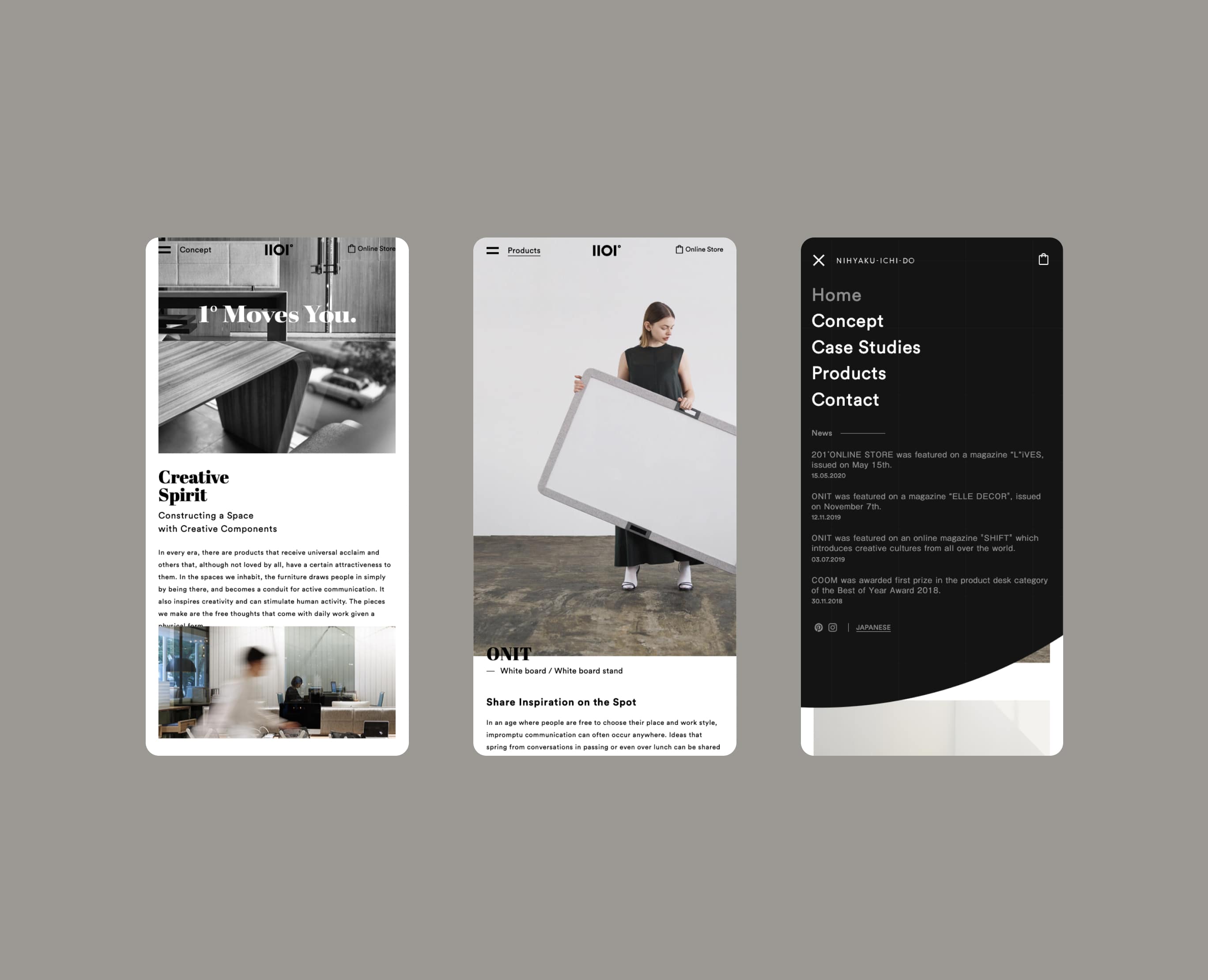
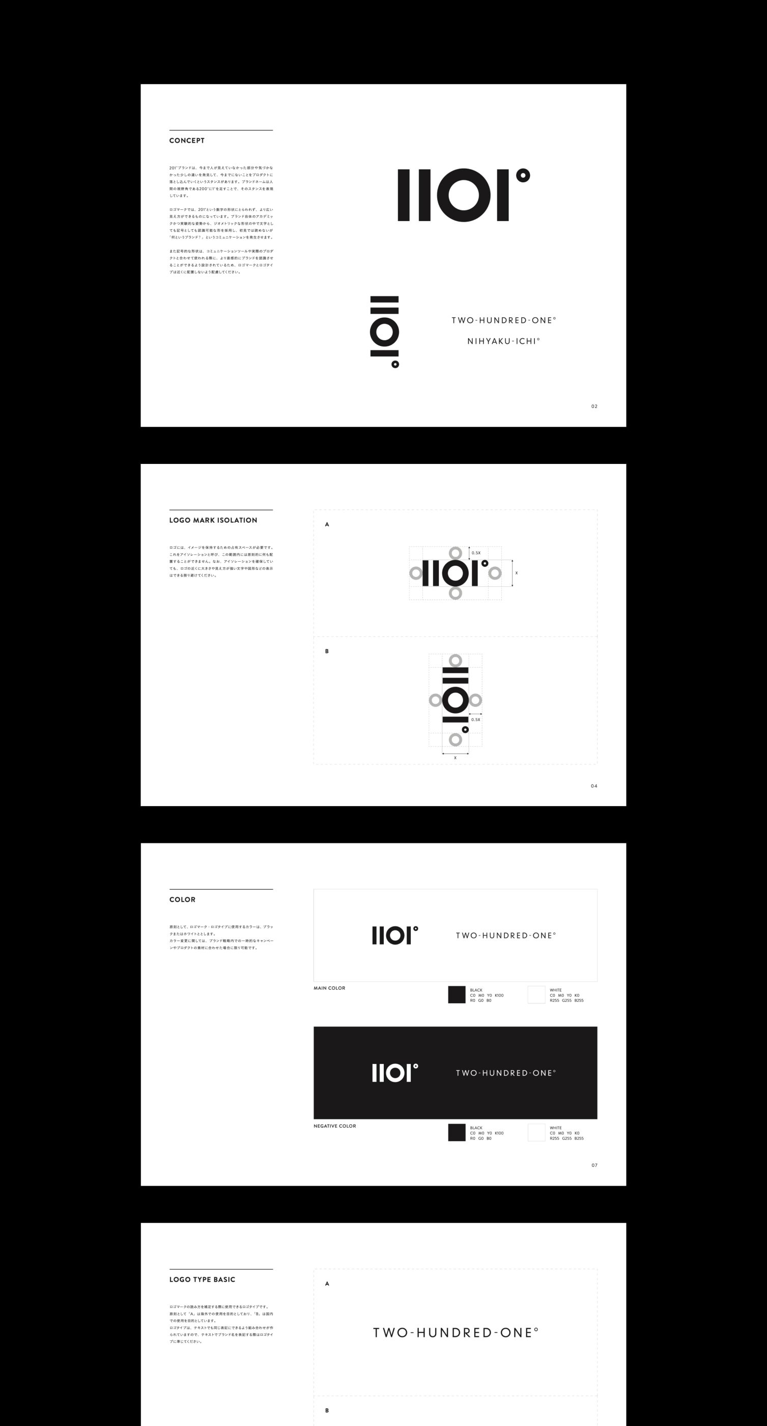
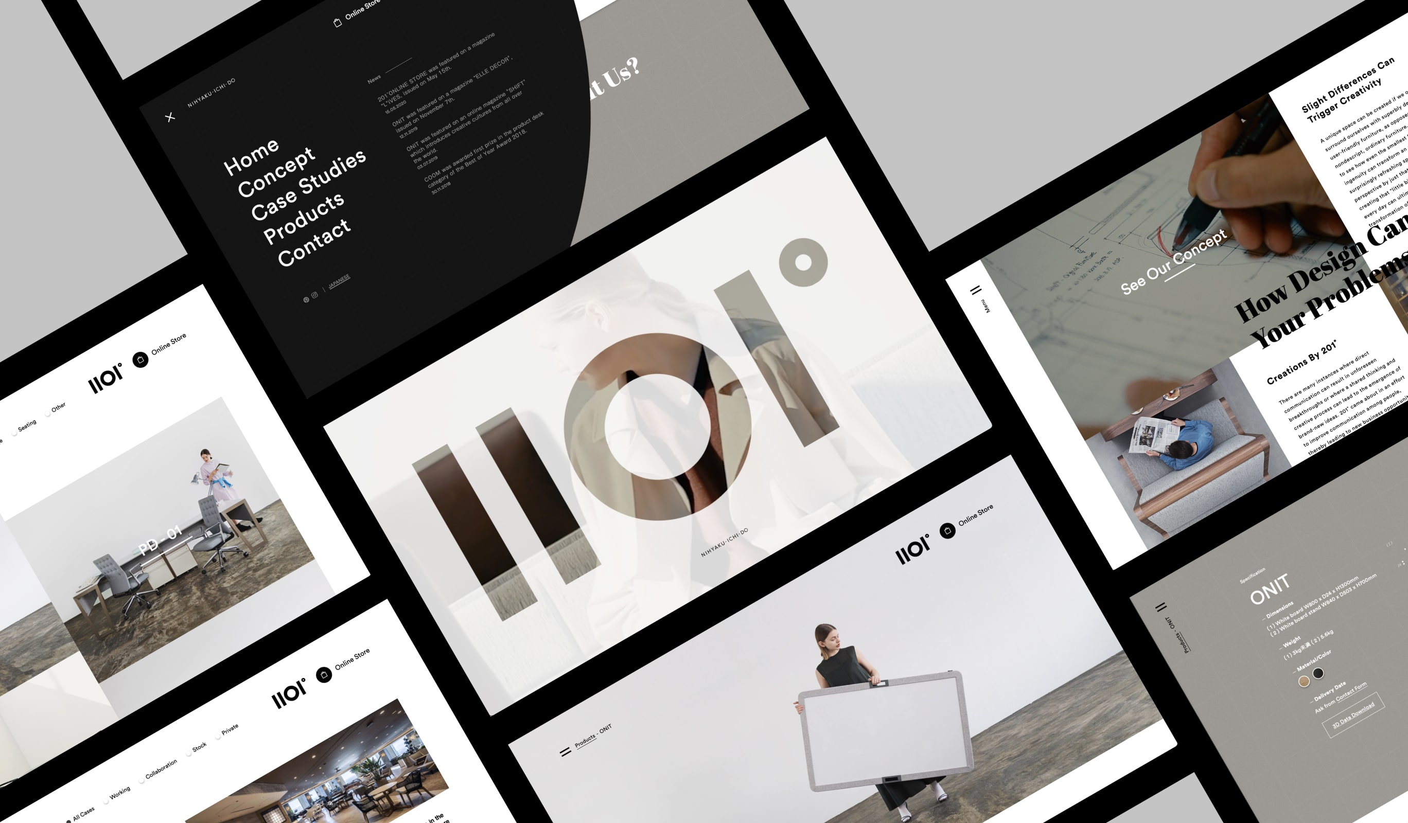
Based on these three keywords, we proposed several logo patterns that were not too assertive of the brand, had an intuitive feel as if they were both letters and pictures, had a calculated geometric visual, and added uniqueness to them. The logo that we finally settled on was a graphic representation of “201°” as a symbol, not as a letter or a number, and when placed vertically, it could be recognized as “二◯一” in Japanese Kanji.
As for the typography, we chose “Circular,” which is based on geometric shapes that match the logo. Since it was too linear and sharp by itself, we used “Abril Fatface” as a sub-font to add a curved softness to the visuals.
The concept behind the web design was to create a design that appeals to the identity of the company by utilizing the symbolic nature of the logo. To achieve this, we used a simple layout to emphasize the product photos, while dynamically using the straight lines and circles of the logo in animations and transitions to express the world view of 201°.
In the intro of the site, the viewer enters the wide world of 201° to create a sense of brand emergence. The video was intentionally shot in a cinema-size horizontal format, with both sides cropped at first, but when the viewer clicks on the video to enter the site, the entire video is visible. The transitions are animated using the circular shape of the logo to give the impression of the logo’s shape.
In terms of implementation, page.js is used to manage the URL branching process. Page.js does not have a function to manage the state of animations, so when successive page transitions are made, the animations are stacked and played back in order to ensure smooth transitions without disrupting the processing order. This is an enhancement. In addition, for the transition animation, two divs are placed in the shape of a circle. The radius of the circle is determined by calculating the distance from the four corners according to the location of the click or tap. In order to play the animation smoothly, the animation is stopped when it starts on the page where it exists. It is a small device, but we always need to keep in mind that playing videos on a large screen is a big load for the browser.
Awarded
- Red Dot — Red dot Award
- Site of the Day — Awwwards
Project team
- Masaya Yamamoto
- COO / Creative Director
- John Nishiyama
- CSO / Copywriter
- Hiroaki Yasutomo
- CTO / Technical Director
- Keitaro Suzuki
- Design Director, Designer
- Tsukasa Tokura
- Front End Engineer
- Kigaru Inc.
- Movie