BRUTUS Web Renewal
- Client
- Magazine house, ltd.
- Role
- Project Management, ArtDirection, Design, Development
- Date
- Sep 2021
- Overview
-
A new experience of "BRUTUS".
A new experience of "BRUTUS".
For 40 years since its launch, the magazine “BRUTUS” has been a patchwork compilation of the times, so as to become a textbook for pop culture.
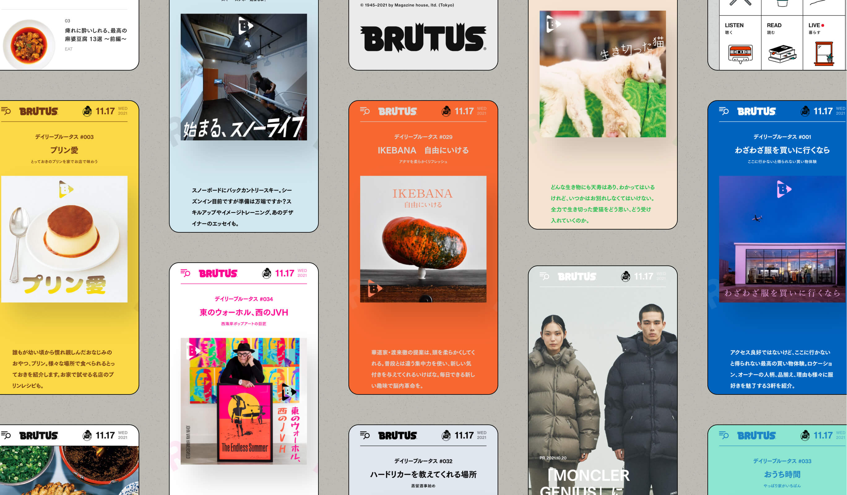
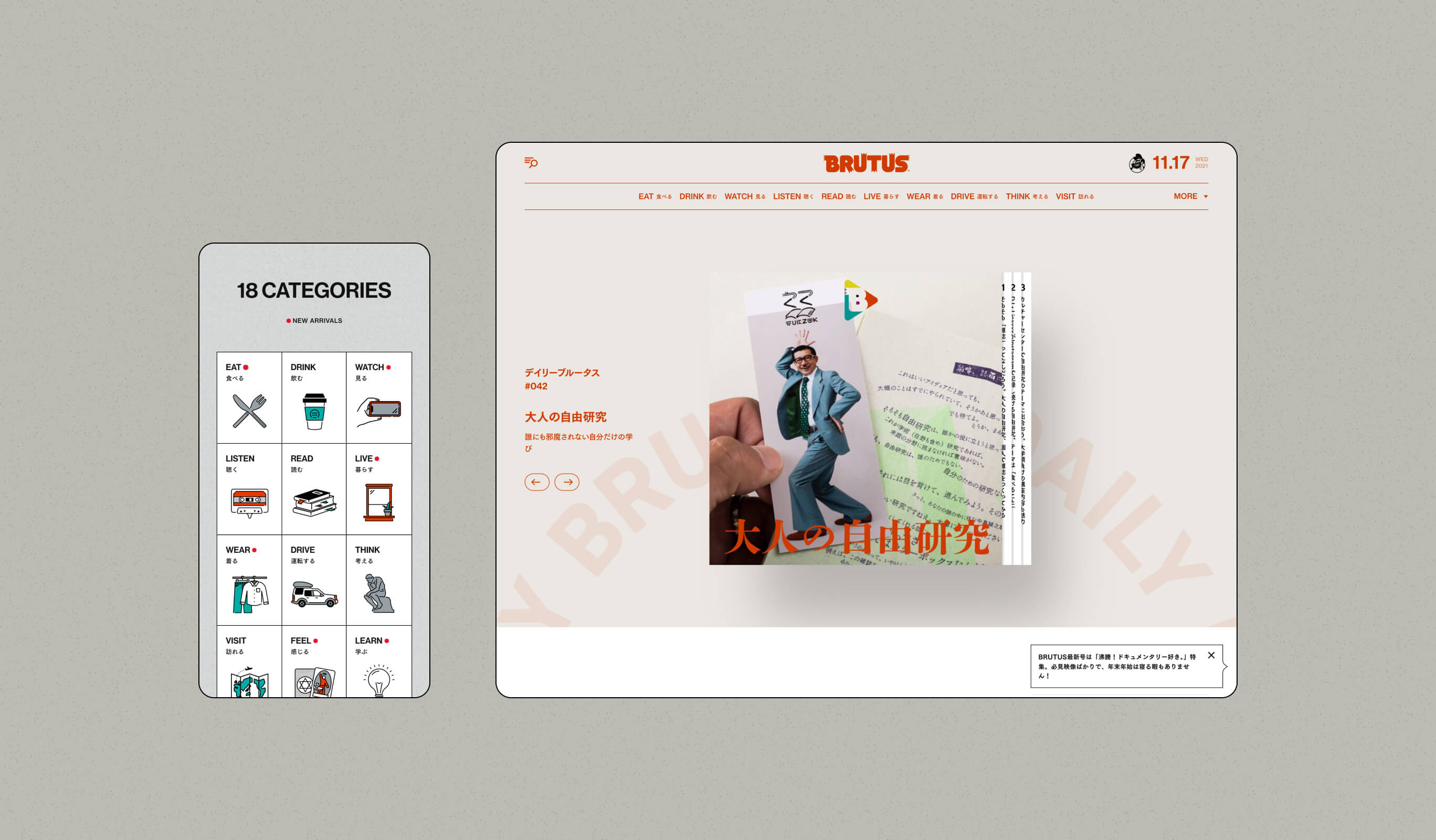
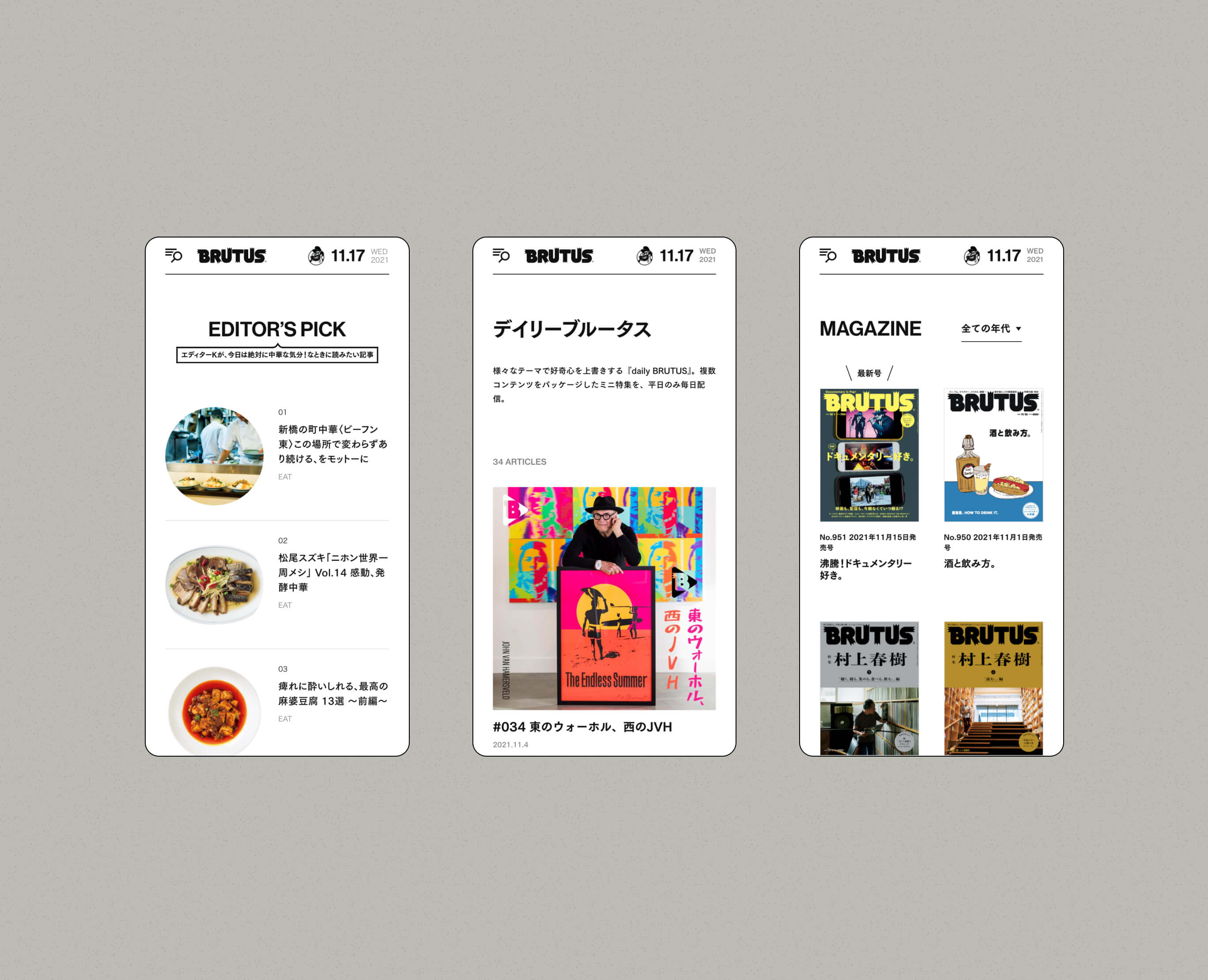
We have worked at renewing the web version of “BRUTUS.jp”, in order to turn the editing power that has been built up in the pages of the magazine so far, into a medium that allows us to experience new things, by making full use of methods of expression that could not be achieved using paper.
- Insight
-
Fuse the brand's greatest weapon with the internet.
Fuse the brand's greatest weapon with the internet.
BRUTUS has a long history and is trusted, but in order to continue to keep the strength that is “BRUTUS” the same as it has been until now, it is necessary to let the group of people who mainly exist on the internet who still do not know about “BRUTUS” itself, know about it.
Therefore, the goal we were going for this time, was to make use of the editing power, which is the greatest weapon of “BRUTUS”, to make the old, paper version of “BRUTUS” into a site that can also be felt on the web.
Also, it was important to proceed efficiently as the schedule was tight.
- Idea
-
The efficiency to actualize the editing power and expressions that represent the identity of "BRUTUS".
The efficiency to actualize the editing power and expressions that represent the identity of "BRUTUS".
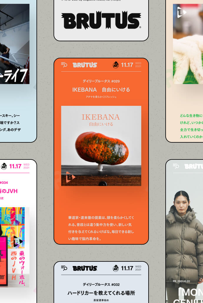
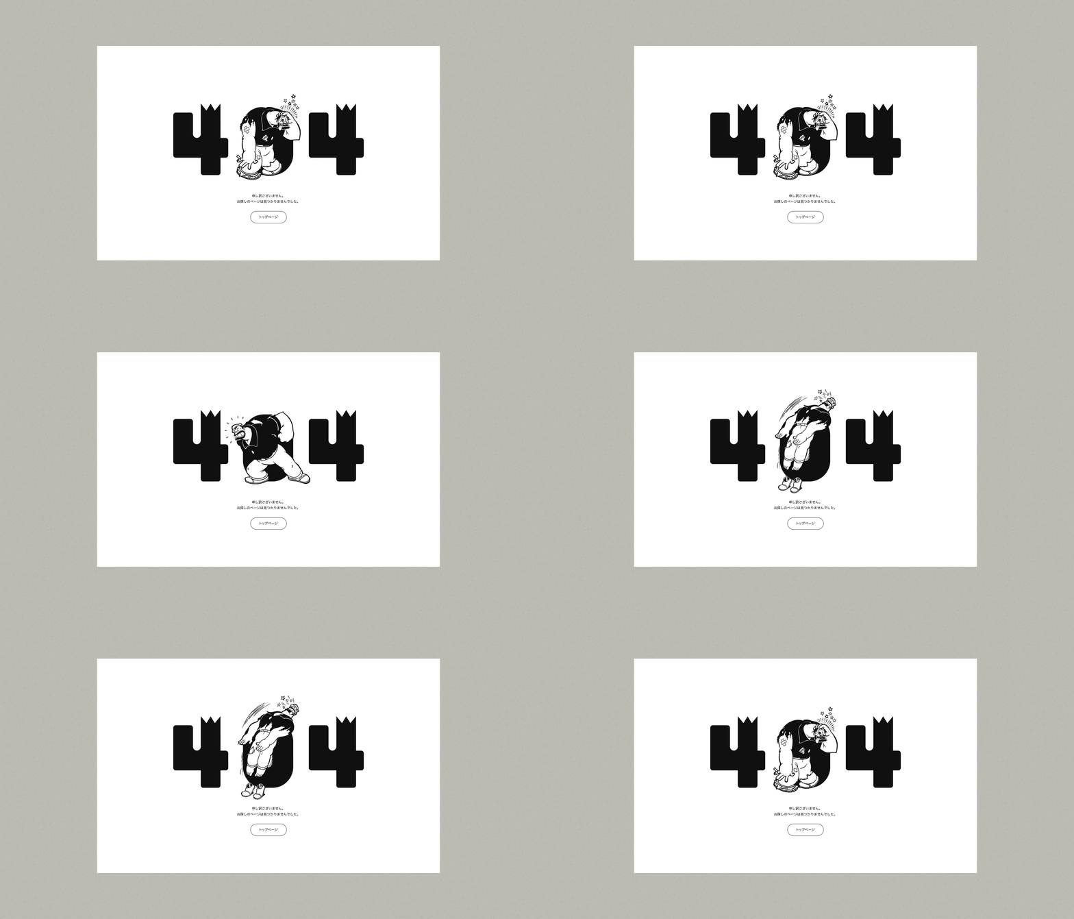
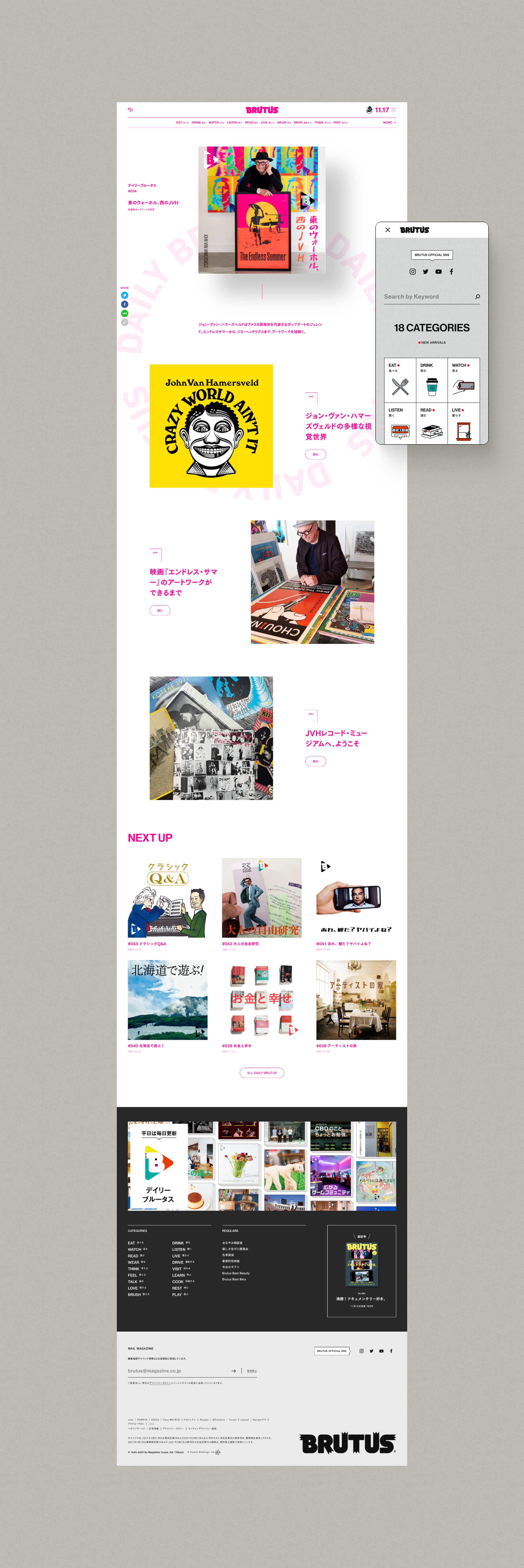
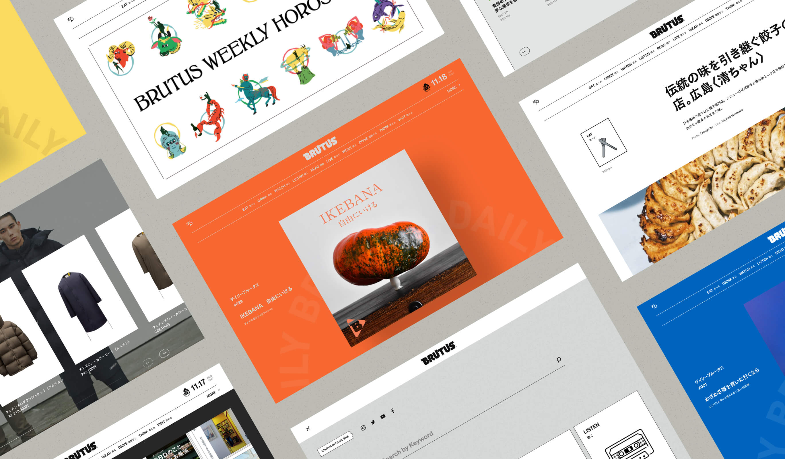
While maintaining the universal and standard look that BRUTUS has cultivated, we have hidden icon animations created by Maeda Design and layout ideas throughout the site, so that you can catch a glimpse of how playful and fun it is. The core content this time, “daily BRUTUS,” was designed so that the colors and graphics could be changed according to the article’s key visuals.
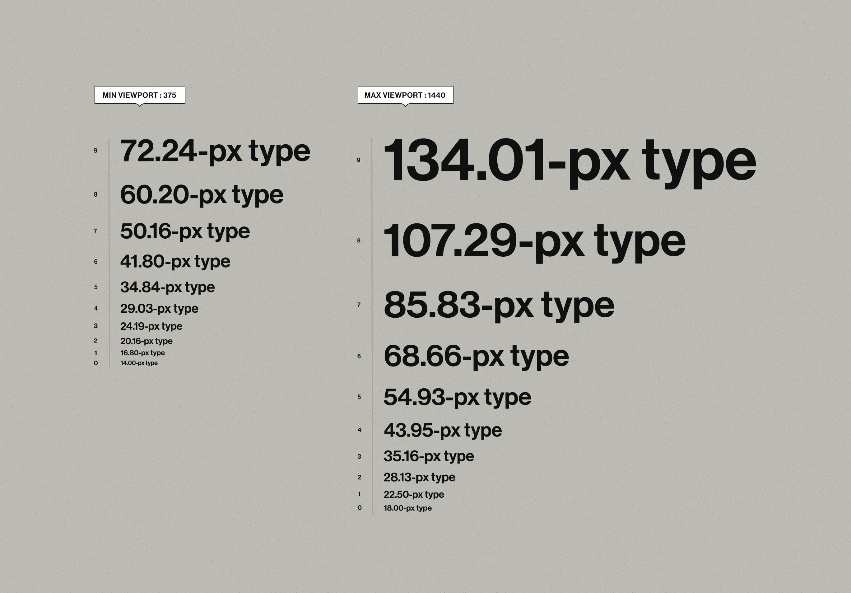
We used Utopia to define the font size and margin size, and took a consistent approach when implementing style adjustments that come with responsive design. It functioned as a common language for designers and developers, and also led to optimizing design and implementation. By adopting Timber as a WordPress plugin, template development has been made more efficient and reusable. In order to handle a wide range of themes and express the identity of “BRUTUS”, which provides new discoveries every time, we were able to efficiently actualize creative ideas that didn’t compromise on a single detail.
Project team
- Kazuya Okada
- COO / CMO / Producer
- Manabu Tsuchiya
- Producer / Marketing Director
- Masaya Yamamoto
- COO / Creative Director
- Hiroki Miyamoto
- Art Director / Designer
- Arisa Miyasaka
- Designer
- Yuhei Yasuda
- Front-End Developer
- Serika Ikurumi
- Front-end Developer
- Junichi Nishiyama
- Senior Interactive Designer
- Umi Teranishi
- PMO / Project Manager
- MAEDA DESIGN LLC.
- Icon design
