GOOD LIFE Corporate Site
- Client
- GOOD LIFE INC.
- Role
- Planning, Copy, Writing, Project Management, ArtDirection, Design, Development
- Date
- Nov 2016

- Overview
-
In an industry that is full of competition, what will you fight with as your weapon?
In an industry that is full of competition, what will you fight with as your weapon?
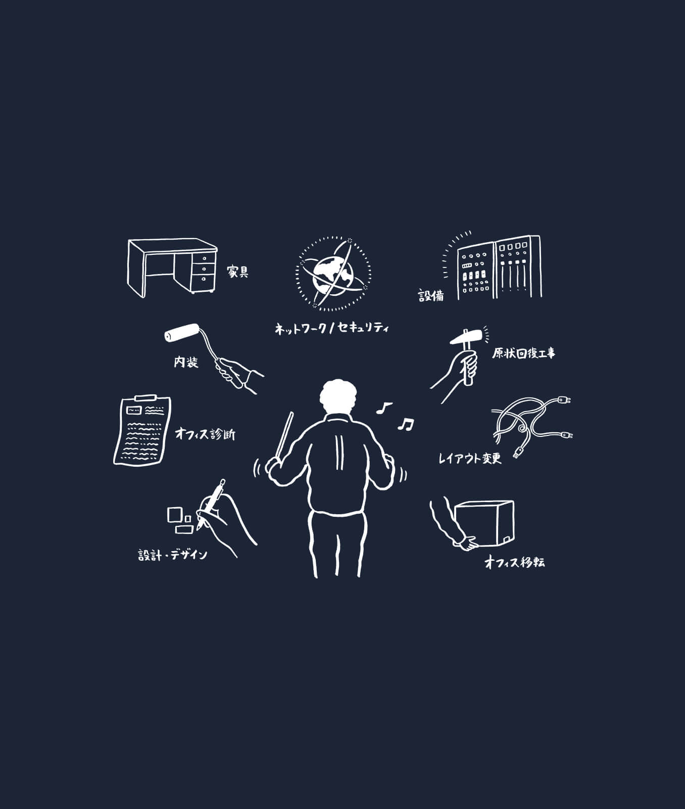
Good Life Co., Ltd. does all kinds of business project management related to offices such as relocation and design. By focusing appeal on the one point of ‘partnership with customers’, we aimed to clearly differentiate ourselves from other companies in the same industry that claim to have the best design. We have applied this policy to everything, such as CI, website content, and production.
- Insight
-
Hone 'Individuality'.
Hone 'Individuality'.
The situation is that the scale of the company is still not that large yet, and there is no so-called ‘showy performance record’. However, as a company that designs offices by profession, we thought that that was by no means the only field to fight in. The greatest weapon that we have come to see, through repeated interviews with people in the field, is the partnership with the customer who is led to say, “Will you do that much for me?” Therefore, we decided on the slogan ‘BE A PARTY’, and incorporated everything on how to build a relationship of trust with customers – from their vision to concrete examples – into content that is in line with this slogan.
- Idea
-
For logos, videos, illustrations, and websites that you feel close to.
For logos, videos, illustrations, and websites that you feel close to.
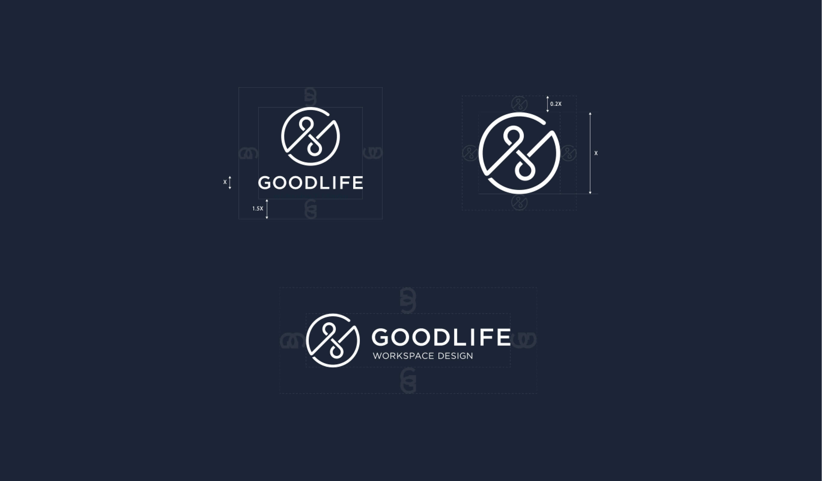
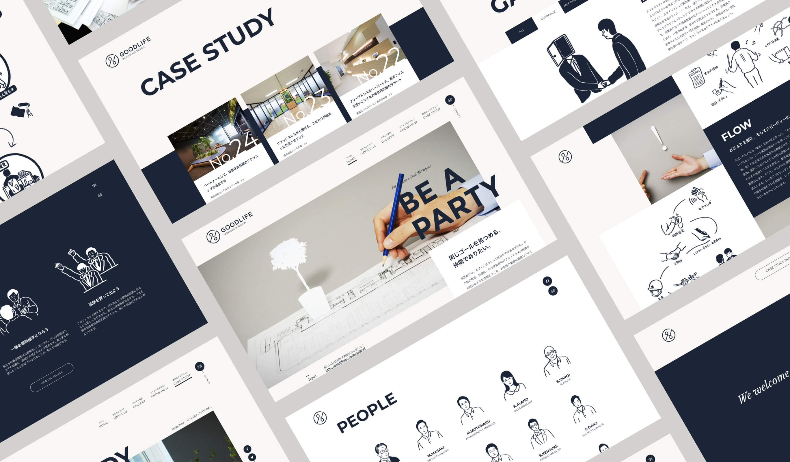
Along with the renewal of the image of our brand, we started from the point of building the image and position of the company itself. We extracted the strengths and merits of GOODLIFE itself that aren’t anywhere else, and incorporated them into the logo design, focusing on the keywords ‘Logical/Intelligence,’ ‘Flexible,’ ‘Relationship,’ and ‘Comfortable.’ The central concept of the logo design was the mindset of moving forward ‘operating in tandem’ with the clients that they always have in mind. With that, we associated the elements and combined them to create the shape of the logo. For colors, we took deep blue as the corporate color, and softly adjusted the tone with shades of white.
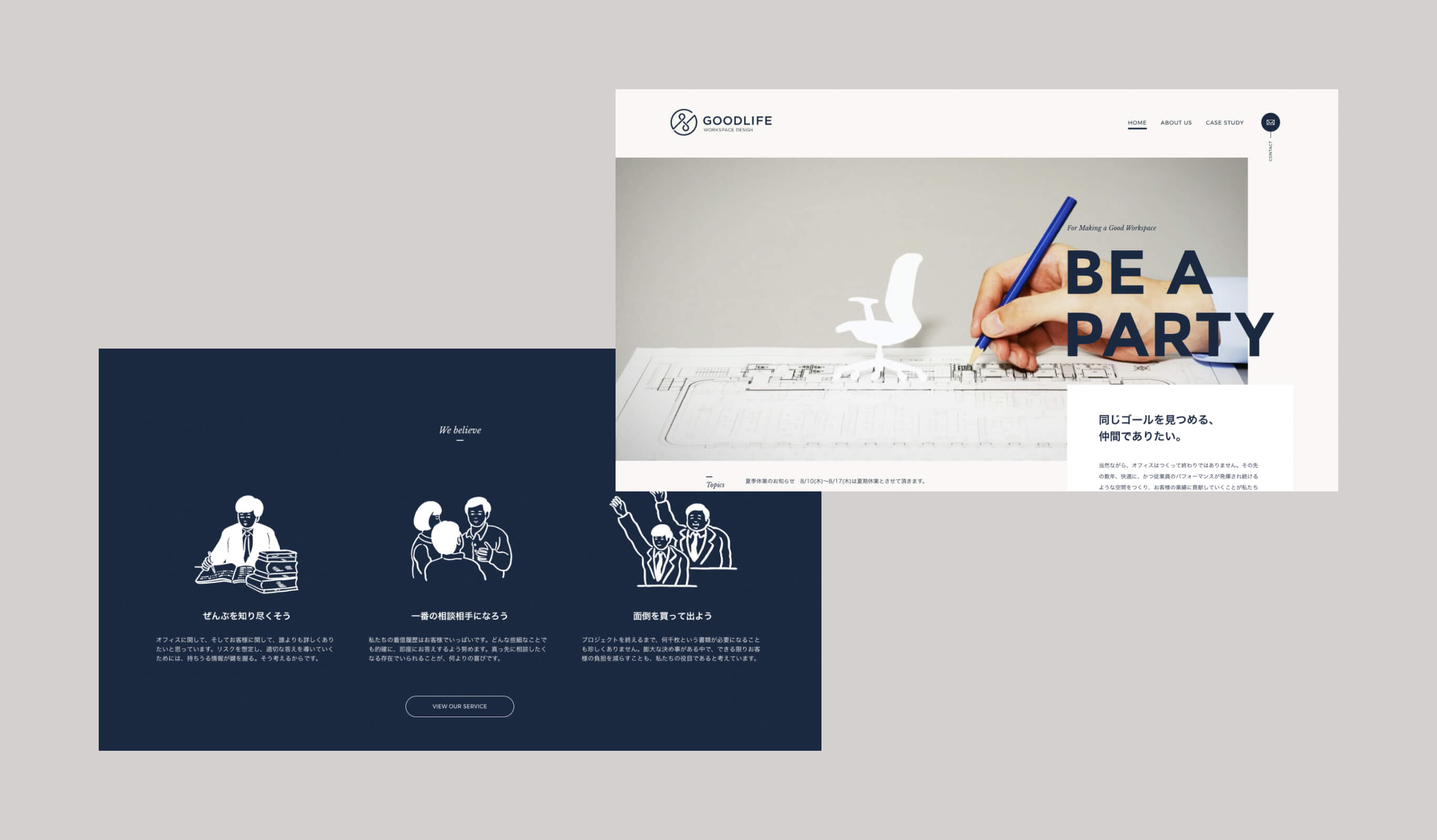
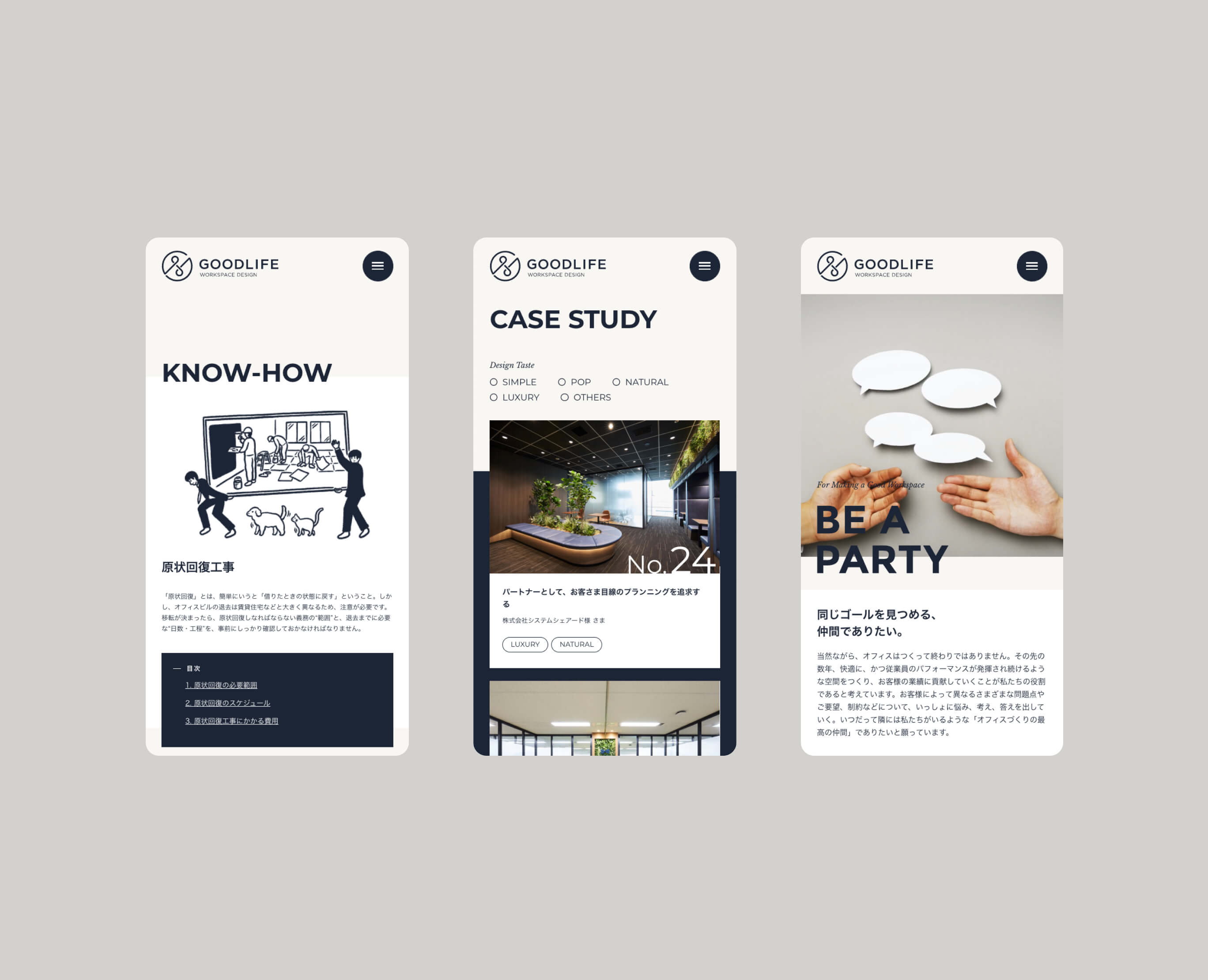
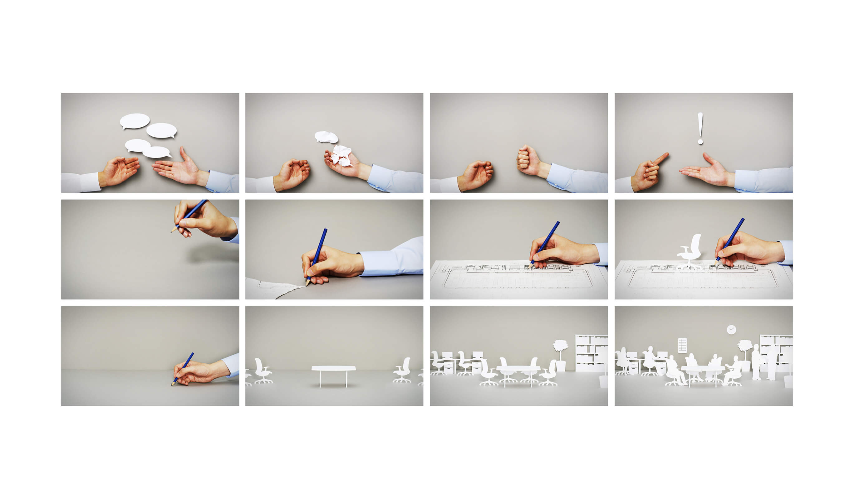
For the website, we worked on further embodying the overall tone that was adjusted with the logo. By continuing to adjust the balance in the deep blue and off-white screens with white space, and matching the stop-motion videos and illustrations with the content, serious and sincere images can coexist with feelings of friendliness and closeness. For the stop-motion photography, we are commissioning stop-motion artist Tajin Takeuchi, to create a video that expresses the concept of the company. For icons and parts that express parts even closer to the company, we commissioned illustrator Mr. Kurosaki to express the softness that is typical of GOODLIFE.
With the website, we put effort into implementing a responsive design that would look beautiful on screens of various sizes. The motion of the curved tracks inspired by the new logo design, and the production of paired objects based on the image of partnership, are scattered throughout the website. In the illustration, the closeness to GOODLIFE is expressed through the animation that is based on the image of the stop motion for the main visual.
Awarded
- Website of the Day — CSSDA
Project team
- John Nishiyama
- CSO / Copywriter
- Junichi Nishiyama
- Senior Interactive Designer
- Wongeun Heo
- Technical Advisor
- Hiroaki Yasutomo
- CTO / Technical Director
- Taijin Takeuchi (kirameki inc.)
- Stop Motion
- Satoshi Kurosaki
- Illustrator
- Akiko Omori
- Photographer
- Takashi Umeda
- Photographer
- Sakura Sugawara
- Copywriter
- Keitaro Suzuki
- ArtDirection, Design
- Sheenan Tenepre
- Development