LARGO Inc Branding
- Client
- LARGO Inc.
- Role
- Planning, Copy, Writing, Project Management, ArtDirection, Design, Development
- Date
- Apr 2019
- Overview
-
Renewal of the entire brand, including tools.
Renewal of the entire brand, including tools.
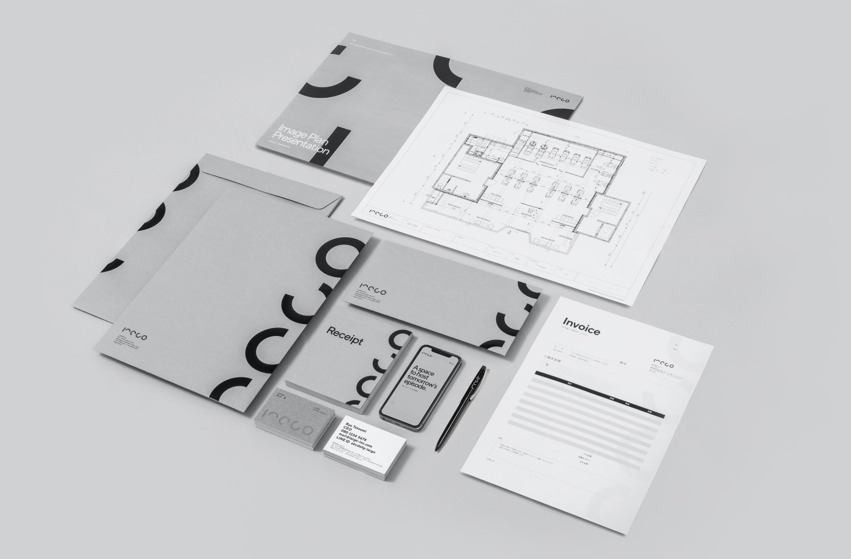
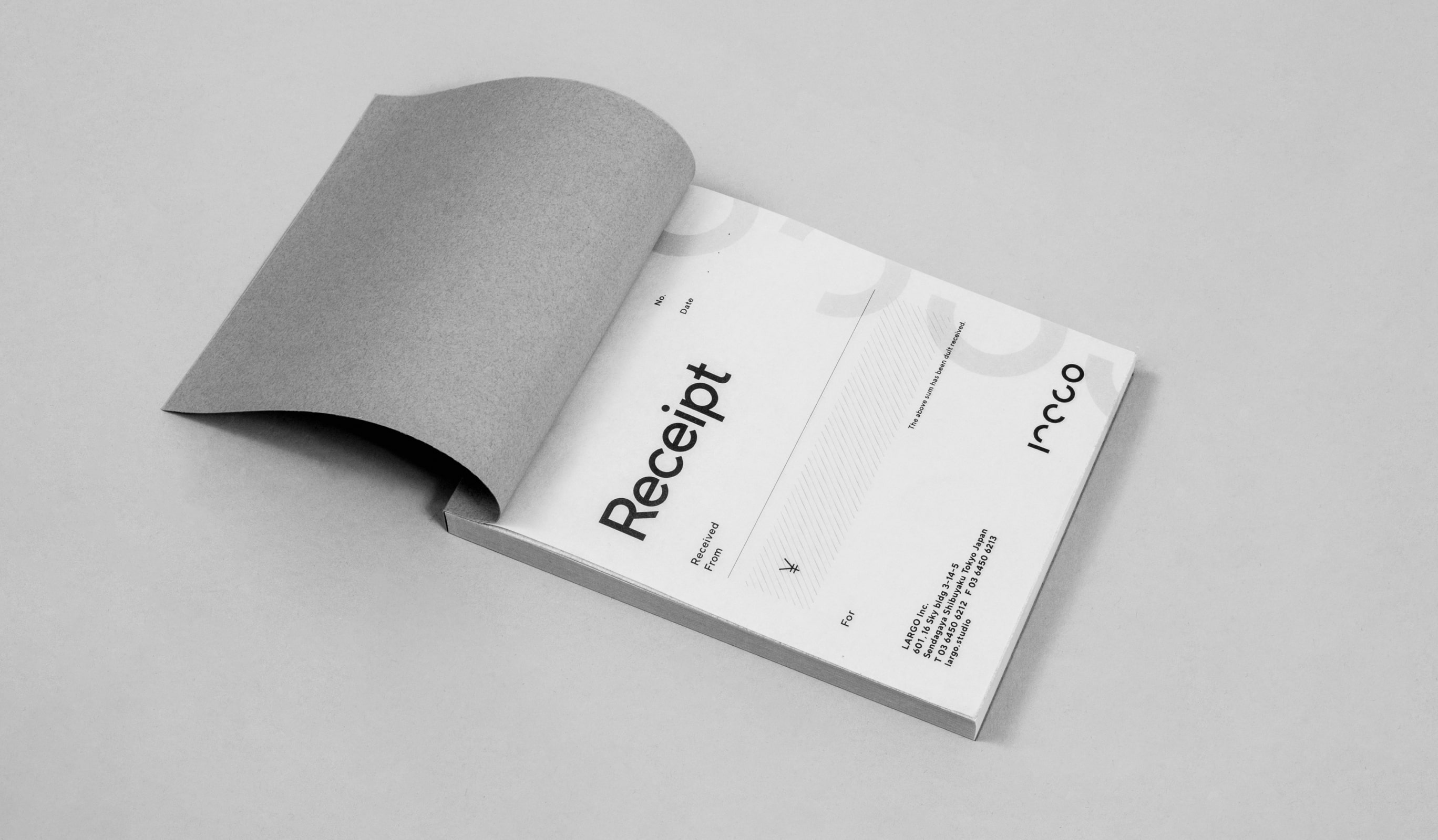
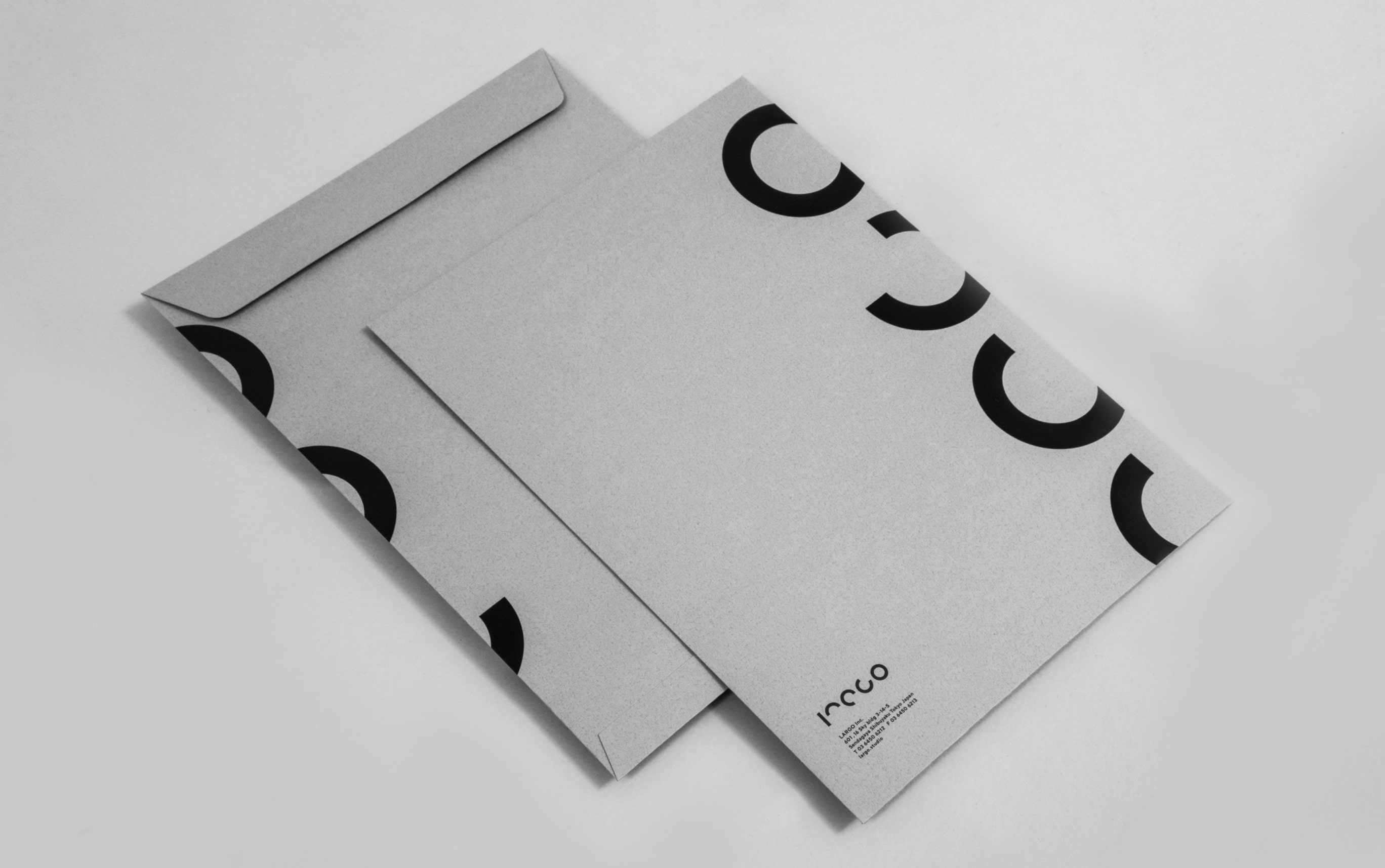
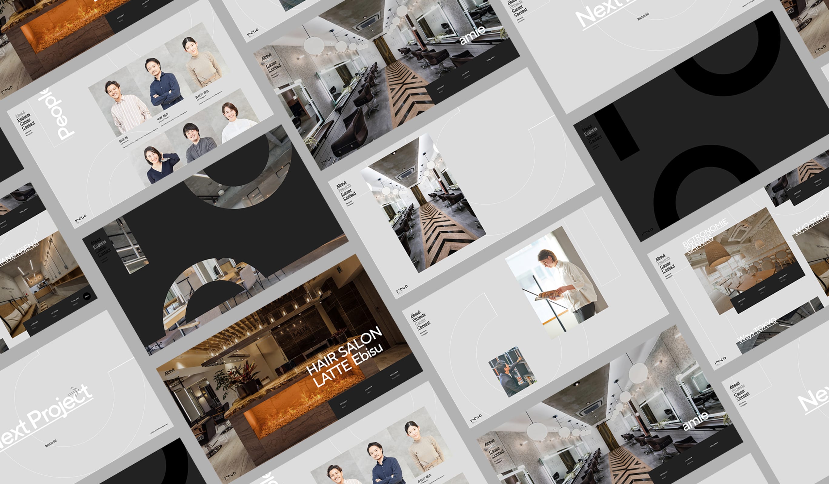
LARGO designs spaces for beauty salons, restaurants, and offices. With the renewal of their corporate site, we took the opportunity to renew their logo, business cards, envelopes, files, receipts, company pamphlets, and other tools, as well as the video used on the site.
- Insight
-
Verbalizing the client's "character" that they themselves were not aware of.
Verbalizing the client's "character" that they themselves were not aware of.
The previous website was not created with any special thought in mind, and it was difficult to say that it reflected LARGO’s philosophy and strengths.
This time, after repeated discussions, we arrived at the idea that LARGO’s character is to design episodes that are later told to users through the space. Behind this was the ability to think and act in a way that made us say, “You’re thinking that far ahead and accommodating us,” without defining our own domain. In fact, in this project, there were many scenes where the client pushed us to go this far anyway, and we were able to experience firsthand their attitude of envisioning the episodes that would occur around them after this renewal.
- Idea
-
Spreading the distinctive logo throughout the tool.
Spreading the distinctive logo throughout the tool.
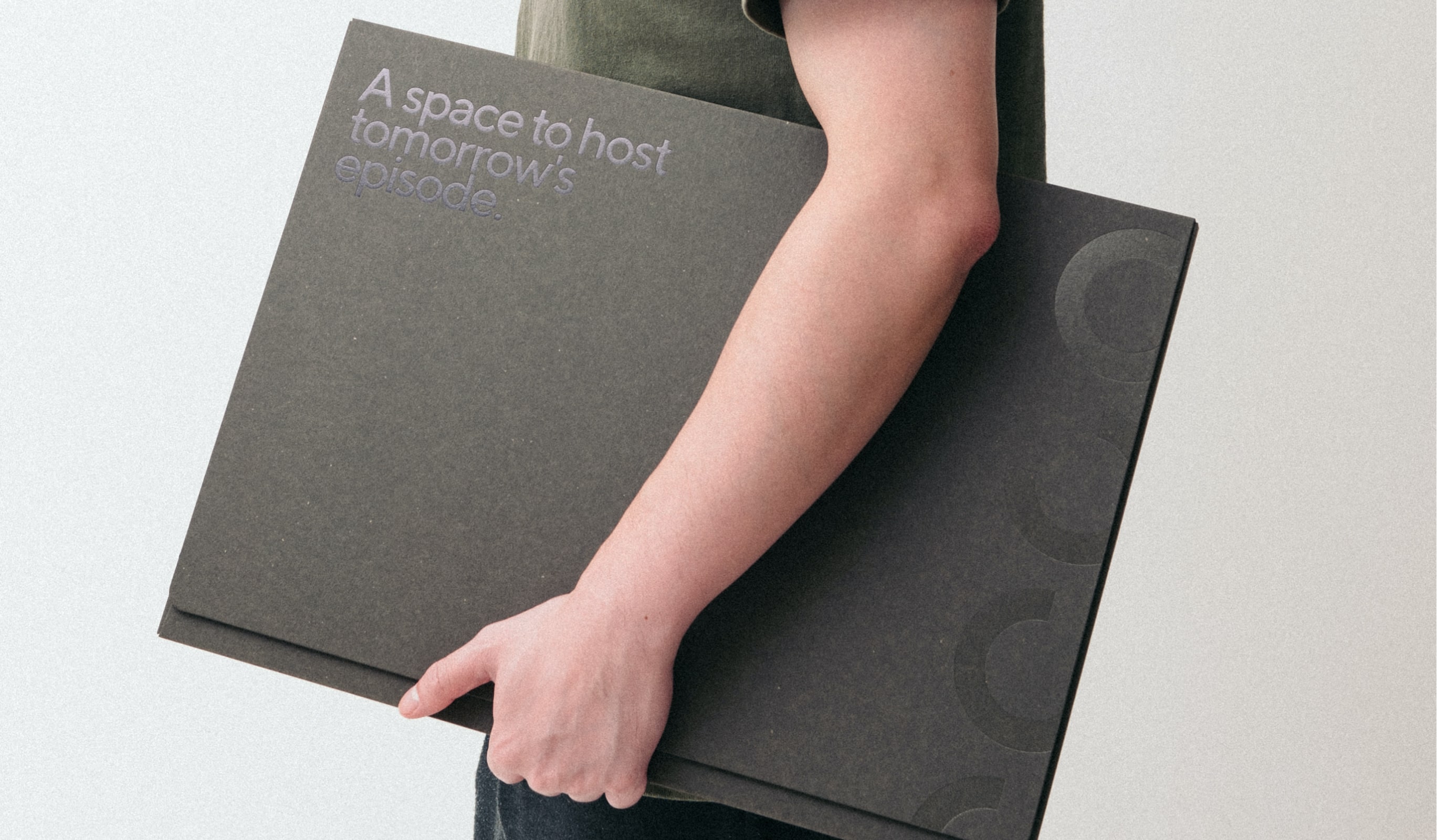
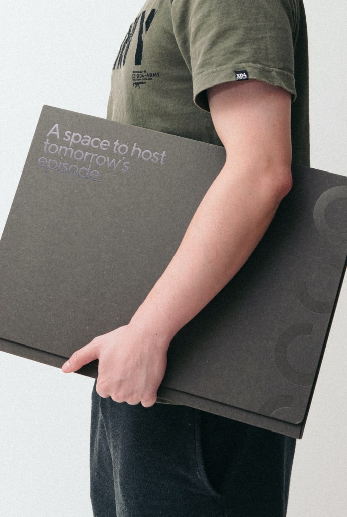
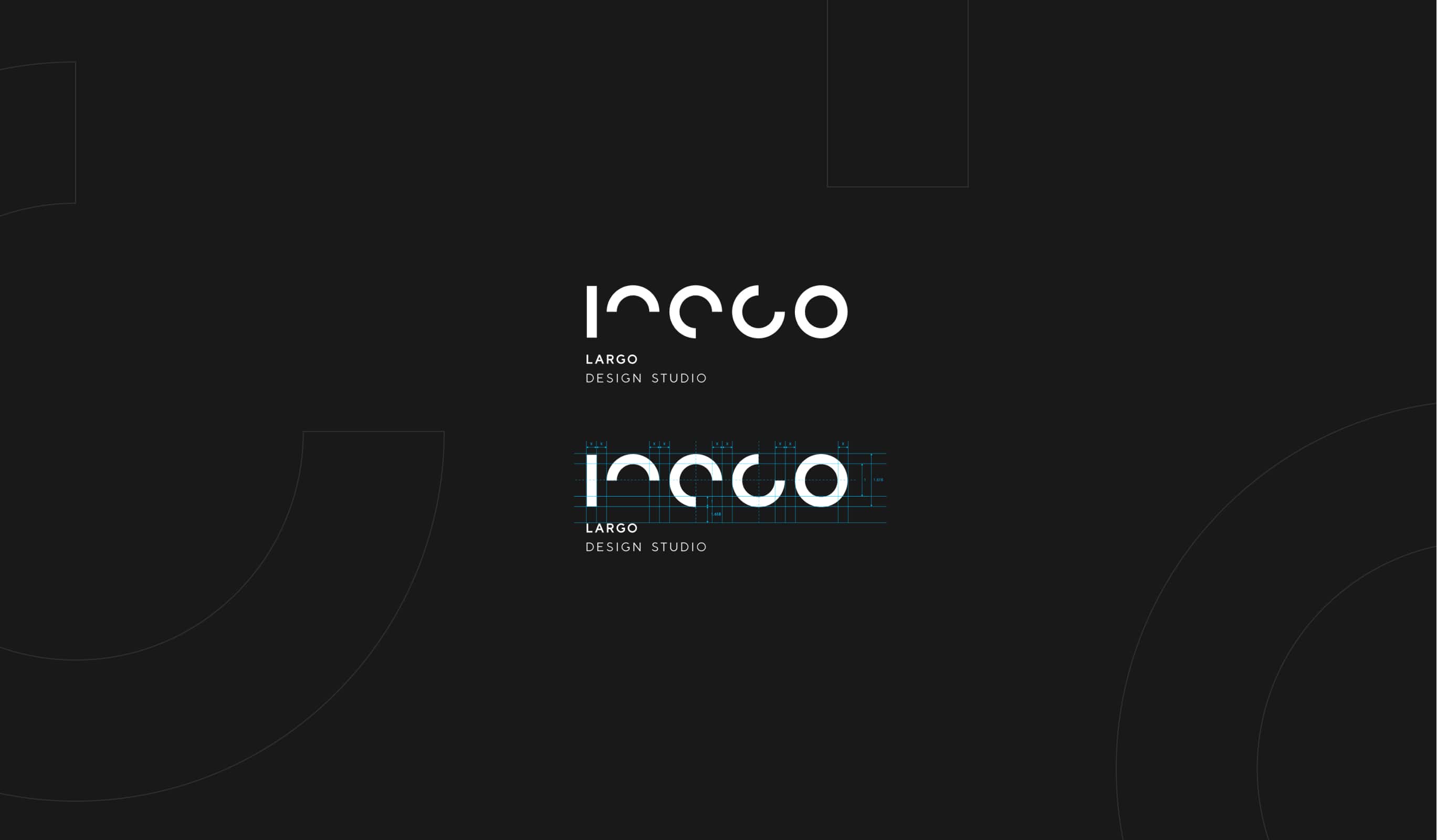
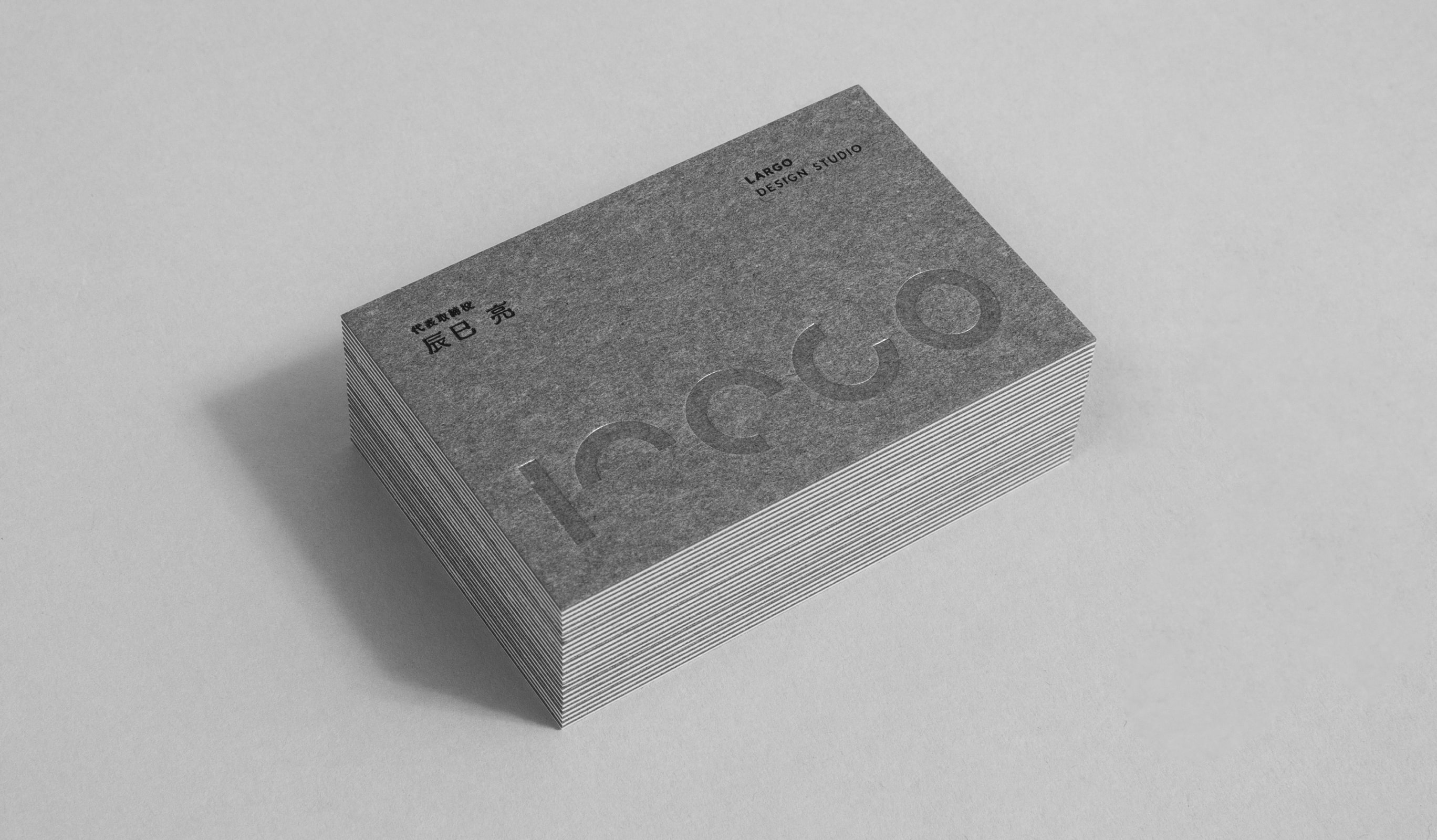
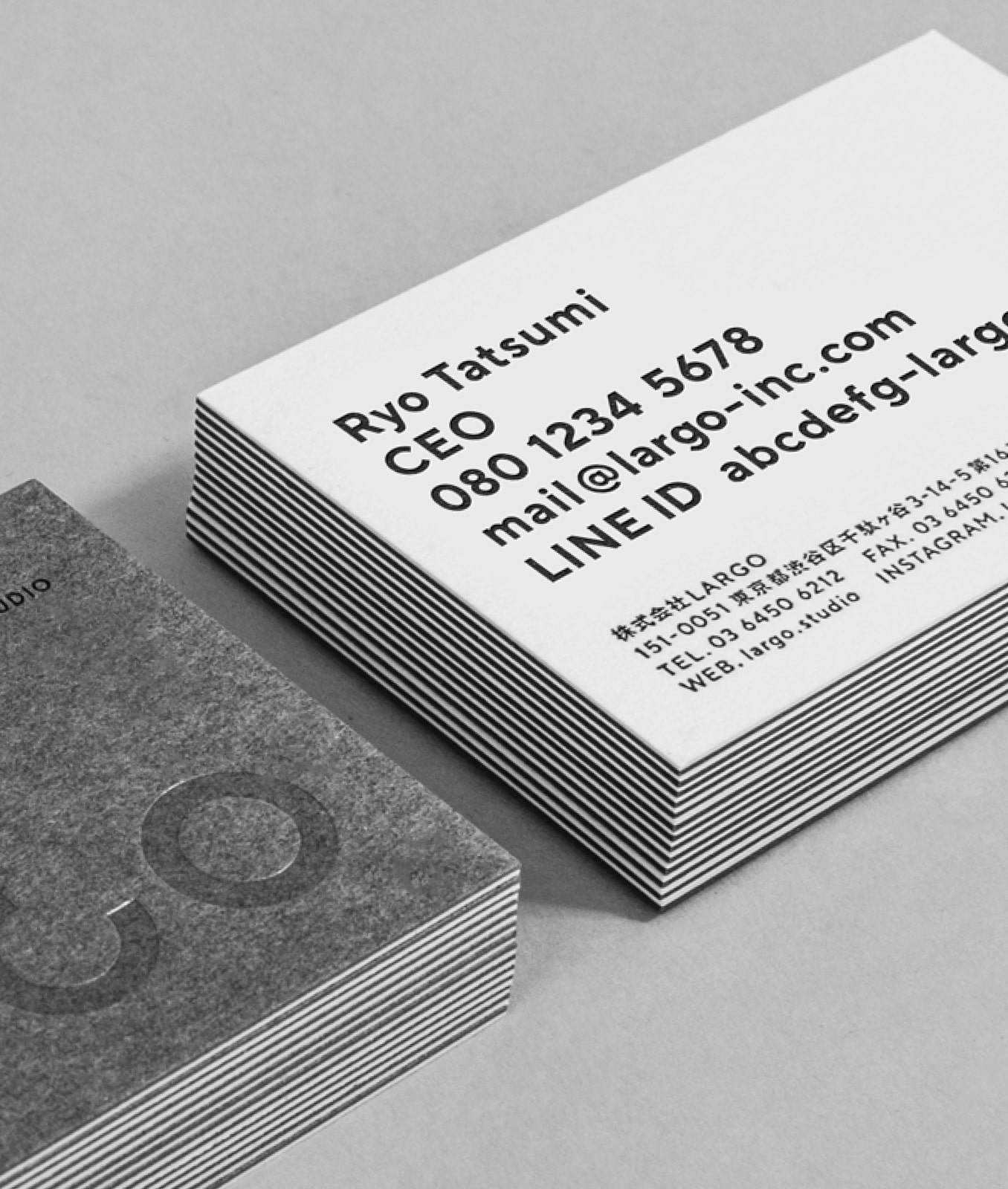
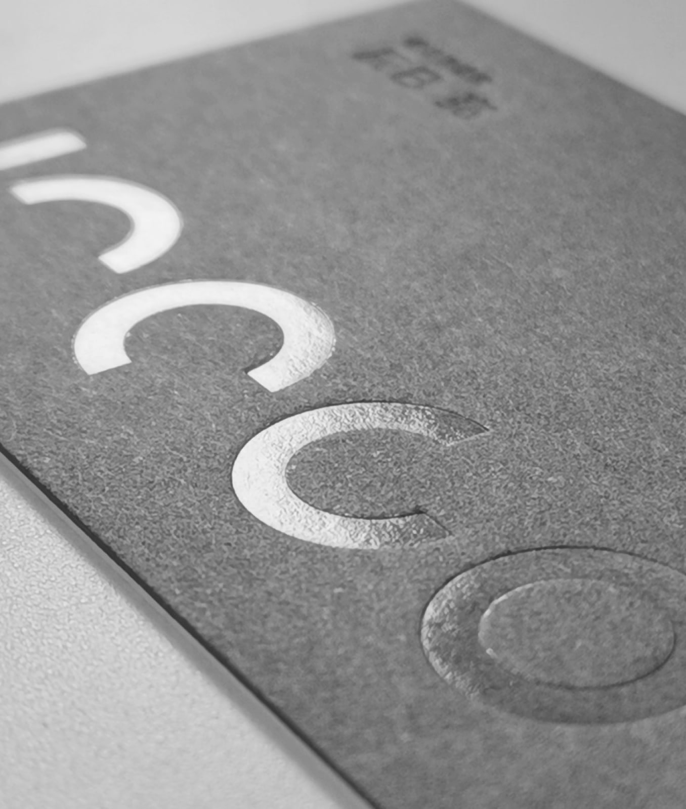
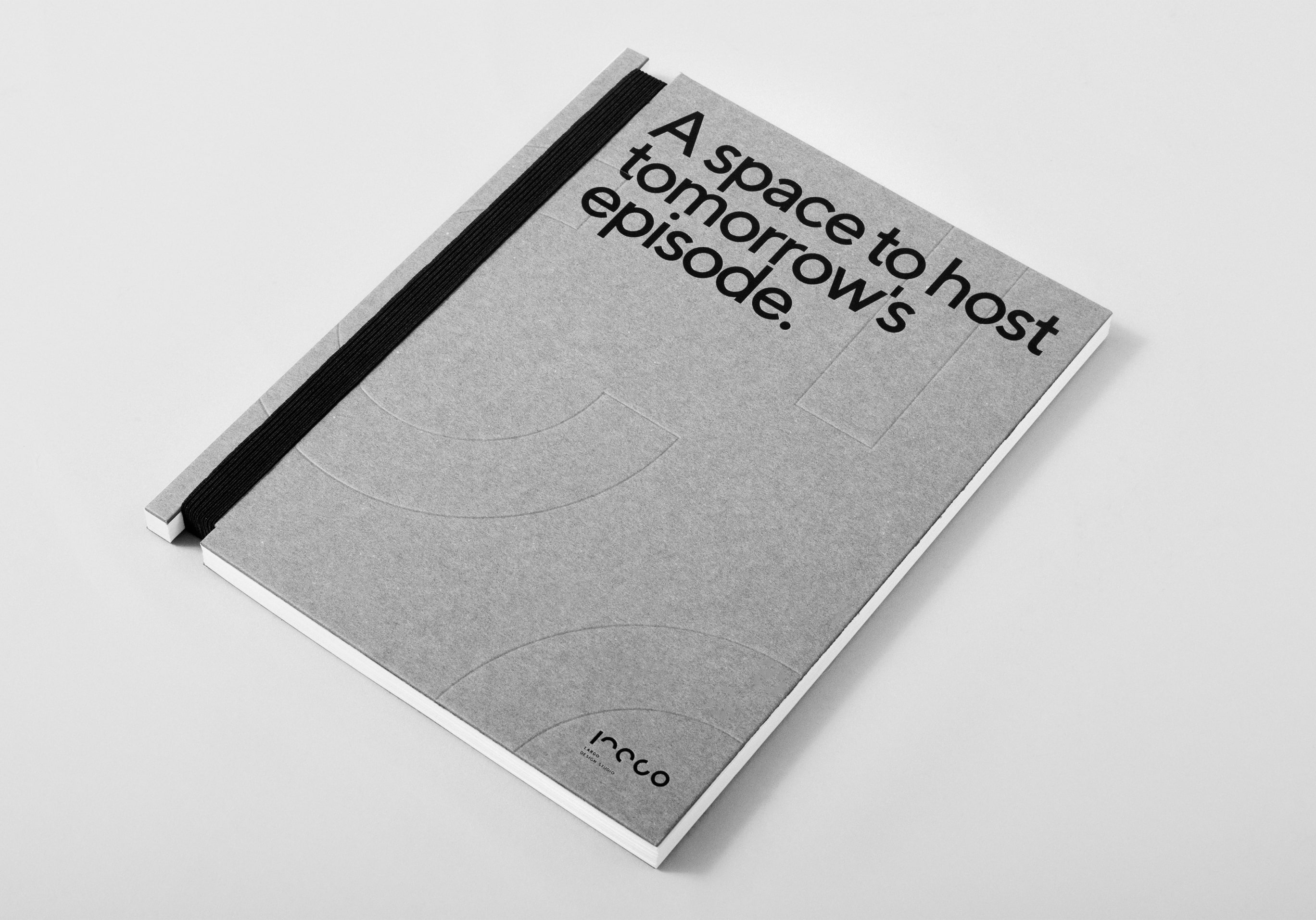
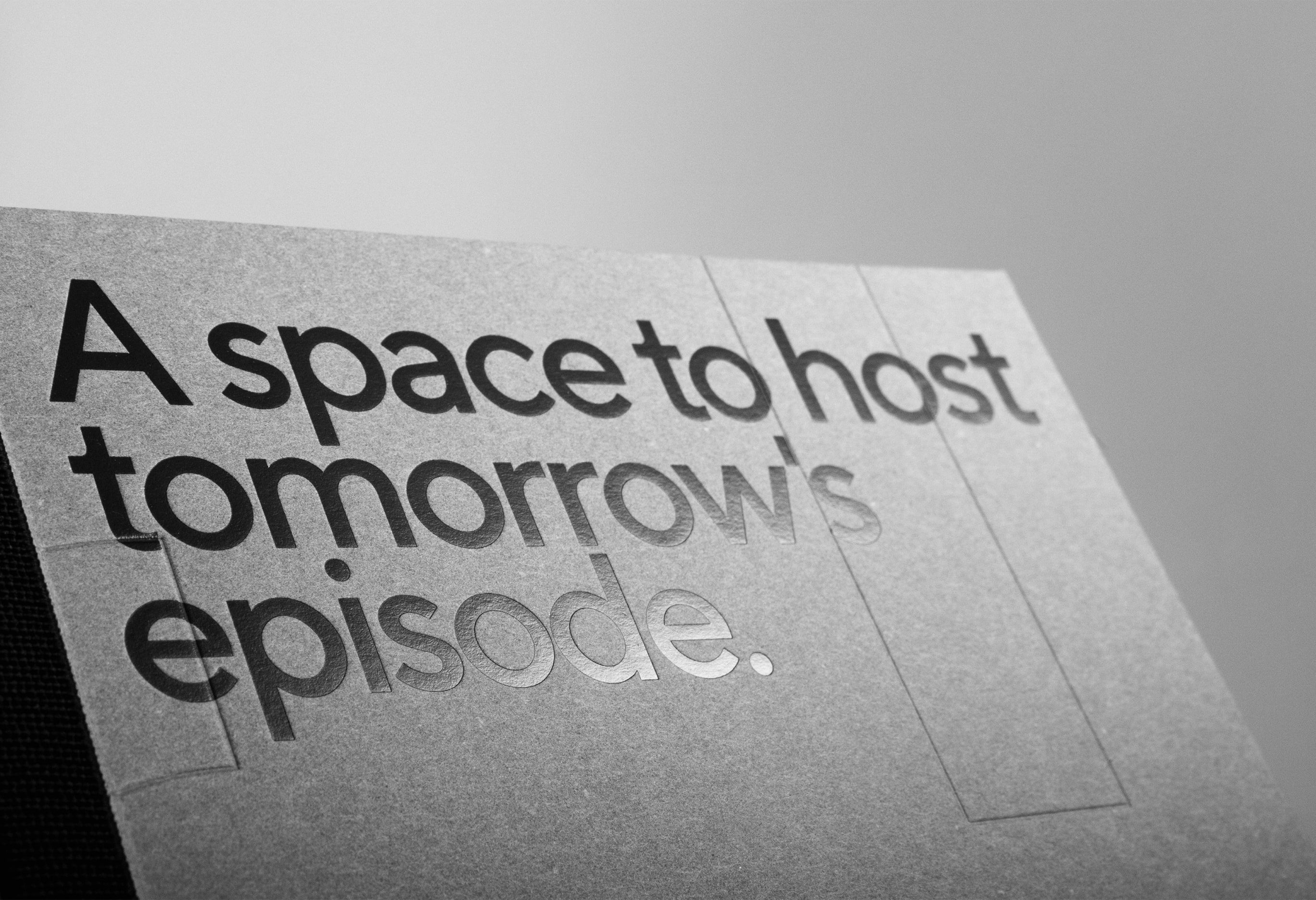
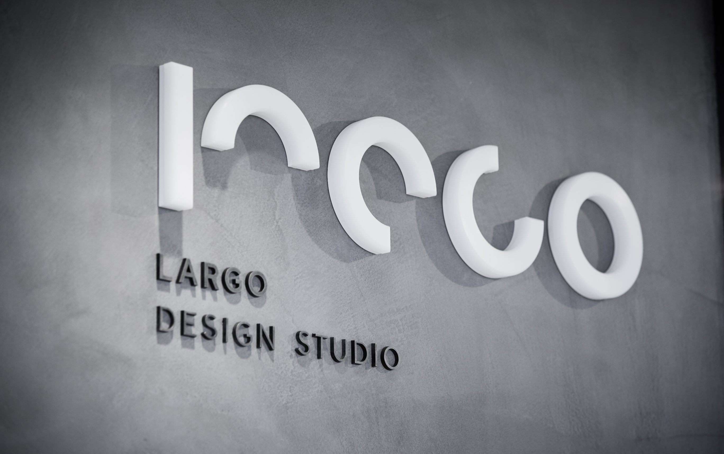
As for the logo, the vertical element symbolizes the “human power” that LARGO considers important as designers. We visualized a designer with such human power shaping a space while changing it in various ways. At the same time as renewing the logo, we also revamped the paper media. For the business cards, we used two layers of plywood, GA board and special A cushion, to create an atmosphere of architecture that combines concrete and different materials. The logo is also stamped with transparent foil, and was also boldly placed on other tools to express a vigorous appearance.
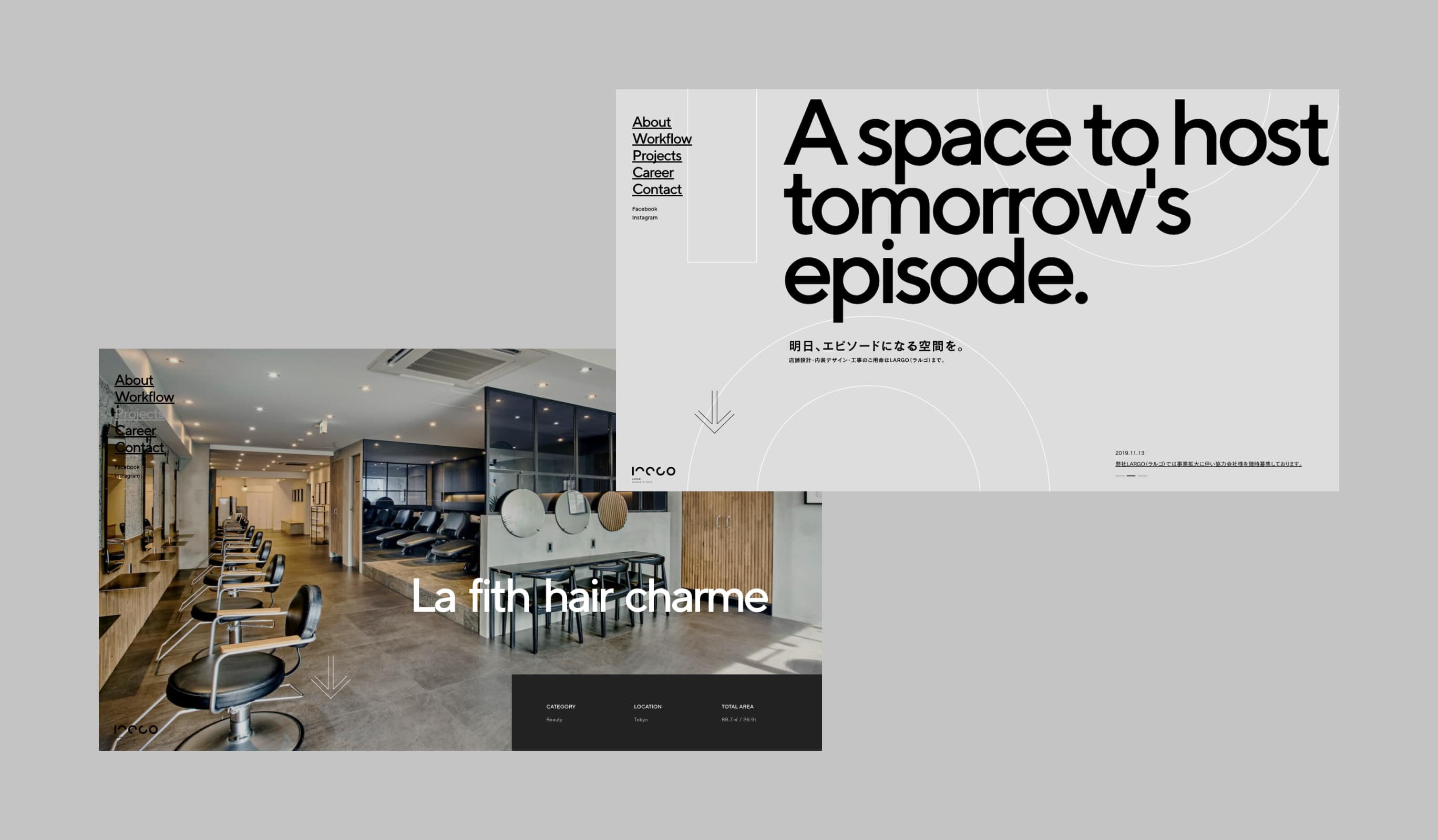
On the website, the logo is used dynamically in the intro and page transition animations. This creates a strong impression of the new logo. We also sought to express LARGO, a company that deals with space design, through motion, and scattered the entire site with auxiliary lines drawn in the image of architectural design drawings.
This time, we adopted a CMS so that the client could update the site themselves, using WordPress as the API and React.js to create a site structure that transitions seamlessly from page to page. The smooth and rich transitions express the continuous expansion of the exciting space that LARGO creates.

- Impact
-
Transitioning to an era of continuous direct inquiries.
Transitioning to an era of continuous direct inquiries.
LARGO’s holistic branding, honored with accolades from the top three global Web Awards and the Red Dot Design Award, has garnered significant attention. Following these accolades, inquiries specifically requesting LARGO surged. This increase meant less need for competitive bidding and other sales efforts, boosting overall operational efficiency and fostering a more comfortable work environment for our staff. Three years after the rebranding, we’ve also developed internal company materials, ensuring that staff joining post-rebranding can fully embrace LARGO’s ethos.
Awarded
- Red Dot — Red dot Award
- FWA of the Day — FWA
- Site of the Day — Awwwards
- Website of the Day — CSSDA
Project team
- John Nishiyama
- CSO / Copywriter
- Ryohei Kamada
- External Advisor / Art Director
- Hiroki Miyamoto
- Art Director / Designer
- Junichi Nishiyama
- Senior Interactive Designer
- Wongeun Heo
- Technical Advisor
- Hiroaki Yasutomo
- CTO / Technical Director
- Keitaro Suzuki
- Design Director
- Masakazu Tsuru
- Producer
- Sunao Nakamura
- Account
